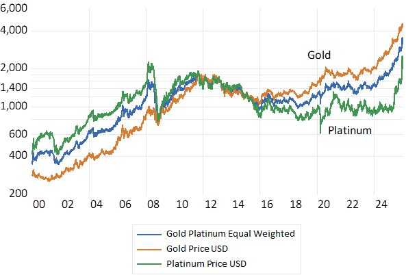
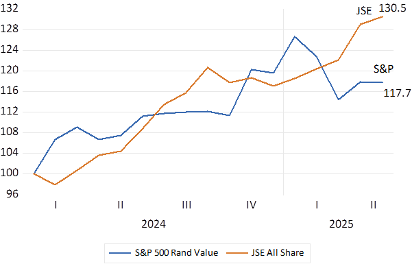
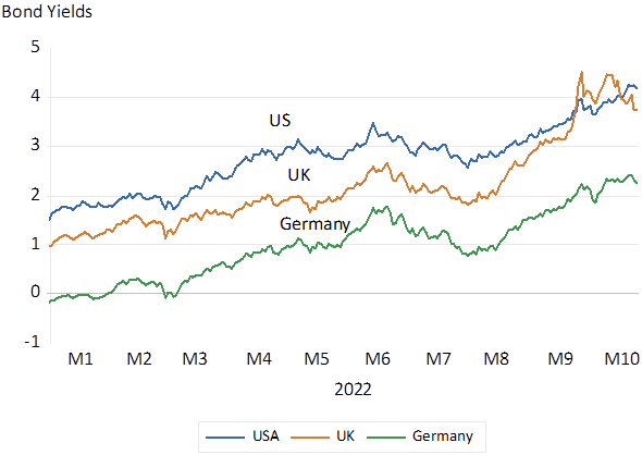
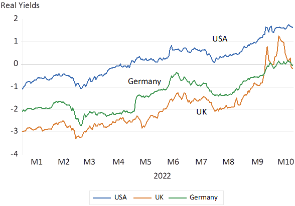
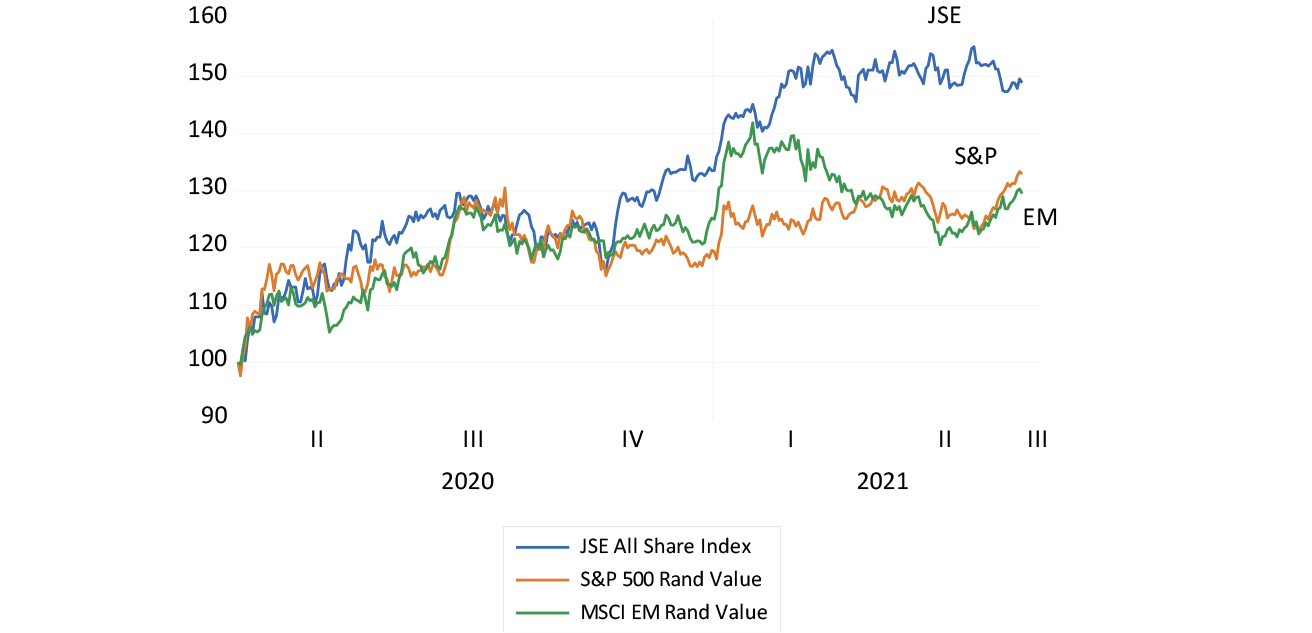
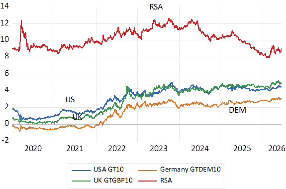
Bond Yields have been rising almost everywhere – though RSA yields have largely resisted these higher yields lately. An extended period of lower bond yields in response to the Global Financial Crisis of 2008-09 and the Covid lockdowns has ended. Not only have nominal yields moved higher, so more tellingly have inflation protected real yields risen- adding to the real cost of capital. In 2022 investors had to accept a negative 3% a year on a German 10-year inflation linker. Or in other words investors had to hand over 3% a year to buy inflation protection from the German government. The same German bonds now offer close to 2% a year after inflation and are accordingly now worth much less than they were. A 10-year US Tips (Treasury Inflation Protected Stock) now yields over 2% p.a. after inflation- providing real yields that only turned positive in 2022 as the financial repression practised by the US Treasury and the Fed came to an end.
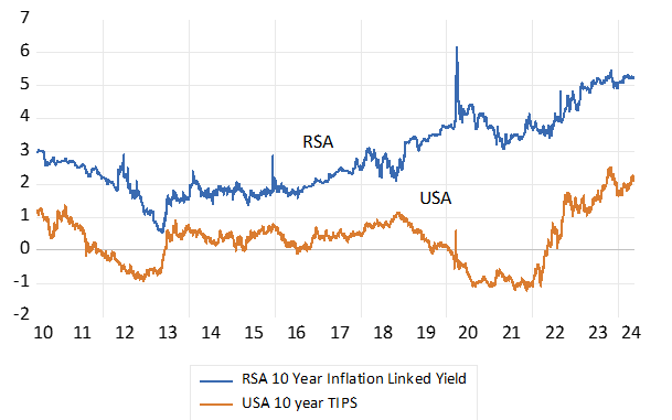
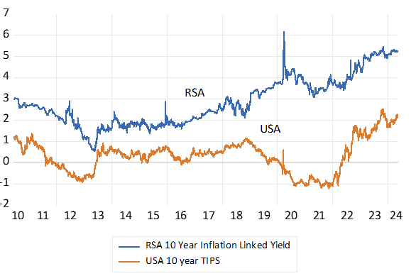
Fig. 1; Government Bond Yields – 10 year Nominal. Daily Data.
Source; Bloomberg; Investec Wealth & Investment
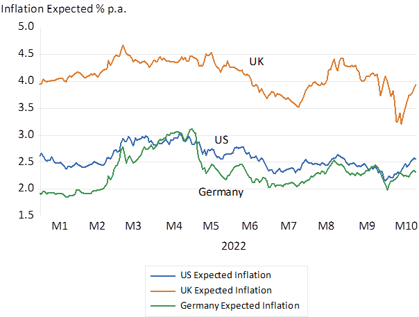
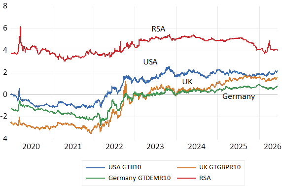
Real yields have risen revealing elevated demands for capital. More inflation expected has had a lesser influence on nominal interest rates- higher nominal yields have been driven higher by mostly higher real rates. The gap between 10 year nominal and inflation protected yields in the US- the so-called breakeven rates – that are presumed to reveal inflation expected – is now 2.4% p.a. for US and 2.3% for German Bonds. In early 2020 the break evens were 1.8 and 1 respectively indicating less inflation expected back then.
Fig 2; Government Bond Yields – 10 year Real Inflation Protected Yield; Daily Data
Source; Bloomberg; Investec Wealth & Investment
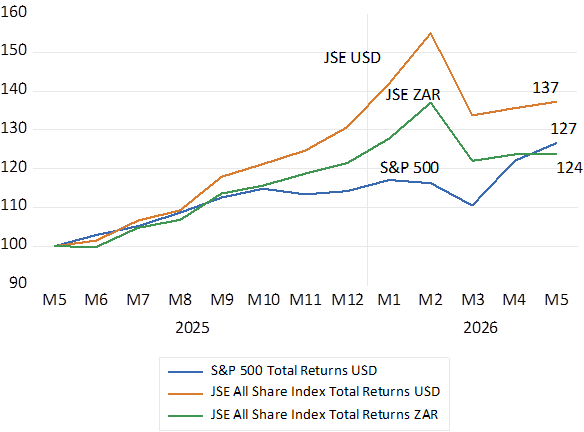
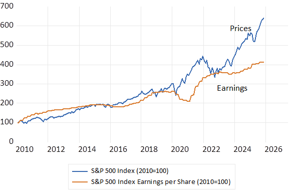
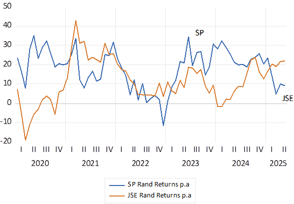
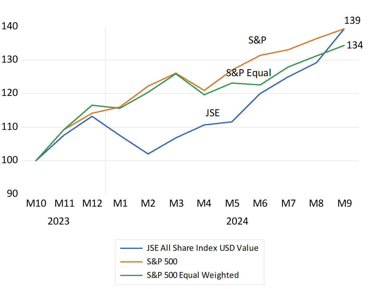
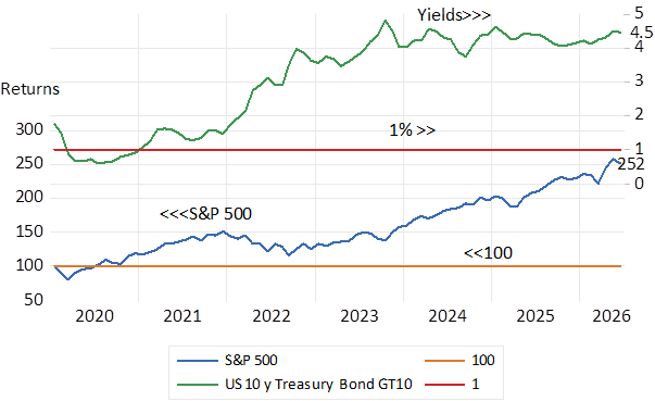
Despite the competition for capital the share markets have marched higher. Ever higher but for a brief episode in 2022 when short and long rates leapt higher as inflation proved more than temporary to the Fed. Long bond yields in the US have stabilised at the higher levels first reached in 2023. Yet the share market moved still higher this year as long term bond yields ticked higher. Since early 2020 the S&P has delivered a very impressive average annual returns of 14.5% while a Bloomberg Index of US government bonds has delivered negative annual returns of (-0.78%) It has been a very good time to own equities rather than bonds.
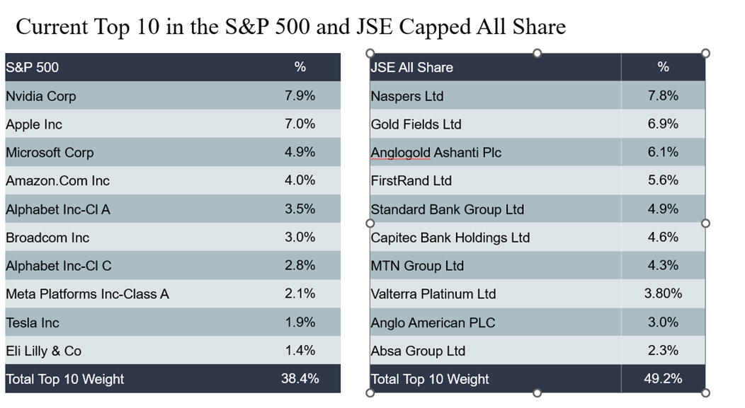
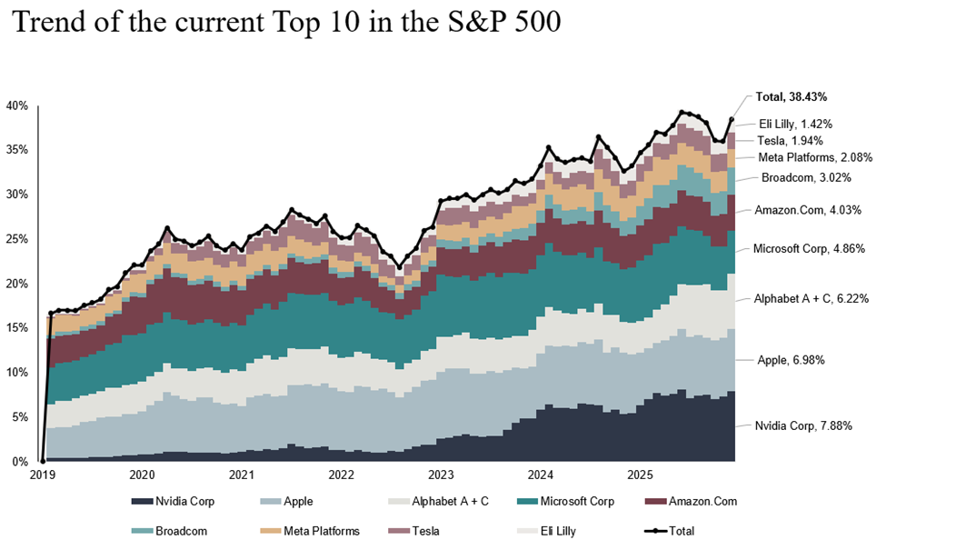
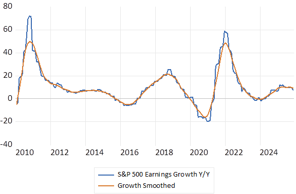
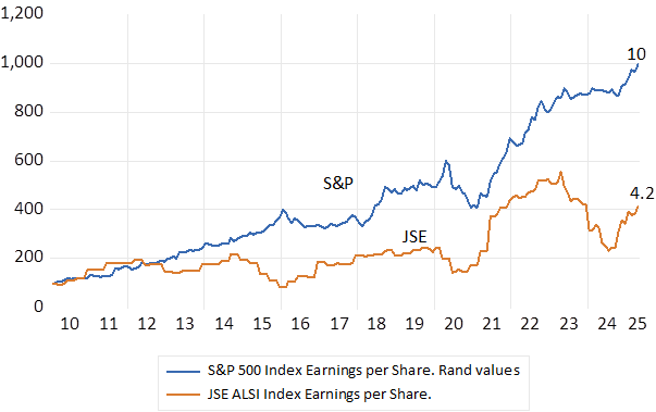
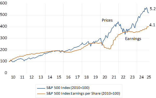
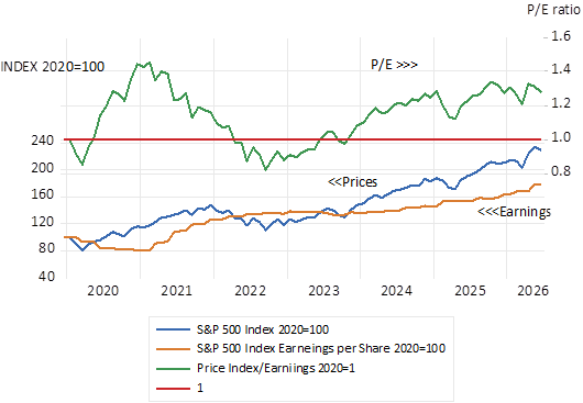
The returns from the average equity has been well supported by the reported growth in earnings. The P/E ratio for the S&P 500 has increased by about 20% since 2020. Earnings have grown very strongly, by 15% over the past 12 months are expected to grow as strongly over the next year.
Fig 3: The S&P 500 and US Government Bond Yields 10 y
Source; Bloomberg; Investec Wealth & Investment
Fig.4: S&P 500 Index and Index earnings 2020=100
Source; Bloomberg; Investec Wealth & Investment
There are impotent other features of the current US stock market that will have contributed to upward pressure on interest rates. The Capex and R&D spending by the IT scalers have been growing very rapidly- by an extra trillion dollars and more per annum – as they compete for space in the new brave world of AI. Spending enough to have had observable macro-economic consequences for the US economy. That is resulting in faster growth and more employment. But also introducing enough extra borrowing to meaningfully increase their calls on the capital market- and thus to influence interest rates themselves. Substantial Free Cash have fallen away given the scale of extra spending on capex and R&D. Free cash flow that would until recently have added to gross savings, have had to be augmented by debt raised to fund highly ambitious growth plans. These extra calls on the capital markets when combined with ever larger large US Treasury Deficits, extra borrowing has presumably made for more stressed capital markets and higher borrowing costs.
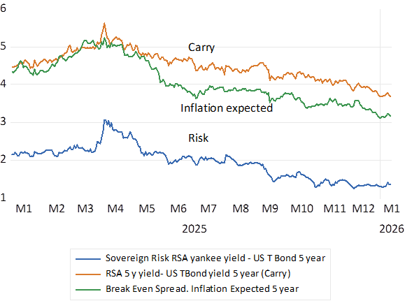
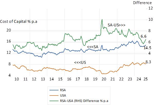
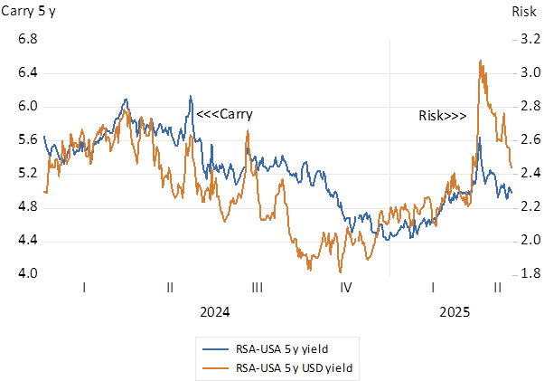
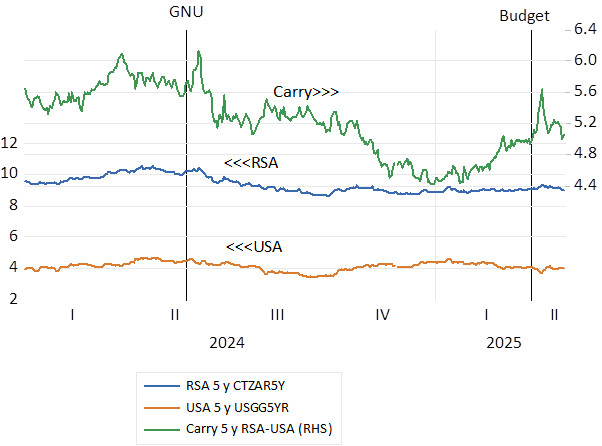
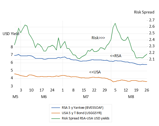
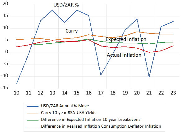
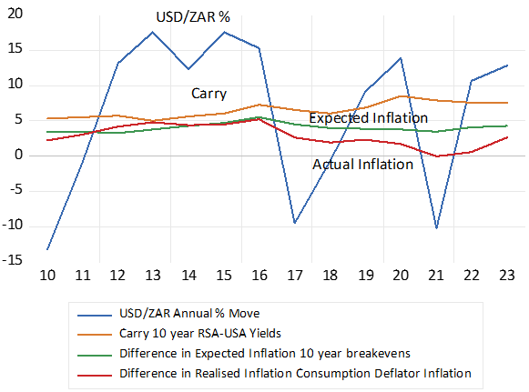
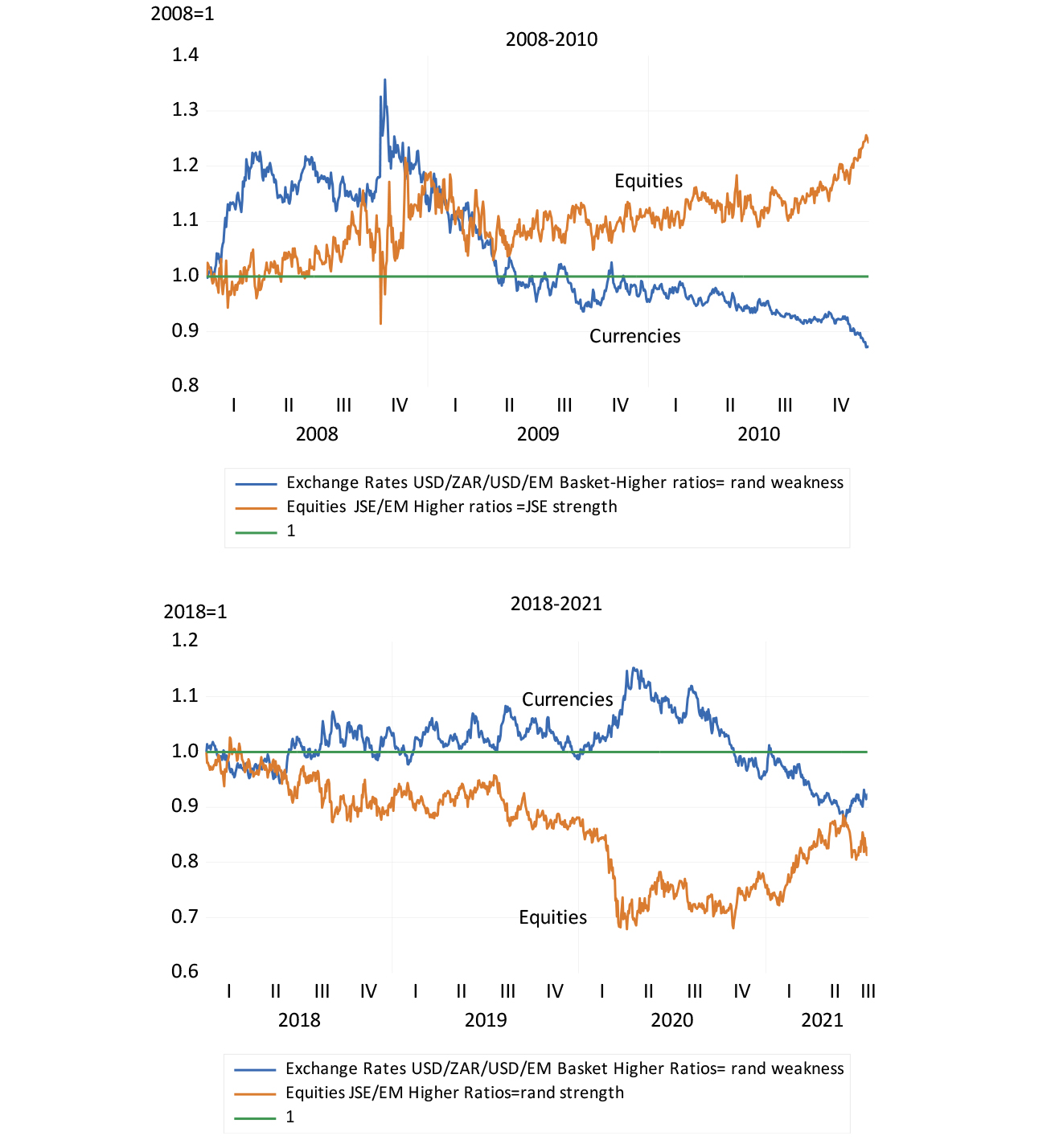
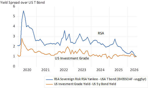
The case of RSA bonds is somewhat different. Nominal bond yields have been falling in response to strong signs of fiscal sustainability. The SA sovereign risk spread, the difference between dollar denominated RSA and USA bond yields has narrowed sharply in recent months. The yield spread on five-year RSA Yankee bonds has fallen below 1% p.a. – to put RSA debt in Investment Grade territory. Also narrowing has been the spread between RSA nominal bond yields and their US equivalents, indicating less ZAR weakness expected.
Fig 5; Risk Spreads- RSA Yankee Spread over 5 y US T bonds and US Investment Grade Spread over US T Bonds
Source; Bloomberg; Investec Wealth & Investment
But there remains a RSA bond market anomaly. The RSA inflation protected yields have not declined. They continue to offer high and inflation certain returns of over 4% a year. Real yields that were under 2% p.a. in 2012. The reason for such impressively high low risk returns is not at all obvious. Clearly foreign investors would not easily be attracted to such yields. They would receive rand returns at exchange rates that would be expected to weaken and to reduce returns expected when expressed in USD. But rand investors would confidently expect high real returns. Perhaps the appetite of local investors for inflation linkers has been more than satiated. Inflation linkers account for a significant 17% of all marketable national government debt – perhaps too much to ask for thus making for expensive debt. Not good for taxpayers- but surely helpful to lenders.