The case against Eskom – redux

In our last edition, we argued that Eskom’s request for price increases, if agreed to by the regulator, would provide Eskom and its shareholder (the Republic of SA), with an unnecessarily high return on capital, some 8% per annum after inflation. We go into some of issues in more detail today, notably the use of depreciation allowances in setting prices.

We indicated that this expected return is more than twice the international norm and that if Eskom gets its way it will possess a very strong balance sheet by 2018.

The key is that this balance sheet strength can only come at the expense of its customers. As we have argued, the right prices for electricity for SA are those that would generate a 4% real return on the extra capital Eskom will be investing in new generating and distribution capacity. Such returns would put the economics of electricity pricing first and would make the state of Eskom’s balance sheet very much a secondary consideration. Moreover, it would still leave its balance sheet in a highly acceptable state for the low risk business it is.

The logic of the investment decision

All projects requiring an investment of scarce capital that offer a positive present value, given some appropriately estimated cost of capital, or discount rate, should ideally be undertaken in the interest of economic growth and efficiency. One of the primary principles applied to the decision as to whether or not to proceed with a project, be it a green-field project or an acquisition of another company, is that the economic and financial decisions should be separated.

The first question to be answered by any agency contemplating investing capital is the economic one. After estimating the extra revenues and operating costs related to the project it can be established whether or not the present value (PV) of these estimated operating cash flows exceeds the intended capital expenditure, given its cost of capital or required risk adjusted return (the discount rate). If the answer is affirmative the next question can be addressed: How best should the project be financed? When extra capital has to be raised from the market place it is the suppliers of capital that will decide whether the project that seems so promising to its originators can in fact go ahead.

At this point in the evolution of the planning process for additional capital expenditure judgments about the structure of the capital to be raised can be made. The presumed riskiness of the project and the strength of the balance sheet will influence the cost of raising additional debt finance. Also relevant will be the tax treatment of the project. Allowances for interest and especially depreciation expenses or investment allowances will make a difference to taxes levied and after tax returns. The firm and the market will compare the after tax, risk adjusted returns of this project with its next best, equally risky, alternative. Clearly if the internal rate of return (derived from operating cash flows) from a project with a limited economic life exceeds the interest cost of debt plus debt to be repaid over the same period, leverage will add to operating profits after taxes.

Why the depreciation allowance should not be regarded as a cost to be covered by regulated prices

A further important point that seems to be disregarded by both Eskom and Nersa is that depreciation allowances are not a cash cost of production. They do however affect taxes paid and bottom line accounting earnings and after tax returns. When estimating the PV of any project these depreciation allowances should not be deducted from operating cash flow when a project is accorded a limited economic life.

Allowing for depreciation on top of maintenance costs would clearly reduce the PV of the cash operating surpluses expected over the economic life of the project. A regulator including depreciation as a cost of production may then allow higher prices to be charged to achieve positive PV projects. This treatment of depreciation as a cost to be recovered in prices would represent a logical fallacy.

Economic depreciation is implicit in the economic life accorded to any project. The shorter the life allowed a project the lower the PV of the cash flows and so the faster the capital is being written off and vice versa: the longer the economic life the greater the present value of any flow of operating cash. It is simply wrong to add depreciation to operating costs when present valuing any project with a limited economic life. It leads to underestimates of PV and so fewer projects qualifying with a PV that exceeds their capital costs. When prices are set by a regulator, it leads to unnecessarily higher prices.

Eskom asks for more than ordinary depreciation allowances – it asks for cost and price inflating replacement cost depreciation

Eskom however has another trick up its accounting sleeve. It argues that the costs it is required to cover with prices include not only conventional depreciation for accounting purposes but so called replacement cost depreciation: a depreciation allowance of 10% p. a. This is applied to the capital equipment employed that is continuously revalued by their higher, inflation augmented, costs of replacement by new equipment .This gives a much higher value for the capital employed and so a much much higher depreciation charges (Eskom hopes) to be recovered through higher prices.

When estimating present value and finding projects with a present value that exceeds their cost depreciation allowances should not be included in costs to be recovered

It should be recognised that depreciation allowances should have no place in the regulator’s calculation. The right price for electricity is the price that would allow revenue to cover all cash operating costs plus the right return on capital – no more than 4% real – on additional electricity generating or distribution capacity that Eskom plans to invest in. Prices set by the regulator should be set to yield a positive PV using this 4% real discount rate (before taxes). If Eskom can justify such projects (which it surely can) then such projects should be financed with a high ratio of debt finance. Brian Kantor
The case against Eskom and its debt management driven price demands

The Eskom initiative for higher prices

Eskom has submitted its Multi-Year Price Determination (MYPD 3) to the National Energy Regulator of South Africa (Nersa) in which it is requesting annual electricity increases of 16% until 31 March 2018, of which 3% is targeted to support the introduction of Independent Power Producers (IPPs). This leaves a monstrous post-inflation increase of over 10% per annum for five years, which threatens the livelihood of small, energy-intensive businesses and the country’s citizens. On what basis does Eskom argue for such vigorous price demands?

What the Eskom balance sheet would look like if it gets its way with prices

If Eskom has its way with the regulators and the politicians on its plans for prices and costs, it will become one of the great companies of the world. It will be possessed of a balance sheet that would be the envy of the world, especially of the world of public utilities. By 2018 it would have assets that at replacement costs would have a value of over R1 trillion, more than three times its R300bn of debt.

The company would then command a AAA debt rating (better than that of the SA government) assuming this is technically feasible. It would incidentally be very helpful to ourselves and also Nersa were Eskom to present pro-forma balance sheets, income and cash flow statements over the five year planning period. It would be even more helpful if Eskom could present the outcomes of alternative scenarios for the balance sheet and debt ratios with lower prices.

Our overwhelming reaction to these Eskom proposals is just how ambitious and dangerous they are for the health of the SA economy.

Why Eskom behaves as it does and why it may be mistaken about the demand for electricity at much higher prices

We will leave it to others better qualified to examine and justify the much higher operating costs (mostly primary energy and employment costs) of generating extra capacity Eskom hopes to recover with higher prices. We have a strong sense that only time could prove – and hopefully will not be allowed to prove – that Eskom is greatly underestimating the real price elasticity of demands for its electricity as well as the opportunities it will open up for firms and households if Eskom gets its expensive pricing way to substitute (a la Sasol) locally generated power. Excess Eskom generating capacity may well become a feature of the future as it was of the past if the forecasts of demand prove over optimistic.

The new, already much more favourable financial reality for Eskom

In reality Eskom is now charging much more. The price charged by Eskom per kWh was 16.2c in 2006, which nearly doubled to 31c in 2010. These charges have since nearly doubled again to the current 61c per kWh. On top of these steep increases, municipalities that deliver electricity charge much more to their industrial and household customers than the Eskom wholesale price. As a result Eskom, after years of artificially low prices, is now earning an internationally comparable real return on all the capital it has invested. Eskom’s median cash flow return on operating assets (CFROI®) troughed at a negative level (-2.5%) in March 2009 at a time new generating capacity was essential to the functioning of the South African economy. CFROI represents the real economic return on inflation-adjusted capital and is comparable across borders and over time, making it an excellent benchmarking metric.

If we strip out the R159bn of presently non-productive construction-in-progress, Eskom’s CFROI improved to an internationally competitive 3.3% by March 2012. Our sense is that such a return, if maintained, would be sufficient to justify investment in additional capacity. With appropriate control of costs, revenue so generated will deliver enough cash from operations to support the balance sheet of a utility company that can typically sustain comparatively high debt ratios – given the essentially low risk nature of its business.

In the financial year to March 2012 Eskom undertook capital expenditure of R59bn. But given the abundant supplies of cash delivered from operations of R38.7bn, Eskom needed to raise only R16.5bn of additional debt in the last financial year compared to R30.5bn of debt raised in 2009. Eskom’s debt to equity ratio is falling significantly as we write.
It is the future of Eskom, not its past that matters when prices are set. Current prices plus inflation would be highly satisfactory returns on the investment being made in additional capacity.

More important than the historical performance is that at the current 61c per Kwh, assuming inflation adjusted prices and not much more than inflation adjusted costs going forward, the internal rate of return on its investment in additional capacity at Medupi or Kesuli power stations would be a more than satisfactory 14% p.a. That is a internal rate of return of six per cent per annum higher than what it costs the SA government to raise long term money. 14% nominal is equivalent to a real internal rate of return of 8% which, as we will argue, is excessive by comparison with global returns for utility companies.

The importance in choosing the right risk adjusted cost of capital for the regulator

The most important issue for any business or any regulator attempting to replicate the market process is just what this rate of return should be to justify an investment in a new project. It follows that the more risky the project is, so the higher will be the required return or discount rate applied to the project.

Electricity generation – especially where the regulated generator or distributor has a high degree of monopoly power – is among the lowest risk projects available in any economy. Demands for electricity are highly predictable compared to most other goods or services and the technology for coal fired stations is very well established.

Why Eskoms’s real cost of capital estimated at over 8% is double the required rate of return

Our major difference with Eskom and Nersa is that Eskom is demanding an exceptionally high real return on the capital it has invested and plans to invest. Last year, the median CFROI was 3.2% for the 100 largest listed electricity companies in the world.

The CFROI for power companies has been remarkably stable, averaging 3.5% over the past decade. For example, Electricite de France (EDF), one of the largest power companies in Europe, has a 10-year median CFROI of 3.6%. Malaysia’s Tenaga Nasional Berhad posted a 10-year median CFROI of 2.6%. Regulated utilities are generally fortunate to be granted a 4% real return on capital. There is no precedent for a real return as high as 8% for a regulated utility and Nersa should dismiss such assumptions about what is an appropriate return for a utility. A real return on capital of 4% should be more than sufficient in a country that requires greater growth to put people to work and place poverty behind us.

Eskom appears to have succeeded in convincing the regulator that 8% is a “reasonable (real) return on assets.” The market-implied real cost of capital for listed SA industrial companies has averaged 5.5% over the past decade. Listed firms, where shareholders are subject to the possibility of 100% downside, are far riskier than a government owned utility. Less risk should mean less return. A real return on capital of far less than 5.5% strikes us as reasonable for Eskom. Our benchmarking points to a 3.5% p.a real return as being globally competitive.

Why Eskom puts debt management first in its concerns when requesting price increases and why it makes little sense given its ownership

It is very clear that Eskom prefers, for its own reasons, not to separate the investment and financial decisions. Its primary objective in setting prices seems to be to strengthen its balance sheet excessively and unnecessarily. Hence the justification for extraordinary – way above required returns on capital – price increases rather than via brilliant control over costs or engineering competence – a success we all would approve of and share in.

We can argue whether or not electricity generating capacity in SA should be privately owned. We would argue for many, rather than only one, management teams responsible for electricity supply and so much more competition between alternative suppliers. It is however ironic that Eskom should wish to deny itself its primary advantage as a wholly owned subsidiary of the Republic. It can depend on the balance sheet of the Republic and by so doing borrow on the same favourable terms.

This facility would not make any difference to Eskom’s cost of capital or required – but relying on the balance sheet of its powerful shareholder would allow lower costs of finance and more debt with which to fund viable projects. If the internal rates of return realised by Eskom exceed the costs of finance, leverage adds significantly to the bottom line and the return on equity capital.

No doubt it is much more convenient and rewarding for the management of Eskom to enjoy financial independence and its own strong balance sheet and the bonuses that presumably come with high operating margins, earnings growth and very high returns on capital. But when this is achieved with excessively and unnecessarily high prices by exploiting its monopoly powers, this does not suit the SA economy at all. The demands of Eskom should be vigorously resisted by the regulator and public opinion. Brian Kantor and David Holland*

*David Holland is an independent consultant and senior advisor to Credit Suisse. The opinions are those of the authors’ and do not reflect the views of Investec or Credit Suisse.

A strange moment for the rand

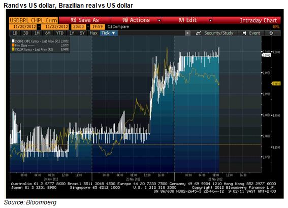
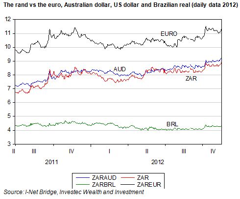
The mystery of the strange behaviour of the rand yesterday (Wednesday) has been solved. Sudden rand weakness had nothing to do with South African events: it weakened suddenly around 11h30 in complete sympathy with a simultaneous decline in the exchange value of the Brazilian real.

As may be seen in the chart below, both currencies weakened significantly at about this time. Hence the rand weakness can be described as a response to emerging market rather than SA specific risk. To deepen the mystery further however, other emerging market currencies, such as the Turkish Lira and the Mexican peso, did not react in anything like the same way. The mystery therefore is to recognise those forces that simultaneously weakened the Brazilian and SA currencies. As for now, this remains something of an unsolved mystery.

The JSE moreover did not react to rand weakness, as might ordinarily have been expected. Retailers, who are particularly vulnerable to rand weakness and the higher import prices that come with it, held up very well and the rand hedges – both of the Industrial and Resource kind – did not outperform.

What Brazil and SA have in common are iron ore exports to China. There was a conference call yesterday organised by one of the institutional brokers on the proposed reduction in Chinese domestic iron ore tax, where it was stated that a more favourable tax treatment of domestic iron ore producers might well reduce the Chinese demand for iron ore imports.

This episode in the currency markets perhaps illustrates once more how important China is to the outlook for commodity prices. Yesterday was not at all a bad day for commodity prices. Iron ore fines were quoted at prices only marginally ahead of the day before and nearly 8% higher, year to date, while the CRB Commodity Price Index was unchanged on the day. Brian Kantor

Striking the rand

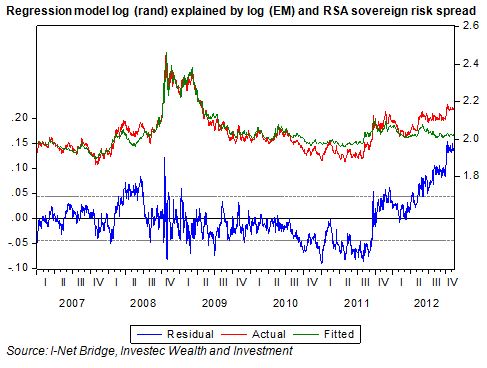
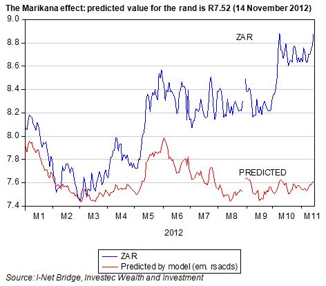
The troubles on the mines and now the farms of SA have hurt the rand. The rand is now significantly weaker than would have been predicted given the behaviour of emerging market equities and RSA sovereign risk spreads.

These two factors provide a very good explanation of the rand/USD exchange rate on a day to day basis. As we show below, the rand is about 12% weaker than predicted by this model of the rand.

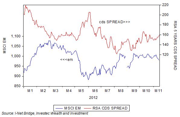
As may be seen below, the MSCI emerging market index has held up over recent months, as has the cost of insuring against a default on RSA foreign currency denominated debt with a five year credit default swap.

However, as may also be seen, RSA debt has derated in recent months. Compared with Turkish, Russian. Brazilian or Mexican debt, the costs of insuring RSA debt has become relatively more expensive.

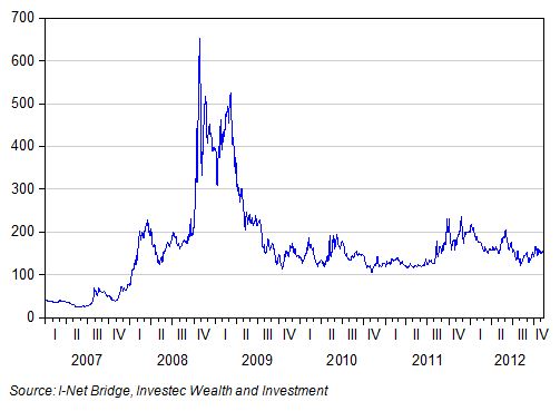
Yet compared to the past, the SA risk spread remains very low by its own standards, at 150bps above the returns on US five year debt.

The exchange value of the rand will continue to be driven by global economic forces, as revealed by: the value of emerging market equities, the risks associated with SA (shown in the debt markets) and now also by SA specifics in the form of strike action. The markets will assess not so much the incidence of strike action, but its expected impact on the economy, notably exports and domestic economic activity. The challenge for the SA government is to reform its system of labour relations to make strike action less likely and less violent; and employment growth more likely. Brian Kantor

Domestic spending: Encouraging October

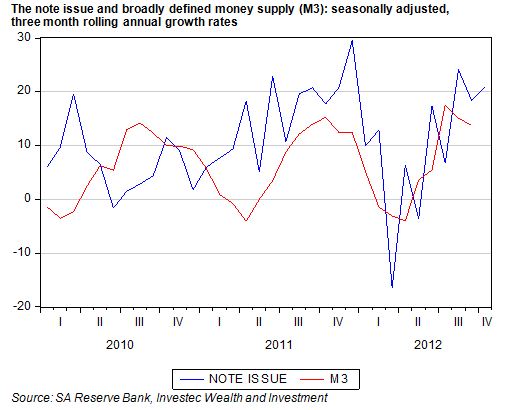
The demand for cash supplied by the Reserve Bank continued to grow strongly in the three months to October 2012. As we have explained before, the Reserve Bank note issue has proved to be a very good indicator of the spending intentions of SA households.

As we show below, the demand for cash fell off in early 2012 but picked up very strongly from mid year. Over the past three months the note issue, seasonally adjusted and annualised, grew by a robust 21%. As we also show, the growth in the broader money supply – mostly in the form of deposits issued by the banks – grew similarly in the three months to September month end.

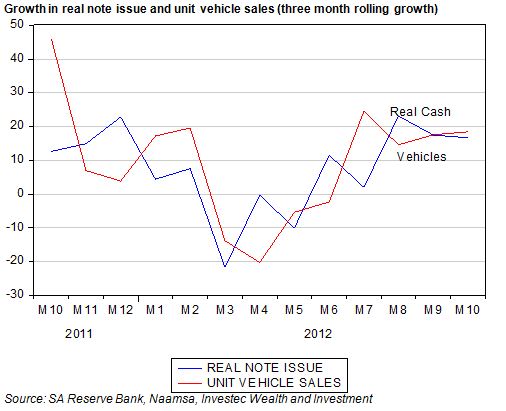
Unit vehicle sales have followed a very similar trajectory to the note issue (adjusted for inflation), losing momentum in the first half of 2012 and then recovering strongly to October.

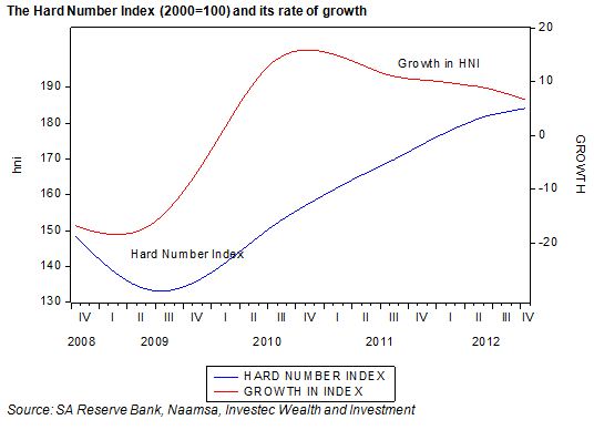
Unit vehicle sales and the note issue (adjusted for the CPI) make up our Hard Number Index (HNI) of the state of the economy. The HNI has two advantages: it is very up to date (updated to October 2012 month end) and it is based on actual recorded volumes (hard numbers) rather than the estimates made from sample surveys.

Given the strength in both vehicle sales and cash volumes, the HNI indicates that the economy has continued to move forward at a good pace. Its rate of growth – what can be regarded as the second derivate of economic activity – however continues to slow down. The indications therefore are that the SA economy is continuing to move forward at a good pace but that its forward momentum is slowing.


Other data releases for October – to be released in due course – are likely to confirm that domestic spending intentions and actions remain robust, surprisingly perhaps to the market place.

The figures for the note issue and unit vehicle sales are the first data posted for the economy post Marikana. It would appear that the strike action on the mines and roads of SA have had little negative influence on spending intentions. This resilience of domestic demand is very welcome when foreign demand is growing as slowly as it is, given the weak state of the global economy. If the economy is to retain its growth momentum, which is essential for political stability and a satisfactory fiscal state of affairs, it will continue to depend on the domestic spender. Domestic spending is being encouraged by low interest rates, which can be expected to stay low until global economic conditions improve.

The Census reports good real progress in household incomes and household numbers

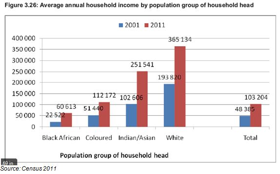
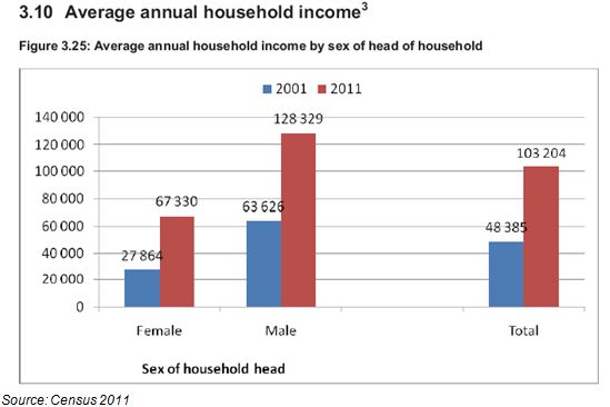
The general impression provided by the census is that significant economic progress has been made in SA over the past 10 years. There are now 14.45m identified households, 28% more than were counted in 2001. Average household incomes of R103 204 were reported compared to R48 305 in 2001. That is an increase of 113% in money of the day terms. Given that the CPI increased by 77% over this period, this implies a real increase of approximately 36% in average household incomes over the 10 years.

The poorest SA households are those led by black Africans. However they did significantly better than the average SA household. Households headed by black South Africans increased their average household incomes by 169% in current prices or by nearly double, when adjusted for inflation between the censuses of 2001 and 2011. The objective of advancing the previously disadvantaged has been met about as well as the government could have realistically hoped for.

The census is consistent with National Income estimates

These increases in self assessed incomes, in response to the question asking respondents to estimate “gross monthly or annual income before deductions and including all sources of income” compare very well with the growth in per capita incomes as estimated by the National Income Accounts. Gross National Income per capita in real terms grew by 35.5% between 2001 and 2011 or at a compound average growth rate of 3.04% p.a. Such growth rates in per capita or average household incomes represent much more than the much despised trickle down. If growth is maintained at this rate over the next 10 years this would represent a doubling of average incomes in 20 years and significant economic progress indeed.

One of the benefits of higher incomes is more and smaller households

It is not surprising, given an improved standard of living, that the number of identified households has increased much faster than the population itself. The population grew from 40.58m residents in 2001 to 51.77m in 2011, an increase of 14.2%, compared to the larger 28% increase in the number of households. Many more family members have had the means able to form households of their own.

The average SA household therefore consists of a surprisingly few 3.58 average members in 2011 compared to a similarly few 3.62 members in 2001. Perhaps this small average household is attributable to the large number of female led households with presumably no males of working age to add to household income or numbers. Households led by women earn significantly less than the average. (see below)

The composition of the housing stock

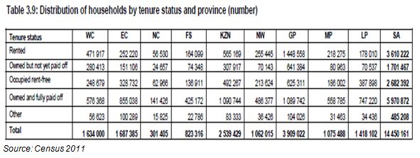
Of the 14.4m housing units identified by the census the great bulk are formal houses or apartments. 1.14 units are described as traditional, 1.249m as informal dwellings (stand alone shacks) with a further 713 thousand shacks in back yards. The ownership structure of these housing units makes interesting reading. Nearly 6m of the units are identified as owned and fully paid off (See below). It is these owners who surely make the most reliable and sought after recipients of unsecured loans.

Stuff at home

These homes – owner rented and mortgaged – seem very well provisioned with household appliances and consumer goods. 10m refrigerators and 11m stoves were identified, together with 4.5m washing machines and more computers, 3m, than vacuum cleaners. 10.7m TV sets entertain the stay-at-homes backed up by as many as 8.5m DVD players and unsurprisingly, 13m cell phones.

Large differences in provincial income –or is it an urban / rural divide?

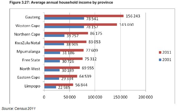
Much larger differences in household incomes are however recorded by the different provinces. Average household incomes are highest in Gauteng (R156 243) and the Western Cape R143 460 – almost three times as high as average household income in the poorest provinces (See below).

These income differences may be regarded as more of an urban-rural divide than a provincial one. The gap between household incomes in the Durban metropolitan region and that or rural KwaZulu-Natal is probably every bit as wide as it is between Gauteng and Limpopo.

Higher incomes mean greater opportunity and so migration – a force to be recognised in advance and encouraged

It is these differences in incomes and income earning opportunities that understandably have led to large numbers (presumably mostly younger men and women) migrating to Gauteng and the Western Cape. Over a million people have migrated to Gauteng over the past 10 years and over 300 000 to the Western Cape. The Eastern Cape has seen net outward migration of 278 000 persons, mostly to the Western Cape, and in Limpopo Province: a net 152 000 residents have migrated to other provinces, mostly to Gauteng.

Migration plus population growth has seen the population of Gauteng increase from 9.38m in 2001 to 12. 27m in 2011, an increase of 30%. This makes Gauteng by far the most populous SA province. The population of the Western Cape has increased by 28% over the 10 years to 5.8m people, more than the population of the much poorer Eastern Cape.

Since transfers from the central government to the provinces are based on the size of their populations, these developments have significant budgetary implications. The argument that the governments of the Western Cape and Gauteng will make is that with migration of this order of magnitude, 10 years is too long to wait to adjust budgets in recognition of population growth and the additional demands growth n population makes on provincial budgets.

However the logic behind the allocation of funds to the provinces based on existing populations, rather than their economic potential, should be questioned. If economic and employment growth were the objective of economic policy then it would surely be better to back the winning provinces – those that offer significant employment and income opportunity – rather than redistribute taxpayers’ contributions to those provinces where economic prospects and achievement are so lacking. The economic potential of SA, as everywhere in the world, lies in the urban not the rural areas. Brian Kantor