SA markets: The Zuma shock wave has not passed through

The Zuma shock wave of Wednesday 9 December 2015, when Nhlanhla Nene was replaced by the little-known David van Rooyen, only to be replaced that weekend by Pravin Gordhan, has had time to be absorbed by the markets.

As we show below, some recovery from the events of that day have been registered on the share, bond and currency markets. As may be seen below, the JSE All Share Index has recovered best: at one point in late December it was almost back to its month end November levels. The RSA bond market, represented by the All Bond Index, with a duration of about six years, was the most deeply affected at the time, but then recovered and is now trading at about 94% of its 1 December value. The trade weighted rand is worth about 8% less than it was on 1 December.

That the Zuma intervention in our fiscal affairs is not regarded by the market as a temporary aberration but more as a permanent danger, is fully reflected in the extra costs of insuring against a RSA default of its obligations on its foreign currency denominated debt. The five year Credit Default Swap (CDS) spreads on RSA debt widened sharply on 9 December and have remained at a highly elevated level of over 350bps. This spread has also increased sharply when compared to the spread on the Emerging Market Bond Index (EMBI – indicated by a narrower difference between the EMBI and RSA spreads) and also when compared to Russian spreads. SA is now regarded as more likely to default than Russia and Brazil. Our credit rating in the market place is thus of junk status. It appears to be only a matter of time before the credit rating agencies catch up with the market place.

Unless the SA government can convince the market place very soon that SA’s fiscal intentions have not changed permanently for the worse, the Zuma shock will prove very expensive for SA’s taxpayers who have to service significantly more expensive debts to come as current debts are matured. Nkandla is very small change compared to this potential bill. The market place will need assurance that SA’s tax base can withstand the higher interest expenses incurred. Evidence that the growth in government expenditure, especially the growth in spending on government sector employment benefits, is slowing down sharply, would be helpful to this end. More important still is any indication and that the growth outlook for SA is improving to help generate more tax revenue to ease the pain of higher taxes rates. The chances of more fiscal discipline seem better than a meaningful pick up in GDP growth. Though the dramatically more competitive rand could and should be helpful to this end, strikes and unhelpful policy interventions permitting. The Barmy Cricket Army are an advance tourist guard doing their best to improve export earnings.

The spread between the RSA 10 year bond yield and the yield on a 10 year US Treasury also widened sharply, to over 8% on the fateful day and has since narrowed to about 7.2% as may be seen in figure 5. This spread indicates that the rand is expected to depreciate by about 7.2% a year, on average, over the next 10 years.

The reactions in the market place to date indicate that the rand continues to respond to the usual daily forces, but off a significantly weaker base. The weaker emerging equity and bond markets are, the weaker the USD/ZAR exchange rate will be and vice versa. Commodity price trends will also be an influence on exchange rates. But these forces are acting off a weaker base, as we show below. The rand is now much weaker than would have been predicted before December 2015 using the Aussie / US dollar exchange rate and the EMBI spread as predictors. A value closer to R13 than R16 might have seemed more reasonable before 9 December. The question then arises: can we confidently expect the base value of the USD/ZAR to improve any time soon?

The answer appears to be an unfortunately negative one, absent an equally dramatic development on the political and economic policy fronts. It does not take much to imagine what that would have to be. The government however will be under few illusions that SA’s dependence on foreign capital remains as heavy as ever. Given the currently low base and highly depressed expectations of SA, the benefits of surprising the markets with good news could have an unusual upside. Good, credible news about fiscal sustainability and more market respecting (business friendly) dispositions- maybe even some privatisation of publicly owned assets to reduce public debt and improve economic efficiency, could much improve the mood. Call them public private partnerships if you have to. But actions and better intentions towards market forces, both inside and outside the country, are urgently called for.

The price of good advice

Calculating the costs and benefits of financial advice – a dangerous exercise in the US and a necessary one in South Africa


It may be argued that one of the important functions managers of private wealth provide is that we can help save our clients from themselves. When we (the wealth managers) act on clients’ behalf, in a conservative way, conscious of risks as well as returns, with wealth entrusted to us, we may well help prevent them from making disastrous investment decisions all on their own. Such poor financial decisions may cost them far more than the fees we charge for our advice and record keeping. Earning extra returns for clients, ahead of the fees incurred, is not the only purpose of our fiduciary duties. Saving wealth owners from themselves is perhaps even more important.


A study made by US economist Robert Litan seems to agree. As reported in the Wall Street Journal (online edition, 4 October), Litan in July testified before the US Congress against a US Labor Department plan to regulate financial advisers. His cost-benefit analysis estimated that, during a market downturn, the proposed regulation of financial advisers, with associated higher fees for advice, could cost investors—especially those who aren’t wealthy—tens of billions of dollars. The cost to clients would be incurred by depriving them of good financial advice, such as advice against panic selling, that they may well have chosen were fees for advice lower.


The regulation of financial advice can raise the cost of advice, perhaps through an extra fee, that many clients may prefer not to pay. Hence the greater likelihood of poor investment decisions made without useful advice: not only the mistake of buying at the top of the market and selling at the bottom, but also advice that should and would discourage any naïve or greedy propensity to ignore the relationship between a promised return and the associated risk of receiving much less, or indeed no return at all. The Litan evidence would have been in the form of an examination of the comparative track records of investors achieved with or without advice – in the light of the observed sensitivity of clients to the fees charged for that advice.


Political costs, too


The story in the WSJ is only partly about the benefits and costs of financial advice. It is also about how his testimony cost Litan his job. A veteran of 40 years with the Brookings Institution, Litan offended left-leaning Massachusetts Senator Elizabeth Warren, who is sponsoring the intended legislation. He was accused, in a letter Warren wrote to the head of Brookings, of concealing a conflict of interest by not disclosing that his study was supported by the Capital Group, a very large mutual fund manager in the US. This conflict of interest accusation, according to the WSJ, was made “notwithstanding” that the first page of Litan’s testimony says: “The study was supported by the Capital Group, one of the largest mutual fund asset managers in the U.S.”  Senator Warren called that disclosure “vague”—while the WSJ named this accusation “an obvious falsehood”.


A private company with an interest in opposing regulation may often sponsor research in think tanks or universities. Even more often, a government agency may sponsor research inside or outside of government itself with an equally obvious and opposing political and bureaucratic interest in implementing additional regulation. Ideally the research, regardless of its sponsor or conclusions, should be allowed to inform public opinion and the legislative outcomes that may follow. Disclosure of sponsorship is both ethical and wise so that any possibly convenient conflict of interest argument will not prove decisive in any adjudication process.


The quality of any research can surely be tested and cross examined regardless of its provenance, as is the evidence of the so-described “expert witnesses” in our courts, paid for by one or other of the litigating parties. An expert witness, talking to the book of a pay-master, in disregard of the evidence, will soon be found out as biased in any thorough cross- examination and such advice will be correctly ignored.


In South Africa, the Treasury and the Financial Services Board have been much involved in regulating the quality of investment advice provided to savers and by financial advisers. Clearly quality advice is desirable. But, as in the US, it also comes with a price, in the form of higher fees or costs, which potential clients may judge as not worth paying for.


One hopes (but doubts) that a similar analysis of the perhaps unintended costs and consequences, as well as the benefits of additional financial regulation in SA, has been undertaken for our market place. A study of the kind provided by Litan – that explores the danger that many more savers will go inexpertly or inadequately advised and so make poor and very costly financial decisions, because such advice is deemed too expensive – would be welcome.


There are always benefits to be had from every regulation of market forces. There are also always associated costs, some more obvious than others. Both the additional benefits and the full extra costs, associated with an intended regulation, should be calculated, as fully as they can, regardless of where the chips may fall.

Point of View: A question of (investment) trusts

Understanding investment trusts and how they can add value for shareholders regardless of any apparent discount to NAV.

Remgro, through its various iterations, has proved to be one of the JSE’s great success stories. It has consistently provided its shareholders with market beating returns. Still family controlled, it has evolved from a tobacco company into a diversified conglomerate, an investment trust, controlling subsidiary companies in finance, industry and at times mining, some stock exchange listed, others unlisted. Restructuring and unbundling, including that of its interests in Richemont, have accompanied this path of impressive value creation for patient shareholders.

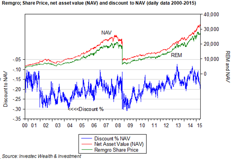
The most important recent unbundling exercise undertaken by Remgro was in 2008 when its shares in British American Tobacco (BTI), acquired earlier in exchange for its SA tobacco operations, were partly unbundled to its shareholders, accompanied by a secondary listing for BTI on the JSE. A further part of the Remgro shareholding in BTI was exchanged for shares in another JSE-listed counter and investment trust, Reinet, also under the same family control, with the intention to utilise its holding of BTI shares as currency for another diversified portfolio, with a focus on offshore opportunities. Since the BTI unbundling of 2008, Remgro has provided its shareholders with an average annual return (dividends plus capital appreciation, calculated each month) of 23%. This is well ahead of the returns provided by the JSE All Share Index, which averaged 17% p.a over the same period. Yet all the while these excellent and market beating returns were being generated, the Remgro shares are calculated to have traded at less than the value of its sum of parts, that is to say, it consistently traded at a discount to its net asset value (NAV).

The implication of this discount to NAV is that at any point in time the Remgro management could have added immediate value for its shareholders by realising its higher NAV through disposal or unbundling of its holdings. In other words, the company at any point in time would have been worth more to its shareholders broken up than maintained as a continuing operation.


pic1

How then is it possible to reconcile the fact that a share that consistently outperforms the market should be so consistently undervalued by the market? It should be appreciated that any business, including a listed holding company such as Remgro, is much more than the estimated value of its parts at any moment in time. That is to say a company is more than the value of what may be called its existing business, unless it is in the process of being unwound or liquidated. It is an ongoing enterprise with a presumably long life to come. Future business activity and decisions taken will be expected to add to the value of its current activities. For a business that invests in other businesses, value can be expected to be added or lost by decisions to invest more or less in other businesses, as well as more or less in the subsidiary companies in which the trust has an established controlling interest. The more value added to be expected from upcoming investment decisions, the higher will be the value of the holding company for any given base of listed and unlisted assets (marked to market) and the net debt that make up the calculated NAV.

Supporting this assertion is the observation that not all investment trusts sell at a discount to NAV. Some, for example the shares in Berkshire Hathaway run by the famed Warren Buffet, consistently trade at a value that exceeds its sum of parts. Brait and Rockcastle, listed on the JSE, which invest in other listed and unlisted businesses, are currently valued at a significant premium to their sum of parts. Brait currently is worth at least 45% more than its own estimate of NAV while Rockcastle, a property owning holding company offers a premium over NAV of about 70%. PSG, another investment holding company, has mostly traded at a consistently small discount to NAV but is now valued almost exactly in line with its estimated NAV.

It would appear that the market expects relatively more value add to come from the investment decisions to be made by a Brait or Rockcastle or PSG, than it does from Remgro. The current value of the shares of these holding companies has risen absolutely and relatively to NAV to reflect the market’s expectation of the high internal rate of returns expected to be realised in the future as their investment programmes are unveiled. Higher (lower) expected internal rates of return are converted through share price moves into normal risk adjusted returns. The expected outperforming businesses become relatively more expensive in the share market – perhaps thereby commanding a premium over NAV – while the expected underperformers trade at a lower share price to provide the expected normal returns, so revealing a discount to NAV.

The NAV of a holding company however is merely an estimate, subject perhaps to significant measurement errors, especially when a significant proportion of the NAV is made up of unlisted assets. Any persistent discount to NAV of the Remgro kind may reflect in part an overestimate of the value of its unlisted subsidiaries included in NAV. The NAV of a holding company is defined as the sum of the market value of its listed assets, which are known with certainty, plus the estimated market value of its unlisted assets, the values of which can only be inferred with much less certainty. The more unlisted relative to listed assets held by the holding company, the less confidence can be attached to any estimates of NAV.

The share market value of the holding company will surely be influenced by the same variables, the market value of listed assets and the estimates of the value of unlisted assets minus net debt. But there will be other additional forces influencing the market value of the holding company that will not typically be included in the calculation of NAV. As mentioned, the highly uncertain value of its future business activities will influence its current share price. These growth plans may well involve raising additional debt or equity, so adding to or reducing the value of the holding company shares, both absolutely and relative to the current explicit NAV that includes only current net debt. Other forces that could add to or reduce the value of the holding company and so influence the discount or premium, not included in NAV, are any fees paid by subsidiary companies to the head office, in excess of the costs of delivering such services to them. They would detract from the value of the holding company when the subsidiary companies are being subsidised by head office. When fees are paid by the holding company to an independent and controlling management company, this would detract from its value from shareholders, as would any guarantees provided by the holding company to the creditors of a subsidiary company. The market value of the subsidiaries would rise, given such arrangements and that of the holding company fall, so adding to any revealed discount to NAV.

It should be appreciated that in the calculation of NAV, the value of the listed assets will move continuously with their market values, as will the share price of the holding company likely to rise or fall in the same direction as that of the listed subsidiaries when they count for a large share of all assets. But not all the components of NAV will vary continuously. The net debt will be fixed for a period of time, as might the directors’ valuations of the unlisted subsidiaries. Thus the calculated NAV will tend to lag behind the market as it moves generally higher or lower and the discount or premium to NAV will then decline or fall automatically in line with market related moves that have little to do with company specifics or the actions of management. In other words, the market moves and the discount or premium automatically follows.

If this updated discount or premium can be shown to revert over time to some predictable average (which may not be the case) then it may be useful to time entry into or out of the shares of the holding company. But the direction of causation is surely from the value attached to the holding company to the discount or premium – rather than the other way round. The task for management is to influence the value of the holding company not the discount or premium.

Yet any improved prospect of a partial liquidation of holding company assets, say through an unbundling, will add to the market value of the holding company and reduce the discount. After an unbundling the market value of the holding company will decline simultaneously and then, depending on the future prospects and expectations of holding company actions, including future unbundling decisions, a discount or premium to NAV may emerge. The performance of Remgro prior to and after the BTI unbundling conformed very well to this pattern. An improvement in the value of the holding company shares and a reduction in the discount to NAV on announcement of an unbundling – a sharp reduction in the value of the holding company after the unbundling and the resumption of a large discount when the reduced Remgro emerged. See figure 1 above.

The purpose of any closed end investment trust should be the same as that of any business and that is to add value for its shareholders by generating returns in excess of its risk adjusted cost of capital. That is to say, by providing returns that exceed required returns, for similarly risky assets. Risks are reduced for shareholders through diversification as the investment trust may do. But shareholders can hold a well diversified portfolio of listed assets without assistance from the managers of an investment trust. The special benefits an investment trust can therefore hope to offer its shareholders is through identifying and nurturing smaller companies, listed and unlisted, that through the involvement of the holding company become much more valuable companies. When the nurturing process is judged to be over and the listed subsidiary is fully capable of standing on its own feet, a revealed willingness to unbundle or dispose of such interest would add value to any successful holding company.

This means the holding company or trust will actively manage a somewhat concentrated portfolio, much more concentrated than that of the average unit trust. Such opportunities to concentrate the portfolio and stay active and involved with the management of subsidiary companies may only become available with the permanent capital provided to a closed end investment trust. The successful holding company may best be regarded and behave as a listed private equity fund. True value adding active investment programmes require patience and the ability to stay invested in and involved in a subsidiary company for the long run. Unit trusts or exchange traded funds do not lend themselves to active investment or a long run buy and hold and actively managed strategy of the kind recommended by Warren Buffett. A focus on discounts to estimates of NAV, to make the case for the liquidation of the company for a short term gain, rather than a focus on the hopefully rising value of the shares in the holding company over the long term, may well confuse the investment and business case for the holding company, as it would for any private equity fund. The success of Remgro over the long run helps make the case for investment trusts as an investment vehicle. So too for Brait and PSG, which are perhaps best understood as listed private equity and highly suited to be part of a portfolio for the long run.


Appendix


A little light algebra and calculus can help clarify the issues and identify the forces driving a discount or premium to NAV


Let us therefore define the discount as follows, treating the discount as a positive number and percentage. Any premium should MV>NAV would show up as a negative number.


Disc % = (NAV-MV)/NAV ………………………………………..           1

Where NAV is Net Asset Value (sum of parts), MV is market value of listed holding company

NAV = ML+MU-NDt …………………………………………….       (2)


Where NAV is defined as the sum of the maket value of the listed assets held by the holding company. MU is the assumed market value of the unlisted assets(shares in subsidiary companies) held by the holding company and NDt is the net debt held on the books of the holding company – that is debt less cash.

Note to valuation of unlisted subsidiaries MU;

MU may be based on an estimate of the directors or as inferred by an analyst using some valuation method- perhaps by multiplying forecast earnings by a multiple taken from some like listed company with a similar risk profile to the unlisted subsidiary. Clearly this estimate is subject to much more uncertainty than the ML that will be known with complete certainty at any point in time. Thus the greater the proportion of MU on the balance sheet the less confidence can be placed on any estimate of NAV.

The market value of the holding company may be regarded as


MV=ML+MU-NDt+HO+NPV………………………………………………..(3)

That is to say all the forces acting on NAV, plus the assumed value of head office fees and subsidies (HO)activity and of likely much greater importance the assessment markets of the net present value of additional investment and capital raising activity NPV. NPV or HO may be adding to or subtracting from the market value of the holding company MV.

A further force influencing the market value of the holding company would be any liability for capital gains taxes on any realisation of assets. Unbundling would no presumably attract any capital gains for the holding company. These tax considerations are not taken up here

IF we substitute equations 2 and 3 into equation one the forces common to 2 and 3 ML,MU,NDt cancel out and we can conveniently write the Discount as the ratio


Disc= – (H0+NPV)/(ML+MU-NDt ) ………………………………………..(4)


Clearly any change that reduces the numerator (top line) or increases the denominator (bottom line) of this ratio will reduce the discount. Thus an increase in the value attached to the Head Office or the value of future business will reduce the discount. ( These forces are preceded by a negative sign in the ratio) A large increase in the value attached to investment activity will also reduce the discount and might even turn the ratio into a negative value, that is a premium. Clearly should the market value of listed or unlisted assets rise or Net Debt decline (become less negative) the denominator would attain a larger absolute number, so reducing the discount. The implication of this ratio seems very obvious. If the management of a holding company wishes to add value for shareholders in ways that will reduce any discount to NAV or realise a premium then they would need to convince the market of their ability to find and execute more value adding positive NPV projects. Turning unlisted assets into more valuable listed assets would clearly serve this purpose


Some calculus might also help to illuminate the forces at work. Differentiating the expression would indicate clearly that the discount declines for increases in H0 or NPV


That is dDisc/dNPV or dDisc/dHO= -1/(ML+MU-NDt)

This result indicates that the larger the absolute size of the holding company the more difficult it will become to move the discount through changes in the business model


Differentiating for small changes in the variables in the denominator is a more complicated procedure but would yield the following result for dML or dMU or dDNt


For example dDisc/DML= -(H0+NPV)/(ML+MU-NDt)^2


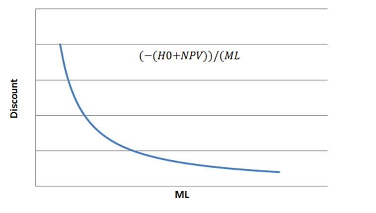
Again it may be shown that the impact of any change in ML,MU or NDt will be influenced by the existing scale of the listed assets held ML. The larger the absolute size of ML the less sensitive the discount will be to any increase in ML. The same sensitivities would apply to changes in MU or NDT. This reaction function is illustrated below
 

pic12png

The future will be determined by interest rates and risk spreads

The long term interest rate front has seen some real action this month. The attack on the prevailing very low yields was led by the German Bunds. It would appear that the modestly positive GDP growth recorded in Europe in the first quarter of 2015 – hence an expected increase in demands for capital to invest – was the trigger for this move.

Europe’s GDP expanded by 0.4% from the previous quarter, or 1.6% at an annualised rate. Further encouragement was to be found in the extension of better growth rates from Germany (where the quarterly growth rate receded slightly) to Italy and France.

US Treasury Bond and RSA bond yields predictably followed the Bunds higher. We illustrate this in the chart below, where the log scale better tells the story of rising yields in proportionate terms. The 10 year Bund yield increased from very close to zero (0.14%) at the April month end to a level of 0.72% on 13 May. Over the same two week period, the yield on the 10 year US Treasury Bond rose from 2.06% at April month end to 2.27% by the close on the 13 May. The 10 year RSA yield increased from 7.85% to 7.994%, slightly lower than the 8.051% registered at the close of trade the day before.

Accordingly, the spread between US and German yields, which had widened significantly earlier in the year, has narrowed sharply, to the advantage of the euro. The greater confidence in European recovery prospects helped send euro yields higher. The somewhat mixed picture about the robustness of the US economy, accompanied as it has been by weaker than expected spending at retail level, thus implying reluctance by the Fed to raise its short rates soon, helped restrain the increase in US yields. This narrowed the spread or interest rate carry and reduced the demand for US dollars.

The evidence suggests that the wider the spread in favour of US bonds, the stronger will be the dollar. The opposite has tended to be true of the rand and other emerging market currencies. The wider the spread in favour of the RSAs, the weaker has been the rand. This interest rate spread can be regarded as the risk premium carried by SA borrowers to compensate for the expected depreciation of the rand, as well as (presumably) sovereign risks. The RSA-USA 10 year yield spread, now 5.72%, is marginally lower than it was on 30 April 2015. It has moved within a rather narrow range since 2013, recording an average daily spread of 5.34%, with a maximum of 6.17% and a minimum of 4.31%.

It can be confidently expected that RSA rates will continue to follow equivalent US rates higher or lower; and that US rates will take their lead from euro rates. However, such co-movement of long term interest rates can be modified by changes in these interest rate spreads. The spread between RSA and US rates, that is SA risk, will be influenced by simultaneous changes in the outlook for the SA economy. The better/worse are SA growth rates (for example), the more capital will flow towards or away from SA, so narrowing or widening the spread and strengthening or weakening the rand.

But the spread will depend more consistently on a day to day basis on the outlook for emerging markets generally. Capital flows into and out of these economies and capital markets will respond to the expectations of emerging market growth and its implications for earnings of companies listed on their stock markets. The JSE All Share Index, when measured in US dollars, follows the emerging market benchmark indices very closely. This is because when capital flows into or out of these markets generally, the JSE consistently attracts or gives up a small, but predictable, share of such capital flows in the same direction. For any given level of global interest rates, the more confidence there is in emerging market growth, the narrower the risk or interest rate spread against the rand is likely to be, hence the stronger the rand is likely to be and the higher will be the US dollar value of emerging markets and JSE equities and bonds.

In the chart below we show how the MSCI Emerging Market Index and the JSE All Share Index (in US dollars) behave very similarly. It also shows how the two indices have underperformed the S&P 500 over recent years as the spread between SA and US interest rates have widened. We show these same trends in 2015.

These developments raise the issue of whether rising interest rates themselves (adjusted for changes in risk spreads) represent a threat to or an opportunity for investors in emerging equity and bond markets. Past performance suggests that rising rates in the US are much more likely to be associated with relative and absolute strength in emerging markets rather than weakness. The explanation for this seems clear enough. Rising rates in the US and Europe will accompany stronger growth and an improved growth outlook. Such growth in the developed world is helpful to the growth prospects in emerging economies, for which the developed economies are important sources of demand for their exports. A rising tide in the developed world will lift all boats – including those moored in the emerging economies.

The following figure strongly suggests as much. It shows how rapidly rising interest rates in the US between 2003 and 2007 were been associated with declining risk spreads for the emerging bond markets. The lower interest rates after the financial crisis in 2008 were in turn associated with greater emerging market bond risks. These risk spreads are represented by the average of the five year credit default swap spreads over US Treasury yields for Turkey, SA, Mexico and Brazil.

Presumably these risks of default decline as growth prospects improve. And improved growth prospects (lower risk) are well associated with higher share prices. In the figure below we show the relationship between the value of the MSCI Emerging Market Index benchmark and the JSE ALSI and the CDS risk spread over recent years. We show how the CDS spread for RSA five year US dollar-denominated debt and the JSE in US dollars have moved in consistently opposite directions.

These relationships would suggest that the threat to the JSE and the rand will not be higher rates in the US and Europe, provided they are accompanied by improved global growth prospects. The threat however to the rand, the RSA bond market and the SA economy plays might still come from SA specific factors. These include strikes, load shedding and higher short rates imposed by the Reserve Bank that prevent the SA economy from participating in a faster growing global economy. The objective of the SA economic policy makers is to avoid such pitfalls.

All about risk and return

Risk and expected returns: The inevitable trade off and how to improve it to the advantage of the SA economy.

Equities are more risky than fixed interest (bonds) and bonds are more risky than cash. Hence equities must be expected to return more than bonds and cash, as compensation for investors willing to bear the extra risk associated with shares. The risk we bear when owning different assets is that we cannot be sure what they will be worth in the future when we might be forced to cash in – the next day, month, year or even, in the case of active traders, in twenty minutes’ time. Hence the more risk, the lower will be the prices attached to assets so that expected returns improve.

Past performance of SA assets provides very strong support for the theory that more risk is accompanied by higher returns. Shares in general have returned significantly more than bonds or cash (in the form of capital gains and dividends or interest received over successive 12 month periods) for SA wealth owners since 2000. But these higher returns have come with significantly more risk, as measured by the movements around the average 12 month returns, calculated monthly. The JSE All Share Index returned an average 16.12% over this period, with a Standard Deviation (SD) about this average of 17.8% p.a. In the worst month for shareholders over this period, February 2009, the 12 month returns on the JSE were a negative 43% while in April 2006 shareholders were up 54% on a year before. The bond market returned an average 11.3% over the same period, with a much lower SD of 6.7% and a worst month, April 2014, when the All Bond Index (ALBI) returned a negative 3.1% over the previous 12 months. The best month for the ALBI was the 27% annual return realized in June 2001. Cash on average returned approximately 8.2% p.a between January 2000 and 2015 with a SD of 2% p.a.

Since inflation averaged 5.9% p.a over the period, all asset classes have provided very good real returns, higher on average than could have realistically been expected back then and more than could be expected over the next 10 years. Such excellent returns, if they are to be repeated, would have to be accompanied by excellent management of the capital invested by SA listed companies and a lower SA risk premium demanded by foreign investors. It was this potent mixture of good management and less risk priced into the JSE share and bond markets that delivered such excellent past performance.

The more the cash in value of any asset varies from day to day, the more uncertainty about their cash in value and so the more risky this asset. In the figure below we show the daily percentage move in the JSE All Share Index and the S&P 500 Index. The price of any individual share included in this index is likely to be more variable in both directions than that of the average share represented by the Index.

This day to day volatility can be measured as a rolling 30 day average SD of these price moves. It will also be reflected in the cost of an option on the Index. The more volatile the market is expected to become, the more expensive it will be for investors to insure against such volatility by buying or selling an option to buy or sell the Index at an agreed, predetermined value. The cost of such an option on the S&P 500 is indicated by the Volatility Index (the VIX) traded in Chicago sometimes described as the fear index. The higher the value of the VIX, higher the cost of an option on the market and the more the fear. The VIX may be regarded as a forward looking measure of expected volatility and the rolling SD as a record of past volatility. Yet past volatility appears to strongly influence expected volatility as we show in the figures below. We also include in the figure the rolling SD of the euro/US dollar exchange rate. It should be noted that volatility appears to revert back to some long term average of about 12. It spiked up dramatically during the global financial crisis in 2008. It also spiked during the various phases of the European debt crisis of 2010 and 2011. Volatility in the share markets now appears as close to average. The VIX had a value of about 14 yesterday. See the figure below.

We provide a close up of recent daily volatility in a further figure below. Volatility moved higher in late 2014 and early 2015. In the share market, volatility has moved back to the long run average very recently while volatility in the key foreign exchange market, the euro/US dollar rate, volatility has moved in the opposite, higher direction.

The relationship between volatility or risk of holding a share and its price, that is the return realised for the owner, is almost perfectly negatively correlated. So if volatility rises, share prices will move in the opposite direction in a highly predictable way. The figures below for the S&P 500 illustrate this. The correlation between daily percentage changes in the VIX and the S&P 500 is a negative 0.84 for daily closing prices since January 2014. The negative relationship between the recent decline in volatility on the value of the S&P 500 Index (volatility up, share prices down), is also illustrated.

Correlation does not however mean causation. The cause of share price or exchange rate volatility is in the degrees of uncertainty felt by investors about what the future may hold for the economy and for the companies and currency traders that are influenced by by these economic developments. If the world could be predicted with certainty, there would be no reason for prices to change; no reason for investors to change their mind about future prospects and so to force prices lower or higher to reflect their less or more optimism about future prospects. For every buyer who must think prices will rise in the future to provide attractive returns, a profit seeker willing to bid up an asset price, there will be a seller (a profit taker) who thinks the prices or the market in general will move in the opposite direction. The more uncertain the future appears, the more they will tend to disagree and the more prices will move widely in both directions from day to day to reflect their differences of opinion until something like greater calm in the markets resumes. This degree of movement in both directions, up then down, down then up, is what makes for volatility. The random price walk that always characterises asset price movements over time s can become abecome a wider or narrower path as prices fluctuate one with wider or lesser changes in both directions over time, as has been illustrated above.

ByG greater calm in the market place is characterized by smaller swings in prices from day to day or even within a trading day resulting in smaller moves, implies one associates with a higher degree of consensus about the state of the world and so the less reason incentive for market participants to push prices more sharply in one and the other direction, when markets are highly liquid and attract many buyers and sellersMore volatile markets, that is wider price swings in both directions, imply a higher degree of dissonance about future prospects.. Changes in market prices Volatility reflects essential disagreement between market participants about the state of the world and the prospects for companies. And prices fall as volatility rises in order to provide investors in general with higher expected returns to compensate for these greater perceived risks.

Thus it might help market participants trying to time correctly their entry into or exit from the market to ask a different question – not where the market is going, but rather where will volatility be going, that is will the world become more or less risky? That is because if it does become more or less risky as prices fluctuate over a wider range, the value of relatively risky assets (perhaps all assets other than the true safe havens – perhaps only US Treasury Bills and Bonds) will move in the opposite direction. Or in other words, the question to ask is not what is the likely outlook for the economy etc. but rather, what is the outlook for the economy and for listed companies, currencies and almost all bonds?

Another way of putting it is to ask whether market views will have reason to become more or less diverse. Will events evolve that become more or less easy for market participants to interpret? Will it become easier to solve the known unknowns that investors recognise as consistently driving valuations? A global financial crisis is a very unusual event, the outcomes from which were extremely difficult to agree about – hence the volatility in 2008 and 2009. A Eurozone debt crisis raises uncertainty about how it will all work out for share prices interest rand exchange rates – as would any breakup of the Eurozone system, another first time possibility for which history supplies little guidance..

Hence the obligation for policy makers to act as predictably as possible. Certainty in economic policy reduces risks for investors and helps raise values. Less risk means higher asset prices and lower expected returns. If SA wishes to attract foreign and domestic capital on superior terms, the aim should be to reduce the high risk premium attached to incomes dependent on the SA economy. High returns of the kind earned by investors in SA assets since 2000 might well be realized, should the SA risk premium come down rather than go up over the next few years. The SA government could do a much better job than it has been doing to introduce certainty in its economic policies and, as important, certainty that the right income enhancing policies are being adopted.

Global rates: What they mean for SA assets

Whither interest rates: up, down or sideways?

The most important feature of global financial markets in 2014 was the significant decline in long term government bond yields. On 1 January 2014 the 10 year US Treasury was trading at a 3.03% yield and the German Bund offered 1.94%. On Friday 16 January 2015 these yields had fallen to 1.83% and 0.46% respectively. These developments, led by German yields, were a great surprise to a market that was expecting both rates to increase, judged by the upward slope of the yield curve a year ago.

The US 30 year Treasury bond offered 3.96% a year ago. It now yields 2.45%, still above the 10 year rate, thus revealing that the market still expects interest rates to rise, but by much less and more gradually. The 10 year US Treasury is priced, in the futures markets, to rise from the current 1.84% to 2.08% in a year and to only 2.86% in 10 years’ time.

Long term interest rates in SA moved in the same direction and this trend lower accelerated in January 2015. Not only did long rates fall but the gap between long and short rates has narrowed sharply. Short term rates in SA have held up and only very recently has the money market revised its view that short term rates would be rising in 2015. The market would now appear to have put off any expected increase in short rates to 2016 and now appears to expect short rates to rise by about 1%t (100bp) over the next three years.

These unexpected movements in SA interest rates, long and short, have had a significant influence on the share prices of those companies listed on the JSE whose performance is known to be very sensitive to interest rates, for example property companies, banks and credit retailers. Changes in interest rates influence not only their cost of doing business but also stimulate or restrain demands for their services and top line growth. Our index of large market cap interest rate-sensitive stocks on the JSE performed as well in 2014 as the JSE-listed Global Consumer Plays and the S&P 500 (in common currencies) – well ahead of almost all the major stock markets in 20141.

Clearly interest rate trends matter a great deal for equity valuation in SA and had a powerful influence on the JSE in 2014. What the does the future hold for interest rates in SA? In 2014 and to date in 2015, RSA yields moved very closely in line with the rand/euro exchange rate. As we show below, interest rates in SA fell as the rand gained value against the euro. This relationship has held up very well this year.

This relationship (which has not always been as strong as this), between the euro/rand and the RSA yields makes every sense. It is weak growth and the threat of deflation in Europe that has sent all interest rates lower, including those in SA. It is these lower rates that have widened the spread between euro and US dollar and RSA rates even as rates have declined, adding to the case for holding dollars and rands. The dollar is strong and the rand is stable, so improving the outlook for inflation in SA in a deflationary (at least in dollars or euros) world.

The direction of economic activity and inflation, and so the exchange value of the euro, will continue to hold the key to the direction of interest rates in SA. This week the European Central Bank (ECB) hopes to add quantitative easing (QE) to its repertoire of instruments designed to avoid deflation and stimulate growth in Europe. We wait to see how much QE will be undertaken and how it will affect interest rates in Europe. In and of itself, QE would lower interest rates. However if QE is thought capable of reviving the Eurozone economy, then this would counter expectations of slow growth and deflation and might limit the downside to euro interest and exchange rates. Our sense is that provided the spread between US and euro rates holds up (currently about 1.4%) a strong or at worst stable US dollar/euro rate should be expected. Interest rates in SA would then move sideways at worst and possibly lower, with long rates continuing to lead short rates. If the rand holds up on a trade weighted basis (weaker against the US dollar and stronger against the euro), then the chances of inflation in SA surprising on the downside improves. Less inflation and less inflation expected portend lower (not higher) interest rates in SA.

1The Interest plays are a market (JSE SWIX) weighted average of:

BGA FSR GRT INL INP IPL MSM NED RMH SBK TRU CCO CLS CPI FPT HYP NEP PIK RDF RES TFG WBO MPC WHL CPF ATT PSG RPL AEG FFA

The SA Industrials Index combines:

BVT IPL SHP TBS VOD BAW AVI LHC SPP NPK

While the Global Consumer Plays consist of a market weighted combination of:

APN BTI CFR MDC MTN NPN SAB SHF NTC ITU

JSE performance: It’s a big tail wagging the friendly dog – but can the dog turn nasty?

The tail is Naspers – the dog is the JSE. Though, to describe the JSE as a dog, would be to do it an injustice given its good behaviour over the years. Naspers (NPN) – the media giant that derives much of its value from its Chinese internet associate Tencent – has been a major contributor to the performance of the JSE over recent years.

Its share price and market value has risen dramatically and as a result Naspers now contributes close to 10% of the market value of the JSE. The company is now worth R597bn and ranks as the third largest company listed on the JSE, behind British American Tobacco with a market cap of R1.287 trillion and SABMiller worth about R990.6bn (all market caps as at 20 November).

Naspers is moreover by far the largest company included in the JSE SWIX Index (with a 10.4% weighting) where the value of the company is adjusted for the proportion of shareholders in the company registered in SA1. The SWIX is the benchmark which many active SA Fund managers use to compare their performance and hope to beat. There are two other companies with a weight in the SWIAX of over 5%: MTN (7.62%) and Sasol (5.74%). The next largest weights are given to SABMiller (3.93%) and British American Tobacco (3.84%). In the figure below we compare the JSE All Share Index (ALSI) and the SWIX from its inception in 2002. The SWIX has outperformed the ALSI in recent years.

This difference in realised returns recently is largely explained by the larger weight of Industrials and Financials in the SWIX and the smaller weight in Resources companies, given the underperformance of Resources in recent years. The best returns on the JSE have come from companies with an increasingly large global footprint, of which NPN is the outstanding example. Others include Richemont, SABMiller, Aspen and British American Tobacco, all with large weights in the SWIX and somewhat lower weights in the JSE All Share Index. We like to separate these Global Consumer Plays that depend on the global economy from the other Industrial companies on the JSE that depend much more heavily on the fortunes of the SA economy.

In the figure below we compare the share prices of the five largest companies listed on the JSE based on a January 2011 starting point. The Naspers share price has moved well ahead of the large cap pack with mining company BHP Billiton proving the distinct underperformer. Note that the large cap strong performers are all companies catering to global consumers.

While the value of Naspers and the other Global Consumer Plays have increased dramatically in recent years, those of BHP Billiton and long time favourite Anglo American (AGL) have barely increased.

As a result of the stellar performance of Naspers the ALSI and the SWIX have come to dance increasingly to the tune played by Naspers. We compare recent daily moves of Naspers and the ALSI below. A good or bad day for Naspers (given the size of the company) will translate almost automatically into a good or bad day for the market as a whole, particularly in recent days when the Naspers movements have been particularly severe.

In other words, investors who track the JSE and the SWIX on a market cap weighted basis have become increasingly dependent on or vulnerable to the Naspers share price. Adding proportionately more Naspers to a JSE-based portfolio would have served investors very well. However a weight of as much as 10% in any one company will bring exposure to a great deal of firm specific risks – such a portfolio or benchmark that included Naspers at its full weight could not be regarded as well diversified or a low risk portfolio. The SWIX, with its large weight in Naspers, MTN and Sasol with over 20% of the Index in these three stocks, should not be regarded as a suitably well diversified benchmark.

An alternative way to calculate a representative market would be to calculate an equally weighted portfolio of the Top 30 most valuable companies listed on the JSE. We compare this equally weighted Top 30 Total Return Index, rebalanced each month, to the total returns realised by the SWIX and ALSI. As the chart shows, the Naspers-dominated SWIX outperformed the ALSI and also the equal weighted Index. In the accompanying table the average monthly returns and risks of the alternative benchmarks have been very similar, though the SWIX has produced superior returns since January 2011 with slightly less risk than an equally-weighted Top 30 portfolio.

As we show below, an equally weighted Index may well outperform a market cap weighted index, as was the case between 1995 and 2000 on the JSE when the market as a whole moved mostly sideways.

Sticking closely to the SWIX weights in recent years would have served a portfolio well. However a more consistently diversified portfolio, while it may miss some of the big winners, will also help investors avoid the big potential losers. Furthermore, when the index acting as the benchmark is itself not well diversified, the dangers of following large companies passively when they lose value are much increased. As is often said of active management of portfolios, it is important to avoid the big losers, perhaps even more important than picking the winners. When the tide is running strongly in one direction, riding the wave regardless of risk will seem like a very good idea. When the tide turns, getting off the surf board would be an even better idea. The active investor is naturally conscious of risks that the passive index tracker will not recognize, especially when the index becomes increasingly concentrated, as it may well have become in the case of the SWIX.

1Shareholder Weighted (SWIX) Indices have the same constituents as an existing market capitalisation weighted Index. However, all constituents are weighted in the SWIX indices by applying an alternate free float, called the SWIX free float. The SWIX free float represents the proportion of a constituent’s share capital that is held in dematerialised form and registered on the South African share register, maintained by Strate. The SWIX free float will not exceed the company free float.

Equity markets and interest rates: September suffering

September was a tough month for equities, even though interest rates had declined by month end.

September proved to be a difficult month for equities and it was especially difficult for emerging market (EM) equities, including the JSE that once more behaved like the average EM equity market. The S&P 500 lost less than 2% of its US dollar value in the month while the EM bench mark lost almost 8% of its value and the JSE All Share Index, measured in US dollars, had fallen by more than 8% by the end of the month. Continue reading Equity markets and interest rates: September suffering

Developed or emerging markets? The JSE offers easy access to both

The JSE All Share Index, when converted into US dollars at current rates of exchange consistently tracks the benchmark MSCI Emerging Market (EM) Index, making the JSE a very good proxy for the average EM equity market.

This relationship, as we have often pointed out, is not co-incidental. It is the very similar earnings performance of the average JSE-listed company compared to that of the average EM company that presumably explains the closeness of the fit. We show below how closely the two earnings per index share series compare. Continue reading Developed or emerging markets? The JSE offers easy access to both

Emerging markets: On the comeback trail?

Emerging and developed equity markets this year are tracking each other rather closely. As we show in the chart below, this has not always been the case.

Between 1990 and 1995, emerging market (EM) equities made their first significant bow on the global capital market stage and outperformed the US S&P 500, the leading developed market benchmark, by some 80%. After 1995 and until 2000, they lost all of this ground gained and much more in relative performance. EM was again the preferred flavour after 2000 until the Global Financial Crisis, an event that took even more out of EM valuations than the out of the S&P and other developed equity Indexes. EM, then in recovery from the global recession, outperformed the S&P 500 until 2010, but then became a decided outperformer until this year. Continue reading Emerging markets: On the comeback trail?

Woolworths: Why the share market did not react (much) to the rights issue

What really matters for shareholders is the decision to invest in David Jones – much more than the funding choices made.

The Woolworths (WHL) rights issue designed to finance its takeover of Australian Department Store David Jones has been in the wings for some time. Despite the prospect of more shares in issue and dilution to come, the share market correctly has not yet reduced the price of a WHL share. Continue reading Woolworths: Why the share market did not react (much) to the rights issue

Point of View: There’s not so much gold in them thar hills

The front page of the Wall Street Journal this week (25 August) carried a story about South Africa leading the world – in illegal gold digging. To quote the report “Dangerous Economy Thrives in South Africa’s Abandoned Gold Mines” by Devon Maylie:

“After years of watching its dominance over the gold industry shrink dramatically, South Africa has emerged as the world capital of illegal gold digging. In staggering numbers—easily into the tens of thousands—desperate former miners and gang members have created a subterranean subculture of abandoned mine-shaft wanderers. Armed with a few crude tools, they dig into blasted or cement-sealed mines, comb through tunnels, and spend days chiseling away at bedrock.
“Once the world’s biggest gold producer, South Africa accounted for 80% of the global supplies as recently as 1970. Today, that figure is less than 1%, in large part because China and other countries have sharply picked up their own production, forcing mine closures here that created an opening for freelancers. Today, some 4,400 abandoned mines dot the countryside, almost four times the number in operation, according to South Africa’s Council for Geoscience. And while there are still about 150,000 formally employed gold miners in South Africa, ‘we’re very close to the point where there will be more illegal miners than legal miners,’ says Anthony Turton, a South African mining consultant.”

The Journal continued:

“… taken together, the output of these swelling ranks are having a noticeable affect on the bottom-line of the country’s sagging mining industry and tax revenues. South Africa’s Chamber of Mines, a body that represents mining companies, estimates that the country loses about 5% of its potential annual mineral output to illegal mining activities, equivalent to around $2 billion. In 2010, the most recent year available, the government estimated losing $500 million in tax and export revenue from gold illegally mined and sold in the black market, compared with about $2 billion it raises annually in corporate taxes from all mining companies.”

A few caveats are perhaps in order here. In 2012 the the Chamber of Mines reported gold production of 167 metric tonnes, or 5.8% of world production that year, well down on output and share of global production in 2003, as illustrated below:

The member companies of the Chamber did much better in extracting gold bearing ore from their mines than in extracting gold as the second table shows. The tonnes of gold-bearing rock they milled actually increased in recent years. What has declined precipitously is the average amount of gold contained in each tonne of ore raised to the surface. Each tonne of rock extracted, expensively and dangerously, from the bowels of the earth now contain a miniscule average 2.9 grams per metric tonne. The loss of SA’s share in global mine production has much more to do with declining grades (from 4.56 grams per tonne in 2003) than it has to do with increased output elsewhere. Global gold output has increased by approximately 230 tones since 2003, while production from all SA mines fell by 208.6 tonnes over the same period. In other words, production outside SA has increased by a little more than SA production has declined.

An important further point worth making is that annual production of gold is a very small proportion of the gold ever produced. Almost all of this has survived and is held as a store of wealth. Therefore, as is surely apparent, the price of gold is little affected by current output – legal or illegal. The legitimate mines may lose potential output to thieves and the SA government is not able to collect income from illegal or informal miners, while the price is unaffected by illegal mining activity – equivalent to 5% to 10% of the legal production. Furthermore, if the gold has been extracted illegally from shafts that have been permanently abandoned, such output is incremental, not lost. The gold would have stayed in the ground and not helped produce any income at all. The costs of mining this otherwise abandoned gold is borne entirely by the workers themselves, including the risks of losing their lives to rock falls and their gold to gangsters preying on them.

Incidentally, the gold produced in SA in 2012 earned R73bn, well up from the R32.9bn realised in 2003 thanks to the higher rand gold price. 5% – 10% of this attributed to illegal gold miners is significantly more than the R2bn worth of illegal mining revenues reported by the WSJ and does not take account of other mining sales that altogether totaled R363.8bn in 2012. Such illegal mining activity, currently largely unrecorded, could add significantly to the SA GDP were it to be included in the national income accounts.

Yet while the recorded output of gold has declined and the numbers employed in gold mining has fallen from 198 465 employees in 2003 to 142 201 in 2012, average earnings of these workers have improved significantly over the same period. Total gold mining earnings amounted to R22.24bn in 2012 or R156 386 per employee, compared to approximately R63 900 earned by the average worker in 2003, or to R103 000 in 2012 (the equivalent when adjusted for CPI). In other words, the average employee in the gold mining industry, of whom there are now fewer, appears to be earning about 48% more in CPI adjusted terms in 2012 than they did in 2003.

These improved remuneration and employment trends are unlikely to be independent. The fewer surviving gold mine workers have become more productive, helped no doubt by more and better equipment per worker, judged by the volume of ore extracted rather than the gold produced. The industry would not have survived otherwise than by providing fewer jobs in exchange for what have become better paid and more productive workers. Operating margins for the Chamber member mines have improved rather than deteriorated over the years, as we show below, despite lower grades of gold mining ore.

The safety record of the industry, judged by fatality rates, has also improved as we show below. Thus the industry has provided better and safer jobs, but for regrettably fewer workers.

As the WSJ makes only too clear, the willingness of the illegal miners to undertake the hazardous and poorly remunerated work they engage in has much to do with the lack of alternative employment opportunities. To quote the article again:

”’If I could find a proper job, I would leave this,’” says Albert Khoza, 27, who says he started illegal prospecting eight years ago because he couldn’t find work and was desperate to send money to his family. On this day, outside an old mine about 60 miles from where Mr. Matjila mines, he has been handling mercury with his bare hands. His eyes are bloodshot and infected, as he stokes the fire with plastic containers”.

Or, as the other illegal miner interviewed, Mr. Matjila, is reported to have said: “’We’re not criminals, I don’t want to be doing this. But I need to make some money.’ Then he stood up to walk down the road to the hardware store to check on prices of new supplies. ‘We have to make a plan to find another hammer,’ he says.

The challenge to the SA economy is to resolve the inevitable trade-offs between better jobs for some workers and the very poor alternatives then open to those who are unable to gain access to what is described as ”decent jobs”. The formal SA labour market has not been allowed to match the supply of and demand for labour at anything like market-clearing employment benefits. And so we have the insiders, those with formal employment and willing to launch strike action to further improve their conditions of employment; and the outsiders who find it so difficult to gain entry to formal employment, of whom the illegal miners represent a numerically important group, as numerous, so we are told, as those formally employed in gold mining.

The solution to the general lack of formal employment opportunities appears as far away as ever. Strike action not only leads to higher real wages and reduced employment opportunities, but still greater incentives to substitute reliable machinery for more expensive and unreliable labour that makes continuous production very difficult to achieve. The unpredictable impact of strikes on production is perhaps as much an incentive to reduce complements of relatively unskilled workers as are higher real costs of their employment.

To encourage employment in the gold mining industry and everywhere else, it would be very helpful if workers were willing to share in the risks of production, as the illegal miners appear willing to do: that is to accept less by way of guaranteed pay and more by way of rewards linked to performance and profits. In other words, for workers to become, to a greater degree, owners of the enterprises they engage with. If pay went up and down with the gold price, the gold mining industry would surely be willing to bear the risks of hiring more workers.

Global interest rates: The lowdown on Europe

Long term interest rates have kept surprisingly low – and the source of this surprise is the threat of deflation in Europe. The ECB will have to do what it takes to avert this threat.

We have long been of the view that the key to the short term behaviour of global equity markets is the direction of long dated US Treasury yields. Until fairly recently it may have been said that the actions of the US Fed were decisive for the direction of these interest rates. The Fed, via its Quantitative Easing (QE) programme had become a very large holder of US Treasuries and mortgage backed securities.


These exchanges of Fed cash (in the form of Fed deposits) for bond and mortgage backed securities were undertaken with the specific intention of not only protecting the financial system, but of holding down mortgage rates to assist the recovery of the US housing market and so of household wealth. At the peak of these operations US$80bn of these securities were being added to the asset side of the Fed balance sheet each month and simultaneously to the cash balances kept by US banks.

The slow but more or less steady recovery of the US economy allowed the Fed to suggest in May 2013 that it would be tapering such injections of cash into the system and that by late 2014 it would hope to end QE. It has since followed through on this prospect. Monthly net purchases of these securities in the market have been tapered and the security purchase programme will be over soon. This announcement of a likely end to the Fed support of the fixed interest market led however to the “taper tantrum” of May 2013. Long bond yields rose significantly and equity values declined. Volatility, in the form of daily moves in equity markets, increased and emerging equity and bond markets – regarded as more risky than developed markets – were particularly affected.

Then, despite the Fed taper in 2014, the trend in long term interest rates reversed direction, markets calmed down and share markets recovered. Indeed, market volatilities as measured by the Volatility Index, the VIX (the so-called “fear index”), had fallen back to pre financial crisis levels by mid 2014 and the US equity markets has moved back to record high levels.

The danger of the VIX at such low levels was that volatility could spike higher and share markets accordingly retreat (given that they were regarded by many observers as, at worst, fairly valued by the standards of the past, as represented by conventional Price/earnings multiples).

It could be demonstrated by reference to past episodes of low volatility and demanding valuations that such a combination of low volatility and generously valued equities would need more than good earnings growth to provide good returns. In the past it appeared that only lower long term interest could overcome well valued equities and low volatility. Moreover, it was widely assumed that long term interest rates in the US, very low by the standards of the past, could only be expected to increase. The upwardly sloping US treasury yield curve indicated very clearly such expectations of higher interest rates to come and incidentally still does so.

To the surprise of the bond market and despite the Fed taper, long term interest rates in the US fell rather than rose in July and August 2014. It was lower interest rates in Europe, especially in Germany, that led global rates lower in July. Not only did German Bund yields fall, with US and other rates falling in sympathy, but the spread between lower European and US rates actually widened, surely adding to the appeal of US Treasuries. The Spanish government now pays less for 10 year money than Uncle Sam.

The Fed therefore is no longer the lead steer of the bond market herd. The danger of deflation in Europe is that it leads interest rates lower. And this deflation is all the more likely given quantitative tightening in Europe to date, rather than easing. Unlike the Fed or the Bank of Japan, the assets and liabilities of the ECB have been falling significantly rather than increasing. That the supply of European bank credit and broader measures of money has been falling is consistent with a lack of demand for ECB deposits.

These broad trends will have to be reversed if European deflation is to be avoided. The ECB will have to do what it takes to increase the supply of money and bank credit. QE action is called for and can be expected to continue to hold down global bond yields. Euro deflation trumps the risk of higher interest rates.

The figures below fully illustrate this story of falling interest rates, declining volatilities and higher share prices. We also show how the US dollar has strengthened in response to this improved spread in favour of the US and how developed and emerging equity markets (including the JSE) when are running together, when measured in US dollar terms.

Volatility: The calm before the storm or is the balmy weather to continue?

Share markets have calmed down, as have most other financial markets. The S&P 500 Index is as relaxed as it was before the Global Financial Crisis broke in September 2008. Daily moves in share prices are confined to an unusually narrow range and the cost of an option on the market (insurance against volatility) has fallen accordingly, as we show below.

A similar benign pattern of modest daily moves can be observed of the JSE Top 40 Index as is also shown.
The volatility priced into an option on the S&P 500 is the Volatility Index (VIX), which is actively traded on the Chicago Board of Exchange. This index is sometimes described as the Fear Index. The more fear or uncertainty about the state of the world, the more investors struggle to make sense of it all, the more prices move in both directions. The theoretical equivalent of the VIX calculated for the JSE is the SAVI. In a global capital market where uncertainty about the future is a common denominator, the VIX and the SAVI move closely together. Force one winds in New York City translate into force one winds on the JSE.

Both the VIX and the SAVI may be understood as forward looking measures of volatility used to price options, but they appear to track actual volatility – measured as the standard deviation (SD) about average daily price moves – very closely. We compare the VIX this year to the 30 day rolling moving average of the SD of the S&P 500 below. Both measures of volatility have declined this year, indicating that investors generally have a much more sanguine view of the future prospects of the companies they invest in.

The stability of the global financial system appears well secured by QE in the US, while the Draghi pronouncement “to do what it takes” to shore up European sovereign credit has soothed the sometimes savage breast of Mr and Ms Market.

So far so very good. Lower volatility (less fear of the future and so less of a risk premium demanded of financial assets hence higher present values attached to expected earnings) has been accompanied, as it almost always is, by higher share values.


The relationship between share prices generally and volatility is consistently strong: when volatility is up, share prices move down and vice versa. The correlation of both the daily level of the VIX and the S&P 500 and percentage changes in both series since 2005 remains very high, of the order of (-0.60) or higher when levels are correlated and even higher (-0.74) when daily changes are correlated.

The good news about financial markets today is that volatilities are low and fear of some economic crisis apparently largely absent. The down side is literally that – if volatility is already so low can it go lower? and if not, can we expect share prices to go much higher? The answer is still perhaps so if the fear stays away. The markets may well continue to grind mostly higher as they have been doing recently. But the chances of a global event that would again frighten shareholders and their agents cannot ever be ignored.

It appears that markets are much more inclined to crash lower on bad news that may mean a change in the world as we know it, than to crash higher on good news. Good news seems to dribble in slowly, bad news can come crashing down on your head overnight. Let us hope that the flow of economic news continues to be mostly encouraging and volatility stays low and share prices grind higher.

Property yields: Expected total returns from property or shares matters much more than initial yield

Growth can more than make up for lower initial yields – something apparently not well understood in property circles

Reference will often be made to some acquisition or other being earnings “accretive”. Clearly an acquisition would hardly be made if it did not promise at least to add to earnings per share (EPS) and thus to the value of each share in issue. It may be thought, naively, that the simplest way for a listed company to accrete EPS would be to issue shares trading at a particular superior price/earnings (PE) multiple in exchange for another company trading at a lower PE ratio.

If it were so easy to add wealth by issuing relatively highly rated shares to buy lower rated shares, no recorded differences in PE multiples could survive such an obvious arbitrage. All earnings would then command the same price which obviously has not turned out to be the case.

The reason for the observed differences in PE multiples or earnings yields (the inverse of the PE ratio), or for matter dividend yields, is that an asset, particularly the bundle of assets and liabilities that make up a company, has a life of more than one year. A company may have an indeterminately long life given that company assets may be replaced or added to. Assets with economic lives of more than one year will be valued on their earnings and dividend growth prospects as well as their initial or first year yields.

The more growth in earnings expected over the life of an asset, the more investors will be prepared to pay for the asset. The faster the expected growth in benefits for shareholders, the higher the price paid per share and the lower the first year yield.

High initial yielding assets will be expected to have short lives and / or limited earnings, when compared to lower yielding assets or companies. If the market has correctly priced two assets in a similar sector of the economy and facing similar risks to their earnings potential, their expected returns will be the same, even though the initial earnings or dividend yields may be very different. Buying the company with a low PE ratio that is expected to grow its profits slowly, while selling a part of what is expected to be a fast growing company with a higher PE will not necessarily add value to the shareholders diluting their share of profits. What is gained in the form of the relatively low price paid for the asset will likely be lost in the form of the slower growth in earnings from the cheap asset – cheap for that reason.

Unless the assets bought can be transformed by better management or the value of the combined asset pool enhanced by economies of larger scale – the fabled synergies that may or may not justify an acquisition – two plus two cannot be worth more than four. Adding low PE assets to high PE assets must reduce the combined PE in line with a weighted average of the established assets and the newly acquired assets with different growth prospects.

There is a well known equation in the financial literature used to make this point, the so calledGordon growth model (see explanation at the end of this piece). This equation simplifies the standard Present Value (discounted cash flow) valuation model applied to any stream of expected operating profits that is discounted back to its present value by applying an appropriate risk adjusted discount rate to the flow of expected profits.

Parsing property returns

The model provides yet another example of the no free lunch principle in life. High yields imply short economic lives and vice versa – though one might think otherwise when listening to the managers of SA listed property companies and their shareholders who appear concerned, above all, to avoid yield dilution when acquiring assets. They appear fearful of buying assets that currently yield less than the current yield on their listed portfolio regardless of what may be differently better growth prospects.

Such observations are however made against a backdrop of extraordinarily good returns from listed SA property. Since May 2004 listed property has returned an average 20.7% a year, while the JSE All Share Index provided an annual average return, calculated monthly, of 18.14%. The All Government Bond Index, the ALBI, has generated an average total return, capital gains/losses plus dividend or interest income, of 8.86% a year over the same period.


Property returns were on average less risky than shares, with a standard deviation (SD) of returns of 15.85% a year compared to a SD of share returns of 18.14%. Lower bond market returns were significantly less variable over this extended period than shares or property, with a SD of 5.16. The money market would have yielded about 7.34% a year over the same period, with still less variablity.

The chart below shows how the initial dividend yields have come down since 2008 in company with lower long term interest rates and declining growth in dividends paid. It may also be noticed that recently, while bond yields have moved higher, the initial dividend yield has moved in the other direction, meaning a recent rerating of the Property Index and improved recent returns from property compared to bonds.

The initial JSE Property Index dividend yield averaged 7.54% since 2004 compared to an average 2.75% for the JSE. The growth in JSE dividends has averaged 16.22% a year (despite the global financial crisis) compared to the steady average growth of 7.67% a year in dividends paid by the listed property companies.


Faster growth in dividends from all JSE equities has clearly compensated investors for initially lower dividend yields, when compared to property investors who started with much higher initial yields but were subject to slower growth in dividends received. The result has been similarly excellent total returns.

When we add the initial dividend yield to the growth in dividends realized, we get what may be regarded as an internal rate of return (IRR). The IRR for the JSE over the period 2004-2014 was an average 18.98% a year, while the IRR for SA Listed Property was 15.22%. However these realised returns from holding property rather than shares were significantly less variable in the light of the collapse in JSE ALSI dividends in 2009. The SD for the IRR of the property sector was 5.34 compared to 19.29 for listed shares. Clearly the income streams from property, if not as much their valuations (and total returns) have proved more consistent than JSE equities in general and such predictability of dividend streams must have helped to enhance their appeal.

Within the property sector itself, we tested the proposition that the highest yielding property companies can be expected to generate the highest returns. The method used was to rank all the components of the Index by their initial yield every month and to calculate and compare returns over the next 12 months. No such consistently positive relationship between initial yield and subsequent returns from the individual property companies was found. In fact, initial company yields have had no statistical power to explain differences in the returns realised by the different listed companies.

This result was consistent with the theory that what should matter for investors in property, is the combination of initial yield plus growth in dividends. Initial yield alone or apparent concerns about yield dilution should not be a focus of attention. What matters is the combination of initial yield and subsequent growth.


The Gordon growth model

The Gordon growth model makes the simplifying assumption that the expected growth in operating profits, earnings and dividends is a constant, permanent one. Thus the price(present value) to dividend ratio can be expressed as P/D= 1/(r-g) where r is the required risk adjusted return or cost of capital equivalent to the discount rate and g the permanent growth rate. The equation can be converted to an equivalent PE by assuming a constant ratio of earnings to dividends.

This equation can then be reformulated to infer the permanent dividend or earnings growth rate implicit in current share prices and dividend yields. That is the cost of capital r, is the sum of the interest rate available from a low risk long dated government bond , say of 8% p.a plus an appropriate risk premium. That is, an equity risk premium of an average 4 or 5 per cent per annum, to be added to the bond yield to give the required return. That is r is equal to say 8 (government bond yield) +5 (risk Premium) =13% p.a. Depending on the above or below average risks, the company faces this average risk premium can be added to or subtracted from.

The initial certain first year dividend yield (for example 3% a year) can then be subtracted from the 13% required long run return in our example to give the implied (permanent) growth in dividends necessary if the required return is to be realised over time. In this example g, the annual growth in dividends would have to be at a 10% annual rate to justify an initial yield of 3%. Clearly, the higher the initial yield the lower the expected growth rate in g required to satisfy r, the risk adjusted required returns. Vice- versa – low initial yields will be associated with higher expected growth rates in dividends or earnings.


Hard Number Index: Modest momentum

The economy in April maintained a very modest forward momentum – but the outlook is deteriorating, not improving.

Early data releases for vehicle sales and notes in circulation indicate that the economy in April 2014 maintained the modest forward momentum of the previous month. Our updated Hard Number Index (HNI), as we show below, is largely unchanged from the month before and reveals a similar outlook for still slower, but positive, growth rates in the months ahead.

The Index is based upon 2010 values. Index values above 100 indicate forward momentum. As we show, according to the HNI, the economy began a period of positive growth in 2004 that has continued since, but for a brief move backwards after the Global Financial Crisis broke in 2008 when the rand weakened and interest rates rose.

In the figure below we compare the HNI to the Reserve Bank’s coinciding business cycle indicator, also with a 2010 base, that has only been updated to January 2014 (with a value of 118). The Reserve Bank’s Indicator was still pointing higher in January 2014 while the HNI had turned lower in Q3 2013. The HNI has generally been a good timely leading indicator for the broader business cycle.

The performance of unit vehicle sales and the note issue is shown below. The outcomes are better than the raw numbers on a seasonally adjusted basis. But for Easter coming later this year than in 2013, such seasonal adjustments, as well as the raw numbers, need to be treated with caution.

If current trends persist, vehicle sales are heading lower, from a smoothed rate of 52 000 units per month, to about 50 000 units, equivalent to an annual rate of 600 000 units by April 2015. The local industry sold 647 217 units in 2013. Trends in the note issue suggest that the cash cycle may bottom out in Q4 2014. If this turns out to be the case, this modest recovery would be very welcome.

Hopefully for the state of the economy, the recent strength in the rand and a significantly lower maize price will have reduced the Reserve Bank’s forecast inflation rate as well as reduced the danger to the economy of higher short term interest rates that would undermine the prospects of any cyclical recovery.

The Reserve Bank fortunately (in a close call) did not raise interest rates in March when the rand was much weaker and long term interest rates significantly higher. It is therefore difficult to see how the Monetary Policy Committee could argue this week for anything but maintaining interest rates at their current levels for a while longer.

Value on the JSE – A contrarian case for SA economy plays

22 April 2014

Based on valuation metrics and given that the impact of higher interest rates is already factored into the valuations of the SA Industrials and Interest rate sensitive counters, the downside for these SA economy-dependent stocks appears more limited than other key JSE sectors.

These are not the best of times for the SA economy, but not the worst of times for the JSE

The outlook for the SA economy is unsatisfactory. The rate of growth is slowing down and the Reserve Bank seems intent on raising interest rates that will slow growth further. This outlook does not portend well for those businesses that serve the SA economy. Investors on the JSE however can take comfort from the fact that the SA share market has become more dependent on the performance of the global economy. If we break down the earnings of the JSE All Share Index, over 60% is generated from revenues outside SA, while 70% of the daily movements on the JSE can be attributed to these global influences.

Should investors prefer global to local plays?

The issue for investors on the JSE therefore is how to allocate their exposure between the listed global and SA plays. Clearly, the worse the SA economy is expected to perform, the stronger the case for preferring the global over the SA plays.

The SA bond and money markets can be confidently presumed to have factored in at least a further 100bp increase in the key SA Reserve Bank repo rate over the next 12 months, with the expectation of more to come over the following 12 months. The stock market will also have taken this into account.

These forecasts currently weigh upon the valuations accorded the SA economy plays, especially those companies for whom the direction of interest rates has proved influential in the past, which can be identified as interest rate sensitive, such as banks, credit retailers and property companies. Yet we can also be confident that the forecasts and assumptions that have influenced the market place will be altered over time with the news flow and that the market will move accordingly.

What if interest rates turn out to be lower than currently forecast?

Should interest rates in SA increase by significantly less than currently expected, it would likely mean unexpectedly high and superior risk adjusted returns from investing in the SA economy plays on the JSE. The opposite impact would be registered should SA interest rates turn out to be even higher than currently expected. We regard the danger of upside interest rate surprises as significantly less than downside surprises for reasons to be explained.

The exchange value of the rand will determine the outcomes for inflation and interest rates

The path to lower than expected interest rates in SA would have to be opened up by a stronger rand. The path to higher than expected rates would have to follow a still weaker rand. A consistently stronger rand improves the outlook for inflation and would avoid any need to raise interest rates and vice versa. Chris Holdsworth1 has successfully replicated the inflation model of the Reserve Bank for Investec Securities and suggests that a rand weaker than R10.70 to the US dollar would lead to higher interest rates, designed to bring inflation back within the headline inflation target range of 3% to 6%. This target band for inflation is currently under threat following the rand weakness of the past 12 months – hence the expectation of higher short term rates. A rand consistently stronger than this R10.70 would keep short rates on hold.

The Holdsworth replication of the Reserve Bank econometric model gives a good sense of some of the dilemmas faced by the Monetary Policy Committee (MPC) of the Bank. The most important of these is that inflation has risen, and may rise further, even though the economy is operating at well below its potential, for want of domestic spending.

Raising interest rates would depress demand further, with little impact on the inflation rate itself. Holdsworth calculates, using the Reserve Bank econometric model, that a 50bp increase in the key short term interest rates typically leads to only a 16bp reduction in the inflation rate, seven quarters out. Therefore, should the rand breach R11.30 against the US dollar, the Reserve Bank would have to raise rates by 100bp or more to hope to get inflation below 6% by the end of 2015.

The possible influence of the SA output gap on the market outcomes

Such an increase in rates would have a highly predictable impact on spending and the so called output gap as estimated by the model. The output gap is the difference between the potential growth of the economy, estimated at 3-3.5% per annum by the Reserve Bank, and actual growth, which is currently well below this. This gap, as shown in the chart below, is currently very wide and will increase further with higher interest rates. Note too that the current GDP output gap is now at historically high levels, indicating that the economy is operating below its growth potential, for want of sufficient spending by households in particular.

1Chris Holdsworth, Quantitative Strategy, Investec Securities Proprietary Limited, Second Quarter 2014, April 2014.


A still weaker level of demand and the still fewer jobs associated with higher interest rates would be an unacceptable price for the economy to pay and the Reserve Bank might be persuaded that higher interest rates are not appropriate given the trade offs in the form of slower growth. Furthermore, as we show in our next chart, there is evidence that higher short term interest rates may be associated with a weaker rand, so the outlook for inflation, despite the lower levels of domestic spending, could deteriorate rather than improve with higher rates. Yet the market still expects the Reserve Bank to think and act otherwise. Our view is that should the output gap threaten to widen further, the Reserve Bank might think again about raising interest rates even if its inflation forecasts have not declined.

Questioning the structure of the Reserve Bank econometric model

One of our issues with the structure of the Reserve Bank econometric model is the assumption, incorporated in the multi equation model, that higher inflation leads to increases in wage inflation and in disposable incomes, adding impetus to household spending and helping to close the output gap.

This presumed relationship – more inflation and so temporarily faster and perhaps unsustainable growth – however relies on a demand side explanation of inflation. In other words, high rates of inflation reveal a state of excess demand in the economy that needs to be restrained. This, as we have indicated, is very far from an explanation of current inflation in SA.

The model also assumes that inflation expectations can be self-fulfilling and lead to higher prices even though demand pressures may be weak. There is no evidence of this. Inflation in SA leads inflation expectations, which remain very stable at about 6%. There is no statistically significant feedback loop from inflation expected to inflation.

Higher consumer prices can alternatively be attributed to reduced, or more expensive, supplies of goods and services, the result of the weaker rand as well as for electricity and other administratively set prices. Such supply side driven increases reduce rather than add to real disposable incomes and spending power, especially when formal employment is in decline or growing very slowly. A weak rand is bad news for the purchasing power of SA households. It becomes even worse news for them when accompanied by higher interest rates. Furthermore, households account for over 60% of all spending and the incentive private firms have to add to their plant and equipment – which accounts for another 15% of GDP – is derived from the spending actions of households. A return to SA GDP growth rates of a mere 3.5% pa will have to be accompanied by an increase in household consumption growth rates.

A combination of a stable rand with stable interest rates is essential for this important purpose. A lift in exports, labour relations permitting, could help stimulate more GDP growth, but would have to be followed up by a recovery in household spending growth rates.

The further dilemma for the monetary authorities is that, even if the output gap were to widen further, it is quite possible that the inflation outlook could worsen rather than improve. It would worsen if the rand were to weaken further and the so-called pass through effect of the weaker rand pick up strength. There is no predictable relationship between SA interest rate moves and the value of the rand, as Holdsworth has again confirmed (see the chart below).

The Reserve Bank – will it undergo an economic reality check?

Changes in short term interest rates may therefore help hit or miss inflation targets even as changes in interest rates have the opposite impact on the growth in domestic spending and output. This leaves the Reserve Bank with uncomfortable trade offs between inflation and growth, which may encourage the MPC to take little or no action on interest rates, as has been its inclination recently.

The MPC may recognise the inadvisability of raising interest rates in current circumstances, having seen how the rand weakened further as interest rates rose in January and strengthened after the March meeting of the MPC when the rates were left on hold.

Global forces will drive the rand and the SA markets

The inflation rate outcomes for SA will be determined mostly by the direction taken by the rand, independent of SA interest rate settings. The global forces that influence the exchange value of the rand are the state of emerging market bond and equity markets. This pattern is highly consistent. These developments in emerging bond, equity and currency markets, in turn reflect the appetite for risk by global investors and the outlook for the global and emerging market economies. The better the outlook for emerging market economies, the more upside for commodity prices, emerging market equities and their currencies.

These helpful trends for emerging markets and currencies, led by lower long term interest rates in the US were a notable feature of the markets in March 2014, when the MSCI Emerging Market Index gained nearly 3% in the month. In January 2014, the Index lost nearly 7% of its value, before adding over 3% in February followed by another strong month in March 2014.

As we show below, these trends were especially helpful to the SA economy plays on the JSE in March 2014. In Q1 2014, we calculate that our grouping of SA Industrials and, to a degree, overlapping SA Interest Rate Plays in March, provided returns of over 9%, the Global Consumer Plays generated negative returns of about 1% and the Commodity Price Plays returned 1.5%. Were the rand to surprise on the upside again, a similar pattern of outperformance by SA economy plays is likely.

The forces that could drive emerging markets higher

Over the next six months, investors in emerging markets, including the JSE, should hope for minimal pressure from US and other developed market interest rates, especially from long bond yields. They should hope that Fed governor Janet Yellen and ECB president Mario Draghi continue to emphasise deflation rather than inflation until the prospect of stronger global growth is fully confirmed. This dovish approach seems a likely one and its realisation will be to the advantage of emerging market economies and the companies dependent on them. Over the longer term, faster growth in developed economies will bring higher interest rates, as demand for global capital improves and when faster growth in emerging markets can compensate for the higher costs of finance that should follow.

Breaking up the JSE by dependence on global or domestic economic forces

The large listed companies that dominate the JSE can be broken down by the degrees of dependence on global or domestic economic forces as indicated in the figure above. There are the Commodity Price Plays, made up of resource companies that depend on the US dollar prices of metals and minerals. This category of JSE-listed companies best excludes the gold mining companies that dance to the sometimes very different rhythms of the gold price. The Commodity Price Plays include the large diversified mining companies Anglo American (AGL), BHP Billiton (BIL) and Sasol (SOL), as well as the platinum, iron ore and coal mining companies.

Then there are the SA Interest Rate Plays: the banks, the credit retailers, property companies etc whose valuations are dependent on the direction of SA interest rates. They include the major banks like Standard Bank (SBK) and insurers like Sanlam (SLM).

A further category of SA economy plays are the less interest rate-exposed SA Industrials, including the cash retailers.

The other important category of Industrial companies listed on the JSE are those clear plays on the global economy. These include Naspers (NPN), Aspen (APN), Richemont (CFR), SABMiller (SAB), British American Tobacco (BTI) and MTN, whose fortunes and valuation depend mostly on the profitability of their activities outside SA. We describe them them as Global Consumer Plays or as industrial hedges since they are hedged against the SA economy and the rand.

About 60% of the JSE All Share Index weighted by SA shareholders (the SWIX) is accounted for by a mere 10 companies, of whom only three companies may be described as heavily exposed to the SA economy: Standard Bank and Sanlam, both interest rate sensitive companies; and Sasol, a resource company, which generates much of its revenues and costs in SA but whose revenue is closely linked to the global US dollar price of oil.

2In this breakdown of the JSE we have combine the individual stocks into their various categories as follows:

Interest Rate Plays:
ABL, ASA, DSY, FSR, GRT, INL, INP, NED, RMH, SBK, SLM, BVT, IPL, MMI, MSM, PIK, SHP, TFG, TRU, WHL,

Commodity Plays:
AGL, AMS, ARI, BIL, IMP, LON, SOL, ACL, KIO

Industrial Hedges / Global Consumer Plays:
BTI, APN, SAB, NPN, SHF, CFR

S A Industrials:
BVT, IPL, SHP, TBS, VOD, BAW, LHC, AVI, SPP NPK

The case for SA economy plays – at current prices

The key question we now address is whether or not the JSE, taken as a whole, can be thought to offer the prospect of good returns for investors, at current valuations. The further issue is the valuation currently attached to the SA economy plays. Can they be considered demandingly valued at current valuations that incorporate the expectation that SA interest rates will rise over the next 24 months? Clearly there is upside for this class of shares should interest rates not rise as expected.

Yet a consideration of the downside risks to this class of shares needs consideration, as well as upside risks. Risks to the JSE All Share and SWIX Indexes, positive or negative, will impact to a lesser or greater degree on any subset of the market, including the SA economy plays.

Holdsworth shows that the JSE All Share Index is currently priced within the norms established since 1995. Cyclically adjusted or normalised earnings suggest an even less demanding rating for the market than do reported earnings. This is because the earnings from the Resource companies listed on the JSE are currently in only partial recovery mode from a deep, cyclical decline in normal earnings.

It would seem accurate to conclude that, by the standards of the recent past, the JSE was not demandingly valued at March 2014 month end, relative to trailing earnings (provided earnings from the Resource companies do in fact return to their cyclically adjusted norms). Clearly, such valuations also depend on the current state of emerging markets generally.

In our valuation models, we allow for an emerging market influence on the US dollar value of the JSE All Share Index and Financial & Industrial Index, in addition to factoring in the level of JSE earnings in US dollars and the interest rate spread between SA and the US. These valuation models, which have provided a good long run explanation of market value, suggest that the All Share Index is between 10 and 20% above the valuation predicted by the model.

Using a similar approach to valuing the S&P 500 indicates, by contrast, a high degree of undervaluation, 20% or so. This suggests that the better value for shareholders is for now still to be found in developed rather than emerging equity markets.

These currently stretched valuations of the JSE have been encouraged by the above long term average growth (of 10% pa) in Financial and Industrial rand earnings in recent years. This recent strong and predictable growth has been augmented by the exceptionally good earnings growth reported by the Global Consumer Plays. The SA Plays have also performed very well on the earnings front, especially in recent years.

Looking at Price/earnings ratios

In the figure below, we show the very different ratings enjoyed by these sub-sectors of the JSE. Global Consumer Plays now enjoy a much improved and exalted price/earnings rating compared to the other sectors.

While Naspers accounts for the largest share, 12.5% of the Top 40 companies included in the SWIX, its share of the Global Consumer Play sub-category is as high as 29%. Almost all of the value of Naspers can be attributed to its large shareholding in Tencent, a Hong Kong listed internet company. Without Naspers, which has recently traded at 65 times reported earnings, the Global Consumer Plays, taken together at SWIX weightings, would enjoy a still demanding 19 times earnings rating compared to the more demanding 24 times multiple when Naspers is included.

While the earnings performance of the SA Industrials has compared well with those of the Global Consumer Plays, these SA economy-dependent companies realise a significantly lower rating in the market. The Global Consumer Plays must be considered as growth companies while the group made up of SA Industrials and SA Interest Rate Plays can be considered as value stocks with much less demanding valuations.

Holdsworth has estimated that the trend earnings growth is 14% pa for the Commodity Price Plays, 9% p.a for the SA Interest rate plays, 15% pa for the Global Consumer Plays, 11% pa for the SA Industrials. The volatility of these earnings growth trends has been lowest for the SA Industrials at 17%, compared to 19% for the Global Consumer Plays, 23% for the SA Interest rate plays, 61% for the Commodity Price Plays and an extraordinarily high 158% for the Gold Mining Companies. Part of the case for the SA Industrials is thus their lower risk character. If these growth trends in earnings are sustained, current valuations of the SA economy plays cannot be regarded as demanding.

It may be argued therefore that, based on valuation metrics and given that the impact of higher interest rates is already factored into the valuations of the SA Industrials and Interest rate sensitive counters, the downside for these SA economy-dependent stocks is more limited than that of the Resource stocks or the Global Consumer Plays.

The upside is that the rand will be stronger than expected and interest rates lower than expected. All these sectors of the JSE will benefit from stronger global growth and strength in emerging market equities and commodity markets that would accompany any renewed appetite for bearing risks in emerging markets. But the SA economy plays as a group stand to benefit most from a strong rand and all that will follow a stronger rand, especially lower interest rates.

The markets in 2014: Identifying the key performance drivers and drawing some scenarios

Developed and emerging equity markets, including the JSE, came under pressure in January 2014 but recovered strongly in February and early March. The JSE in February did especially well for both rand and US dollar investors.

We show in the figures below how these developments on the JSE – a poor January followed by a recovery since – are strongly associated with movements in the bond markets. In January, long dated US Treasury yields were falling while SA yields in rands (unusually) were rising. In February, US yields moved sideways while SA yields fell. Hence the yield spread between SA bonds and US Treasuries widened sharply in January and narrowed in February, to the advantage of the JSE (in rands and US dollars) and the rand. These relationships between interest rates, the rand and the JSE developments are not coincidental. They are causal.


The yield spread is the risk premium attached to SA assets. The wider the risk premium, the higher the discount rate attached to rand income, and the lower the value of the rand and the US dollar value of SA assets. In the figures below we show how the rand/US dollar exchange rate and emerging market (EM) equities responded to the yield spread in 2014. The rand responds to capital flows into and out of the SA bond market and the JSE.

If we could accurately predict the direction of US interest rates and the risk premium, we would be able to accurately predict the direction of the rand and the JSE.

In the figures below we demonstrate these relationships since January 2013, using daily data. The S&P 500 has been an outperformer over this period and the JSE in US dollars consistently tracks the EM average very closely. This relationship is not coincidental either. JSE earnings and dividends in US dollars track the EM average closely because JSE earnings are more dependent on the state of the world than on the SA economy – as is the case for most EM listed companies. The JSE and EMs generally have performed better relative to the S&P 500 recently after lagging behind badly in 2013.


The patterns may be more or less regular, but predicting the direction of US rates and the yield spread is anything less than obvious. We can however suggest alternative scenarios and their implications, and assign our sense of the probabilities.

Four possible scenarios for the US economy:
+ = above expected growth or inflation
– = unexpectedly low growth and inflation.

1. Growth + Inflation – The triumph of Bernanke

2. Growth – Inflation + The scourge of Stagflation stalks the land

3. Growth – Inflation – More of the recent same?

4. Growth + Inflation + Punchbowl not removed in time


Scenario 1: Unexpectedly strong growth with no more inflation. This implies higher US nominal and real interest rates and will call for an early reversal of quantitative easing (QE)

Implications: Good for US equities and cash but bad for long dated bonds, yield plays, inflation linkers and EM. Good for the US dollar. EM currencies will come under pressure. Risk spreads may decline, helping higher yield credit, including EM credit, given less default risk. The preference then would be for developed market equities over EM equities since they are more able to win the tug of war against the higher cost of capital (though in due course EM equities will also benefit from a stronger global economy).

Assigned probability: 30%

Scenario 2: Stagflation – slow growth with more inflation

This implies low real interest rates with a steep yield curve as higher expected inflation gets priced into the long end of the bond market. This is ideal for inflation linkers: risk spreads widen and more inflation will be better for equities than bonds, though not good for either. Stagflation will be better for EM equities that offer more growth at lower real discount rates. Cash will have appeal if short rates stay above inflation. Fears will enter the markets of not only inflation but also of inflation fighting responses that will further reduce the US and global growth outlook. Bad for the US dollar, good for precious metals.

Probability: 10%

Scenario 3: More of the recent same. Below par growth – below par inflation

More QE will mean low real and nominal rates (the failure of QE will raise policy issues and encourage more direct intervention in markets, adding risk and volatility). Bonds to be preferred over equities – EM equities and currencies will be preferred to developed markets and currencies and defensive stocks may be worth paying up for. Gold will have appeal given low real rates and danger of intervention.

Probability: 25%

Scenario 4: Punchbowl not removed in time; QE overshoots, meaning above par growth with above par inflation

Real and nominal interest rates will kick up. Equities will be preferred over all bonds – credit may offer equity like returns. Developed market equities will be preferred over emerging markets. Cash will be better than bonds – high real interest rates will counter inflation expected in the gold price. Real estate with rental growth prospects will have strong appeal as an inflation hedge.

Probability: 35%

The least promising short term scenario for EM equities bonds and currencies, including the JSE and the rand, would be expectations of still stronger growth in the US with less inflation and higher real and nominal interest rates. This would represent something like the conditions that prevailed in 2013 after the tapering tantrums of midyear that threatened emerging markets. Over the longer term, a stronger global economy would help emerging market economies and their companies.

For now less optimism about US and global growth and lower interest rates would be helpful to EMs and currencies. Over the long run, the ideal conditions for all equity investors would be strong global growth rates with low inflation. For bond investors, a combination of higher real interest rates and higher real income from their bond portfolios – without more inflation to drive up nominal bond yields and drive down bond prices – would also be welcome.

The Hard Number Index: Foot off the accelerator

Hard numbers for January 2014 in the form of vehicle sales and notes in circulation are now available. We combine them to form our Hard Number Index (HNI) – a useful indicator of the state of the SA economy because it is so up to date.

The indication from the HNI is that while the economy is maintaining its forward momentum (numbers above 100 indicate growth) the pace of growth is slowing down and is forecast to slow further in the months ahead. This lower absolute number for the HNI in January 2014 is the first decline in the HNI registered since the economy escaped from the recession of 2008-09, when the HNI as may be seen turned briefly below the 100 level.

The turning points in the HNI anticipate those of the Reserve Bank Coinciding Business Cycle Indicator consistently well, as we also show. However this business cycle indicator has only been updated to October 2013 which is a long time ago in the business of economic analysis and forecasting. It will not come as much of a surprise to observers that the pace of domestic spending in SA slowed down in January. Higher short term interest rates imposed by the Reserve Bank in late January 2014 will do nothing to encourage spending growth that at best was stalling in the final quarter of 2013.


It was the slowdown in the growth in the supply and demand for cash (adjusted for inflation) in January 2014 that dragged the HNI lower. The real money base growth cycle peaked in 2011 and has been on a more or less consistently lower trajectory since then. The forecast is for a further decline in this growth rate.


By contrast, unit vehicle sales in January 2014 held up well. On a seasonally adjusted basis unit sales in January 2014 were about 1000 units higher than in December 2013, that in turn, on a seasonally adjusted basis, were well up on November 2013 sales.

For the motor dealers, December and January are both usually below average months for selling new vehicles. The current level of sales would translate into an annual rate of sales of about 650 000 units this time next year, which would be little changed from the pace of sales in 2013. However some preemptive buying ahead of exchange rate forced increases in list prices may well have provided a temporary boost to new unit sales in December and January. A combination of a weaker rand and higher financing costs does not bode well for the new vehicle market in SA.

For motor and component manufacturers, the profit opportunity must be in export markets where prices are set presumably in foreign currencies – trade unions permitting. The opportunity for SA to lift growth rates from the currently unsatisfactory pace, must lie with increases in export volumes. The weak real rand/US dollar rate, currently about 17% below its purchasing power equivalent value compared to its 1995 value, offers the opportunity for SA producers to take full advantage of higher operating profit margins to increase export volumes and rand revenues significantly. It is up to SA management and workers to seize the opportunity to share in the operating surpluses that a weak real rand makes possible.

Rand and bond markets: Some very welcome relief from the global bond market

Emerging market (EM) stocks and bonds had suffered and developed market equities had flourished, since long term interest rates in the US began their ascent in May 2013, when the US Fed first signaled its intention to taper its support of the US bond market and reduce its injections of cash into the system.


The rand, in company with many other EM currencies took its cue – as it usually does – from the capital flows into and out of EM equities and bonds. The New Year brought no relief for EM markets and currencies, regardless of the direction of US long rates, that turned generally lower in 2014.

That is until last week, when EM markets and currencies ended the week on a stronger note. The key to this improvement was a narrowing spread between US and EM local currency bond yields, as exemplified by the performance of SA government bonds last week. The spread narrowed and the rand and the JSE, in US dollar terms, benefitted – as did other EM equities.

We may hope that this relief for EM markets is more than a straw in the wind and that the now significantly lower EM bond and equity prices have renewed appeal for global fund managers. Any sustained strength in EM currencies will help restrain EM central banks (including the SARB) from raising short term interest rates. The SA-US yield spread will deserve particularly close watching in the days and months ahead.