These are exciting times for investors in South African assets. They are exciting for the usual reasons. Precious metal prices and the value of the producing mines have been on a tear. And precious metals are still very important for SA incomes, exports, the foreign exchange value of the rand, inflation and interest rates.
We have been here before – notably in the period between 2002 and 2007 when precious metal prices boomed, the rand strengthened and inflation and interest rates came down. And economic (GDP) growth accelerated in response. An episode that was disrupted by the global financial crisis. Though for a long period after 2012 precious metal prices in USD were in decline.
A reprise is very possible as interest rates recede further in response to lower inflation rates. And in response to a genuinely strong rand that the Reserve Bank may well conclude that is too strong for our good. And decide that the attractions of investing in rands should be discouraged to a degree with a lower carry in favour of the ZAR. And additionally buy dollars that would add to the cash reserves and the lending capacity of the banking system.
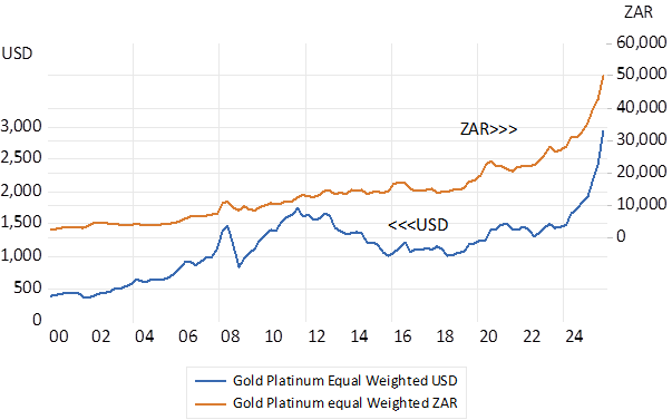
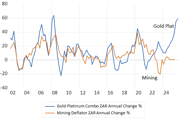
Note below the similarity in metal price trends in USD between 2002 and 2007 and lately. An equal mixture of the gold and platinum prices tells the story – which will be confirmed when the GDP and Balance of Payments statistics are updated later this month. Yet an updated mixture of platinum and gold tells the macro-story in an immediate way. The growth rates in this mixed basket mix are very similar to the growth in mining revenues generally as we show below.
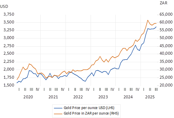
The big metal price picture in USD and ZAR (2000-2026 Daily Data)
Source; Bloomberg and Investec Wealth and Investment
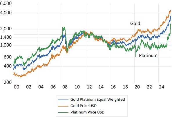
The big picture for gold and platinum in USD
Source; Bloomberg and Investec Wealth and Investment
Gold Platinum and the Mining Price Cycles
Source; Bloomberg and Investec Wealth and Investment
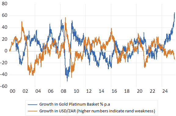
The impact of the surge in gold and platinum prices on the USD/ZAR exchange rate has been predictable – given past behaviour, as we also show below. The simple correlation between these two growth series is -0.54
Annual % move in the Gold-Platinum Basket and the USD/ZAR. Daily Data 2000-2026
Source; Bloomberg and Investec Wealth and Investment
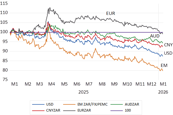
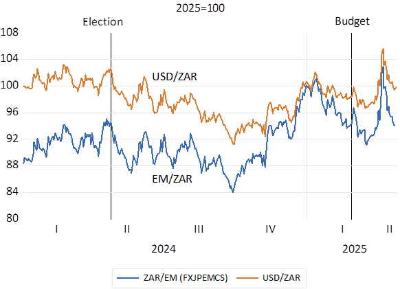
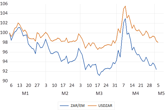
It is therefore not at all surprising that the ZAR continued to strengthen against all currencies and not only the weaker dollar. Including strength against the EM basket and the Aussie dollar, another commodity currency. (see below)
Exchange Rate Moves; Daily Data 2025-2026 (2025=100)
Source; Bloomberg and Investec Wealth and Investment
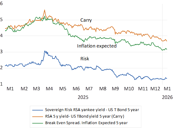
Furthermore, the bond market has responded favourably in a consistent way. Interest rates have receded as has the expected rate of inflation and the expected move in the USD/ZAR as represented by the five-year carry. (see below) The SA sovereign risk premium is now 1.34% p.a. down from the 3.1% registered in early April 2025. The prospect of faster growth improves the outlook for tax revenues and fiscal sustainability. Hence less to be borrowed at lower rates that also incorporate less inflation expected.
Risk Spreads 2025-2026. Daily Data
Source; Bloomberg and Investec Wealth and Investment
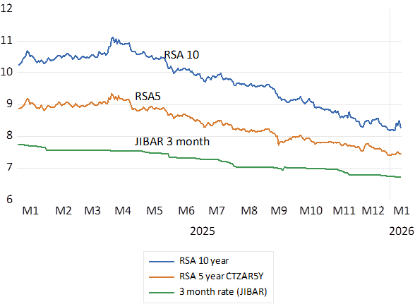
Long term RSA rates are lower by nearly 300 bp compared to early April and short rates are down by 150bp. The slope of the yield curve has flattened. There would be more to come – rand strength combined with the stimulus of lower interest rates, should the impetus from the precious meal prices be maintained. Carry on please Mr.Trump. SA is an unintended beneficiary of policy uncertainty.
SA Interest rate Trends. Daily Data; 2025-2026
Source; Bloomberg and Investec Wealth and Investment
In days of yore an impressive, listed company might have been described as a ‘blue chip’. Now the modern equivalents are more likely to be characterised as ‘Quality’ companies. ZebraGPT, when asked why blue and why chip, answered in summary that “…the term “blue chip” symbolizes high-quality, stable investments, drawn from the prestigious connotation of blue poker chips, which represent the highest value in the game. This term emphasizes the reliability and strength of the companies classified as blue-chip stocks, making them preferred choices for investors seeking stability and long-term growth…” Blue chip and Quality are cut from the same block.
Fund managers with a focus on “Quality” will be compared in performance with their rivals applying a different style of investing. With perhaps a focus on a class of stocks known as “Value” or “Growth” designed to outperform portfolios with a Quality bias and also outperform the wider stock market.
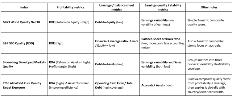
How should a quality company be identified? A variety of Index constructors and rating Agencies select “Quality” companies and combinations of them to inform investors. The Table below indicates the criteria adopted by four of these different agencies. As may be seen there is much common ground and the correlations between these different Indexes and their movements are very high.
How would an enterprise qualify as a Quality business – or hope to do so? That is to evolve as a large successful and valuable business with predictable growth in profits and a strong balance sheet that is expected to ensure its survival through the good and not so good economic times. Such success, simply put, must be achieved through consistently successful allocations of capital by the business. A successful “quality” firm will have invested capital in projects and people and systems and marketing and knowledge and culture that provides good returns. If the growth in its bottom line, exceeds the opportunity cost of the capital employed by the firm, it will have every incentive to scale up its offers to customers, investing more capital to grow its top revenue line and its earnings.
Such positive returns on shareholders capital will then generate the extra cash required to fund its growth from its own operations. That is from its own savings reinvested in the business. The higher the cash content of its bottom lines, the less accounting noise, the easier it will be to grow without additional debt or raising fresh equity, convincing actual and potential shareholders of its quality, that is the predictability and sustainability of its business model. Organic growth, doing more of the successful same, perhaps with smallish bolt-on acquisitions of similar or complementary operations is to be preferred to growth through Mergers or Acquisitions, that could prove to be large expensive wastes of capital.
Investing in the intangibles, in employees and marketing, and in innovation through targeted R&D may also have become an increasing proportion of the extra capital employed as production and sales become more knowledge and data based. If so, adding such expenses to the balance sheet and amortising them realistically on the income statement, will better reflect the true nature of the modern enterprise and its long-term prospects. More so than conventional accounting that treats such investment as an earnings reducing expense, so ignoring the potential long-term benefits of such allocations of capital.
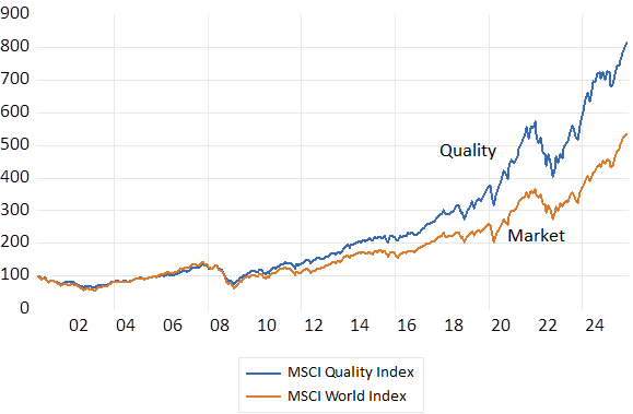
A mixture of cost of capital beating returns combined with a willingness to allocate extra capital for growth that facilitates growth is a true measure of quality and the source of value add for its shareholders. More so than simply realising high returns on capital – without continuously investing for growth. Investing in the Quality Index as constructed by MSCI since 2000 has however given superior returns for similar risks when compared to the MSCI Value and Growth Indexes. 100 dollars invested in the Quality Index in 2000 has grown to over 800 dollars compared to the World Market Index that would have grown to about $530.
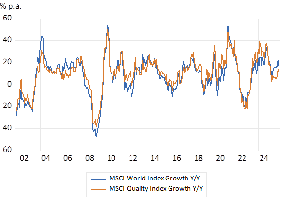
Between 2000 and 2025 the monthly returns on the MSCI World Index averaged 0.61% per month with a Standard Deviation (SD) of 4.45% compared to 0.73% per month for the MSCI Quality Index for less volatility (SD of 3.47%) The MSCI Growth Index realised a market beating average 0.65% per month with more risk on average (SD 4.75%) and the Value Index achieved a below market return of 0.56% (SD 4.5) The superior returns from Quality began in 2009 and have continued over most years since. Though this year to November Quality has underperformed the World Market by about 4%. Correctly timing entry or exit from Quality or Value or Growth will remain a temptation.
Does the better long term return for less risk from investing in a Quality Index represent not just the benefits of Quality, that would always perhaps command a premium price enough to reduce realised returns for shareholders. But explained rather by consistent improvements in the quality of the average quality stock? A Quality company today has arguably become absolutely superior to one of 25 years ago and therefore more valuable on its improved merits. Or quality has improved in a surprising way encouraging investors to bid up the value of a quality company and so reduce future returns. Improved quality perhaps because managing return on capital, tangible and non-tangible is the new religion for managers?
The MSCI Quality Vs Market Indexes (2000=100) Month End Data
Source; Bloomberg and Investec Wealth and Investment.
The MSCI Quality Index vs the MSCI World Market Index; Annual Returns % p.a. (Y/Y) 2000-2025 Monthly Data
Source; Bloomberg and Investec Wealth and Investment.
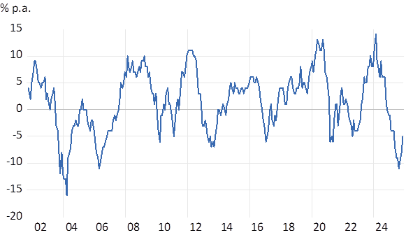
Returns. Quality vs World Market – Differences in Annual Returns
Source; Bloomberg and Investec Wealth and Investment.
[1] Carig Evans is an Analyst with Investec Wealth and Investment
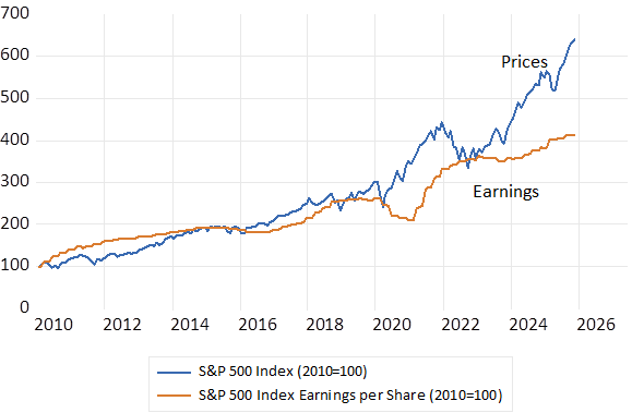
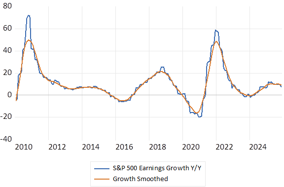
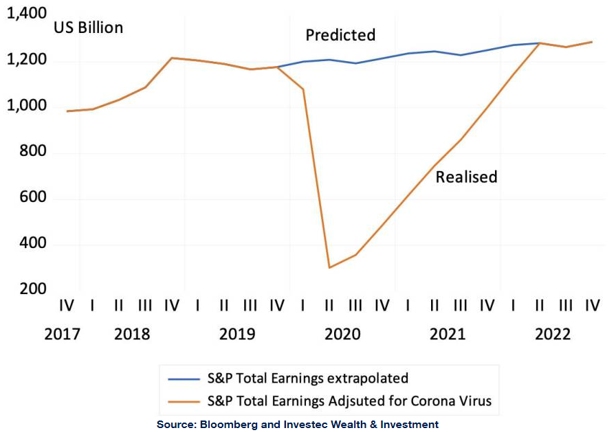
The US economy, judged by the flow of quarterly earnings reports from its leading companies is in very good shape. S&P 500 Index earnings have grown by about 8% over the past year. And the analysts are expecting further growth in earnings over the next twelve months- as much as an additional 14% by this time next year. Sales are growing and profit margins remain at highly elevated ratios. Fears of recession have proved greatly exaggerated.
And the prospect of further reductions in short term interest rates is still widely anticipated. Though several of the major employers, despite their impressive top and bottom lines have publicly revealed a deep reluctance to hire more workers. A wait and see approach to employing more workers and managers seems to be a widely adopted strategy by US business – understandably so. Waiting to see more clearly what the future of adopting AI means for their work forces seems an eminently sensible approach for all businesses everywhere, including South Africa to take.
And so the Fed – the US central bank – has a dilemma. And not only because the government shut- down has denied its policy makers the usual flow of updates on the state of the labour market. There may well be something much more fundamental at work that makes the conventional Fed play book much less useful.
The Fed has a dual mandate- it is instructed to control inflation and to maximise employment with its interest rate and asset purchase settings. And while the prices of goods and services are still presumably subject to the usual somewhat predictable supply and demand forces – the labour market may not be – given the hard to predict pace of adoption of AI. The relationship between the state of the economy and the state of hiring and firing may be changing in a fundamental way- at least for now. As may the link between wage rates, costs of production and prices charged may change. More (or less) demands for goods and services may not translate into coincident demands for workers. And so lowering interest rates to encourage demand for goods and services may be further good news for the revenue and profit lines of US business and lead to higher prices – without doing much to raise employment levels. If so, the case made now in the US for lowering interest rates is weaker.
That access to AI and AI empowered robotics will make workers of all kinds – those behind computers or assembly lines or down mine shafts more productive and safer is indisputable. As has been true of technological advances in the past made with the aid mostly of improved mechanics rather than computing power. Workers clearly produce more when complemented by more and better tools. But for additional profit margins, including covering the cost of the extra capital utilised, to translate into higher rewards for workers requires a relative shortage of workers. And competition for them. It is this competition for relatively scarce labour that has raised the rewards for work, enough for the average worker to consume more leisure – that is to work fewer hours.
Or the adoption of AI might lead to an excess supply of potential workers enough to drive down the rewards of the average, insufficiently skilled worker. While the same forces help promote the exceptional incomes of a highly skilled and productive few. For example, the million dollar a year AI engineers now eing paid ever more handsomely to move from one AI firm to another.
Among the beneficiaries of more profitable, perhaps less labour-intensive technology, would include the owners of the more profitable firms- the employers of the AI and the computing power. Including include among the owners the many members of retirement and pension funds with valuable shares in the AI success stories. Who may then be called upon to shield those unable to find decent jobs- to reduce inequality – as will be argued- with higher taxes.
One however can be optimistic about the impact of increased productivity on economic outcomes. Intense Competition to apply the technology and to scale up production for additional profit will mean more produced, lower prices and improved service. Lower prices and greater convenience greatly encouragers demand and demand for not only robots but also humans to supply a growing market. Think of Uber as an example. The convenience and price of E hailing has grown the market for a taxi service and the number of drivers. Another example might help. If cutting the lawn or your hair took a third of the time and a sixth of the current cost, we would surely trim more frequently and spend more time in the gym. The demand for AI advanced hair or lawn dressers who can share your woes, might well improve rather than decline. Hairdressing for boys does incidentally seem to be a growth story.
S&P 500 Index and Index Earnings per Share. (2010=100)
Source; Bloomberg and Investec Wealth & Investment
The S&P Earnings Cycle (2010 – October 2025)
Source; Bloomberg and Investec Wealth & Investment
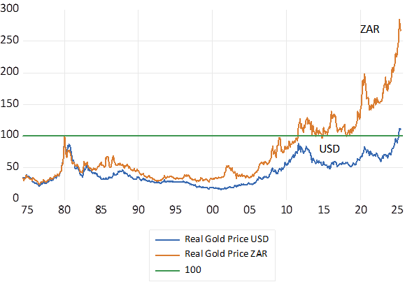
The Donald has slapped us with tariffs. He has also given us an extra R20 billion a year in the value of the gold we sell and added about R600 billion to the value of the gold shares listed on the JSE. The gold price has been on a tear this year. Up by 23% in USD and 19% in mighty ZAR. If we adjust for US inflation the real inflation adjusted dollar price of gold is now at record levels- higher than it was in early 1980 when the gold price broke 800 dollars per Troy ounce. In real rand terms the gold price is now almost to 3 times higher than it was in 1980.
Gold Price Monthly Data (2020-2025)
Real (Inflation Adjusted) Price of Gold USD and ZAR. Monthly data.
Source; South African Reserve Bank and Investec Wealth and Investment
A favourable trend for producers but not favourable enough to prevent a continuous decline in gold mined in SA. The rand costs of mining gold, especially their employment costs, have risen faster than prices in general reducing profits. There is also less gold to be found in the ground. The grade of the ore extracted for gold has fallen from 8 grams per tonne of rock in 1980 (a mere sliver of gold trapped in rocks deep underground) to about 6 grams and less today. It was 12 grams per tonne in 1970 before the gold price took off with the end of the gold standard. The last new significant increase in gold mining capacity was the South Deep venture undertaken by Gold Fields in 2015. And before that the Moab-Khotsang development of 2003- now part of Harmony.
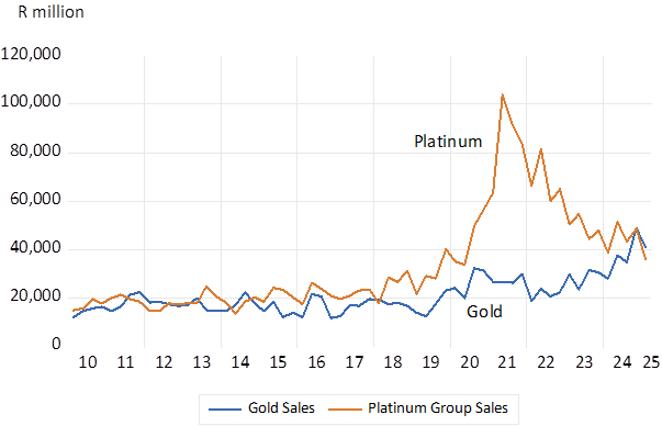
Gold mining now plays a much-diminished role in the SA economy. In 1980 gold mines in SA produced close to 1000 metric tonnes of gold. Current output appears to have stabilised at about 100 tonnes. Gold sales in 1980 were equal to an imposing 15% of the economy (GDP) and 45% of all merchandise exports. These proportions today are about 2% of GDP and 7% of goods exported.
Annual rand revenue for Sales of Gold and Platinum Group Metals
Source; South African Reserve Bank and Investec Wealth and Investment
What is good for the gold price has been even better for the shareholders in gold mines with significant reserves of gold in the ground. That are consistently revalued in line with the current price of gold to add to the prospective operating profits from the mines. It is suggested that proven reserves of gold of the SA mines are equivalent to about 20 times the current output of gold.
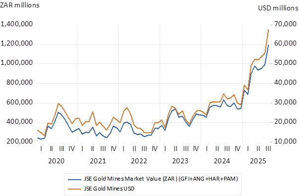
This year the market value of the four largest gold mining companies listed on the JSE (Goldfields, Anglogold, Harmony and Pan Africa) has about doubled this year. From a combined market value of 30 billion dollars in January, they are worth about 70b dollars today. Yet before we get carried away with the scale of this wealth creation on the JSE, it should be recognised that the combined value of the JSE listed gold miners is now less than that of the leading US listed global miner, Newmont, with a market value of USD75b.
The market value of JSE listed Gold Mines Monthly Data (2020-2025)
Source; South African Reserve Bank and Investec Wealth and Investment
The gap between the gold price and what is described as the all in sustaining cost of mining gold that excludes capex, has widened significantly –of approximately 1971 dollars per ounce produced and sold by Harmony, 1694 for Anglo and 1739 for Goldfields. Operating profit margins (the jaws) have therefore widened dramatically. You clearly get more bang for your gold buck investing in gold mines rather than in gold bars. Since 2020 the monthly per centage move in gold shares is about twice the move in the gold price- in both directions.
The changes in the gold price beta have a statistically significant impact on the changes in the value of the gold shares. They explain up to 50% of the move up or down in the value of the shares. Yet still leaving much to be explained in the behaviour of shares in gold mines by forces other than the gold price itself. For example, allowing for the risk that extracting the gold bearing rock will rise sharply as mines attempt to add production. Or that cash flush gold mine managers will pay too much to acquire other gold mines. Or most important, that the gold and other mines over their long lives may be subject to onerous taxes and regulations or even expropriation without adequate compensation. Especially likely when they prove highly profitable. Unknowns that clearly affects the present value of any mining venture. Gold in the ground is worth more in North America and Australia than in SA and Africa for these reasons – less uncertainty about mining policies – and more sympathy for the capital providers.
Judged by the Amendment of Mining Regulations Bill, now with Parliament, the SA government prefers not to recognise how the value of a gold or indeed any other mine, and the incentive to explore for and establish new mines, is adversely affected by policies that are hostile to risk taking shareholders. The government rejects advice from the mining industry and serves special not the general interest in a thriving mining sector.
[1] Campbell Parry and Graham Barr have been most helpful. They do not bare any responsibility for my interpretations
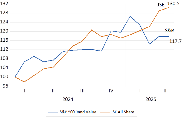
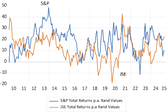
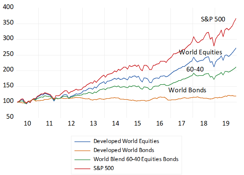
Something unusual happened on the share markets over the past 16 months. The JSE has outperformed the S&P 500 Index by a large margin. Improving its rand value by 30.5% (including dividends reinvested) while the US S&P 500 Index valued, also in rands, has gained less, 17.7% up since January 2024.
Fig.1; The S&P 500 and the JSE All Share Index; Total Rand Returns (January 2024=100) Monthly.
Source. Bloomberg and Investec Wealth & Investment.
Fig.2 S&P and JSE Index Earnings per Share (2024.01=100) Month end
Source; Bloomberg and Investec Wealth and Investment
Comparisons after 2010 are odious for South Africa and the JSE
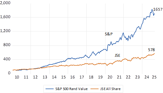
Yet over the past fifteen years the JSE has trailed the S&P by a very large margin. The rand value of the S&P 500 is up by as much 16.5 times since 2010. Compared to a 5.8 times gain for the JSE.
Fig.3; The value of R100 invested on the S&P 500 and the JSE All Share Index. (2010=100) Dividends reinvested.
Source. Bloomberg and Investec Wealth & Investment.
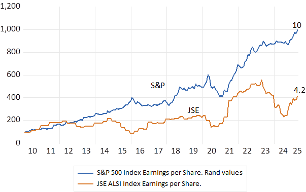
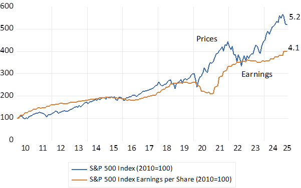
Fundamentals, that is increased earnings, improved economic performance, discounted by generally lower interest rates account for much of the rising value of the S&P Index. S&P Index Earnings per share in USD have grown by 4.1 times since 2010 while the Index has increased by 5.2 times with much of the re-rating realised after 2023. Converted to ZAR, S&P earnings have multiplied by 10 times since 2010 while JSE earnings per share have increased by much less, up 4.2 times since 2010.
Fig.4; The S&P 500 and the JSE All Share Index. Index earnings per Share. Rand Values Monthly (2010=100)
Source. Bloomberg and Investec Wealth & Investment.
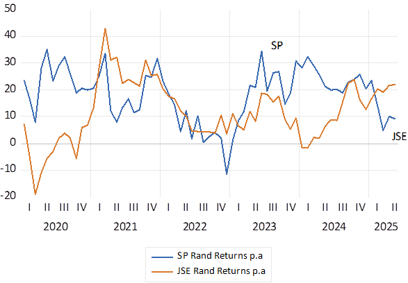
Annual returns – very different- risks similar
Fig.5; Total Annual Returns in Rands 2010-2025. S&P 500 JSE All Share Index. Monthly (Average 18.7 Vs 11.9) (SD 10.7 vs 10)
Source. Bloomberg and Investec Wealth & Investment.
Fig 6; Total Annual Returns Rands 2020-2025 Monthly (Average 18.2 Vs 11.7)
Source. Bloomberg and Investec Wealth & Investment.
The S&P rerates in recent years
Fig.7; The S&P 500 Prices and Earnings (USD 2010=100)
Source. Bloomberg and Investec Wealth & Investment.
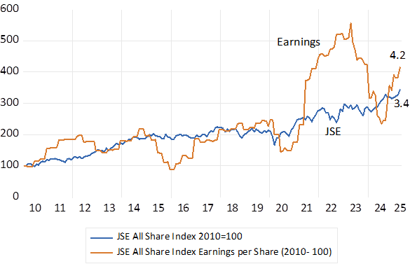
The JSE has derated
JSE earnings have by contrast grown faster than share values since 2010 – by 4.2 times compared to the Index that has risen by less- 3.4 times. A derating rather than a re-rating. The temporary earnings boom of 2022-23 linked to metal prices and global supply side constraints did little to boost the JSE.
Fig 8; JSE All Share Index. Index values and Earnings Rand Values (2010=100)
Source. Bloomberg and Investec Wealth & Investment.
Equity risk premiums – realised and expected. The unexpected has happened to an extraordinary degree over a fifteen-year period
The US 10 year Treasury Bond has provided an average annual return of 3.9% over the period 2010-2025 –thus providing equity investors with a close to an average 10% p.a. extra returns over bonds. Past performance suggests that an extra 4% p.a. from a well-diversified basket of equities would have been enough to justify the extra risk. The S&P 500 delivered much more than could have been expected, delivering an average 18.7% p.a. rand return since 2010 and 13.6% p.a. in USD. It surely cannot get much better than it has been for holders of US equities over the past 15 years.
By comparison, the equity risk premium for SA investors has averaged only 2.8% p.a. since 2010. The yield on an RSA bond since has been an average 9.1% p.a. ( the inflation rate was an average 5.1% p.a. providing an impressive real return of 4% p.a. for a low risk asset) while the total return on the JSE averaged 11.9% p.a.
Such exceptional returns as delivered by the S&P 500 over an extended period required a combination of unexpectedly good news. About the operating profits of the listed firm and about the risks attached to these profit flows, that are used to discount these expected flows. South Africa mostly disappointed investors on these metrics. An equity risk premium of 2.8% p.a. does not compensate for the extra risk. At least an extra 4% p.a. would have been expected.
JSE earnings growth accelerates, and risks recede since 2024
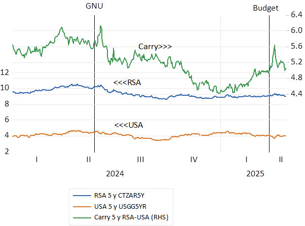
Yet recently, over the past 15 months, thanks largely to the increases in the price of gold, and the very strong growth in the earnings reported by the gold mining companies – JSE earnings have outpaced S&P earnings both in rands by about 25%. In addition, the risks attached to RSA bond yields had also declined thanks to the formation of the Government of National Unity (GNU) in mid-2024. Risks as measured by the spread between RSA dollar denominated bond and their US equivalents. And reduced the cost of capital for SA business, the returns they must exceed to add value for shareholders, regarded here as RSA long bond yields plus an equity risk premium of 4% p.a. The establishment of the GNU reduced SA risk- the budget dissonance has since raised it -while the risk premium and the cost of capital – has declined from its post Budget highs. (see below)
Fig.9; South Africa. Sovereign Risk Premium and the Cost of Capital. Daily Data 2024-2025.
Source. Bloomberg and Investec Wealth & Investment.
Since about 2013 SA risks and cost of capital have risen.
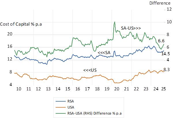
The sovereign risk premium attached to RSA bonds have mostly risen since 2013, driving up long bond yields and the cost of capital. Very slow GDP growth and the threat it poses to the tax base and fiscal stability have raised the SA risk premium and has meant higher required returns from SA bonds and equities and lower valuations. These required returns or hurdle rates for investors and firms rose from about 11% p.a. in 2013 to about 14.5% p.a. today. That is to about 6.5% p.a. higher than the cost of capital for the average US company, using the same 4% equity risk premium. The lack of expenditure on extra productive capacity by SA business, a GDP growth depressor, is easily explained by these baleful facts. (see below)
Fig. 10; SA and US costs of capital and their differences. (Bond Yields + 4% = cost of capital for the average corporate) Daily Data 2010-2025
Source. Bloomberg and Investec Wealth & Investment.
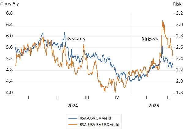
Fig.11; Sovereign risks and the five year carry- the expected movement in the USD/ZAR (% p.a) 2024-2025 Daily Data
Source. Bloomberg and Investec Wealth & Investment.
Fig. 12; Bond Yields; RSA five-year Yankee and US Treasury Bonds 2024-2025 Daily Data
Source. Bloomberg and Investec Wealth & Investment.
Fig 13;The ZAR Vs the USD and the EM Basket (Higher ratios indicate ZAR weakness) Daily data. 2025=100
Source. Bloomberg and Investec Wealth & Investment.
Fig 14; The ZAR in 2025; Daily Data; Lower Numbers indicate ZAR strength
Source. Bloomberg and Investec Wealth & Investment.
The Bottom Line
The JSE, as does the SA economy, desperately needs the stimulus of unexpected growth in listed company earnings and in aggregate real incomes, with less SA risk attached to them. Sustaining the GNU would reduce risks and interest rates. Better, the GNU could help deliver very surprisingly faster growth. That is do more for the economy than merely limit the mistakes the government would otherwise make, as is the prevailing presumption implicit in the very slow forecasts of growth in GDP. The economy has much scope for a growth surprise- off a very undemanding base.
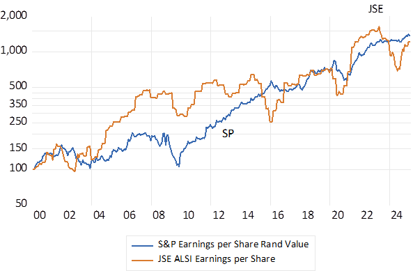
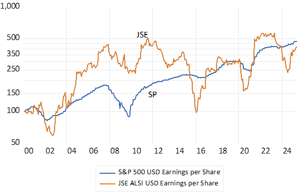
An appendix- taking the story back to 2000- the SA economy and the JSE performed much better until 2010.
It wasn’t always so – the comparison starting with year 2000. The JSE has been very competitive with the S&P on valuations and earnings performance
Fig 15: S&P Vs JSE Total Returns (2000=100)
Source. Bloomberg and Investec Wealth & Investment.
Fig.16; S&P and JSE Index Earnings per Share Rand Values (2000=100)
Source. Bloomberg and Investec Wealth & Investment.
Fig.17: S&P and JSE Index Earnings per Share USD Values (2000=100)
Source. Bloomberg and Investec Wealth & Investment.
America has not always been great. In the nineteen sixties America lost the war it fought in Vietnam. Conscripting its badly suffering Army and long overdue attempts to address racism divided the nation in a most ugly way. And in the seventies, inflation took off. It had risen to over 13% in December 1979
And then came a most impressive comeback. Inflation came under control in the eighties after a short sharp recession and the US won the cold war under the inspirational leadership of Ronald Reagan. And something else, very important for the economy, was under way. The revolution in corporate finance, in theory and practice, came to transform how American business would direct itself and improve its performance. Increasingly managers came to act in the interest of the providers of their all-important capital, their shareholders. Return on capital became the focus of management attention. A discipline that was forced on managers by increasingly active investors, backed by access to credit made available to them on an unprecedented scale.
Shareholders did not need business managers to diversify on their behalf. Conglomeration became a dirty word. The share market could do it for them and big business became more specialised and more efficient and profitable in the true economic sense- earning more than the opportunity cost of the capital they employed. The bar was being raised for US business and its CEO’s and they responded accordingly by improving the efficiency of their r operations to the great benefit of workers and savers and investors.
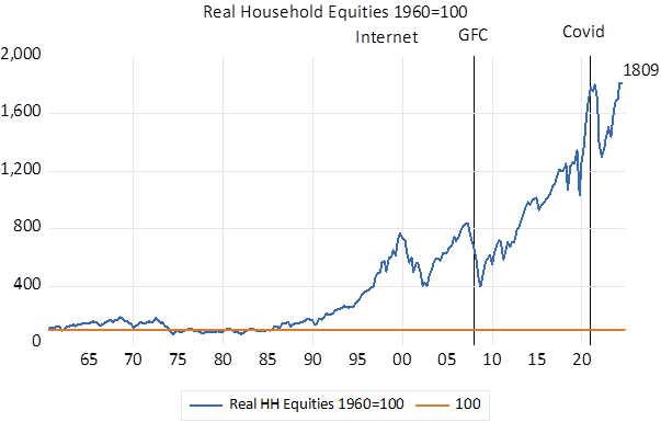
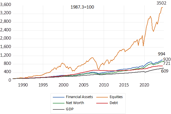
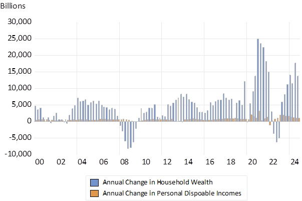
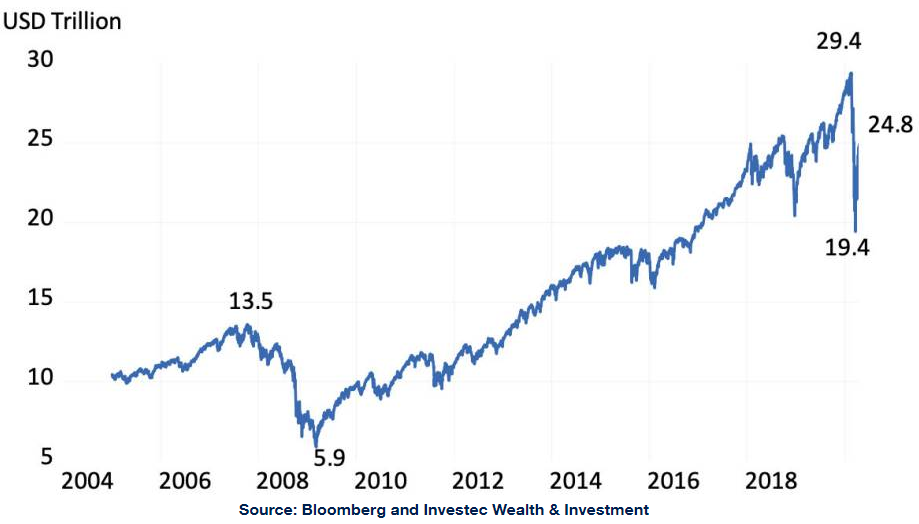
The US equity markets tell the story of improved efficiency and enormous amounts of additional wealth creation. Donald Chew, who was there at the beginning in a recently published book, provides an incisive overview.[1] The improvement in the value of US equities and in the strength of household balance sheets after 1985 has been nothing less than extraordinary. The value of US household’s investments in business, their equities, adjusted for inflation, was stagnant for as many as 25 years between 1960 and 1985. Put another way the share market was not a source of real wealth creation for about a quarter of a century. Thereafter the market value of US equities held by households took off and is now worth about 18 times more in real terms than it was in 1985. Buoyed increasingly by the gains in the market value of these equities, the ratio of household wealth after debts to household incomes has increased from 4.8 times in 1987 to the current over seven times, even as disposable incomes have risen.
Personal Disposable incomes grew from $3.65 trillion in Q1 1988 to 21.89 trillion by Q4 2024. That is at an average compound growth rate of 4.8% p.a. over the 37 years. The net wealth of US households grew from $18.52 trillion in 1988 to $163.5 trillion by 2024 at a higher average compound growth rate of 5.9% p.a. over the same period, helped largely by the increased value of US businesses.
These wealth gains have been especially large after Covid. Between 2020 and 2024 personal incomes after taxes, assisted by Covid relief, grew from 14 trillion to 22 trillion or by 57%. The net worth of US households grew much faster and extraordinarily from 42.2 trillion in 2020 to 163.5 trillion, by the end of 2024, or by 287%. These wealth effects surely dominated the income effects on spending.
Charting the explosion of wealth in US equities.
The charts below show the trends and how gains in the equity market came to dominate household balance sheets.
Fig.1; Household Wealth to Personal Disposable Incomes; Ratio (1987- 2024)
Fig.2: US Holdings of Equities Adjusted for Inflation. 1960=100
Source; Federal Reserve Bank of St. Louis (Fred) Investec Wealth & Investment
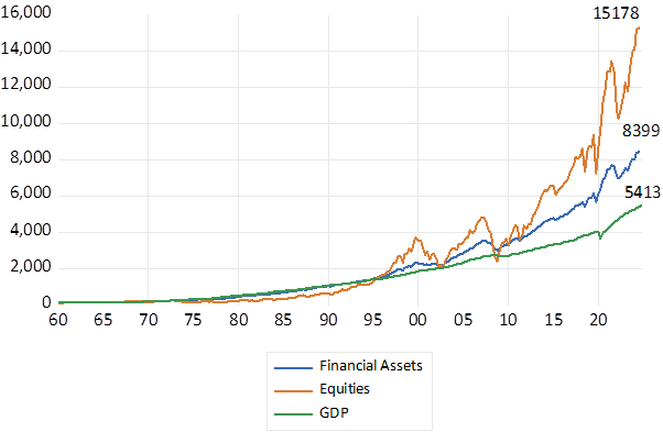
The value of equities in household portfolios has come to dominate much more valuable household balance sheets. A fuller illustration of the trends in household balance sheets after 1990 is also shown below.
Fig 3; US Households Holdings of Equities, Financial Assets and GDP. (1960=100)
Source; Federal Reserve Bank of St. Louis (Fred) Investec Wealth & Investment
Fig 4: US Households Balance Sheet Categories (1987=100)
Source; Federal Reserve Bank of St. Louis (Fred) Investec Wealth & Investment
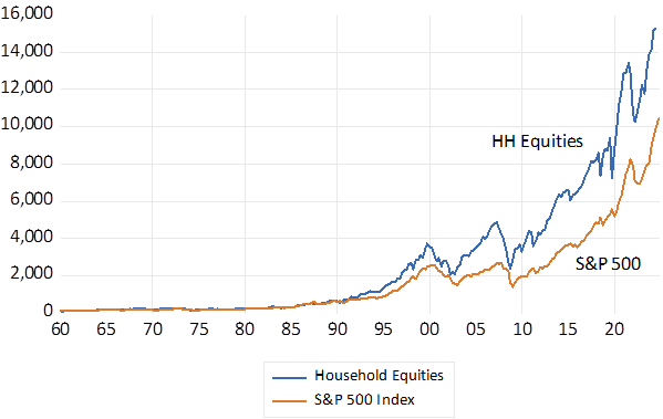
Fig.5; The value of equities held by US Households and the S&P 500 Index. 1960=100
Source; Federal Reserve Bank of St. Louis (Fred) Investec Wealth & Investment
Fig.6; Annual Increases in Household Wealth and Incomes. USD Billions (2020-2025)
Source; Federal Reserve Bank of St. Louis (Fred) Investec Wealth & Investment
South Africa – a case of capital wasted.
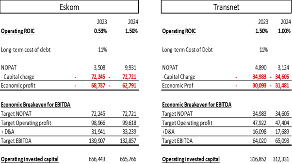
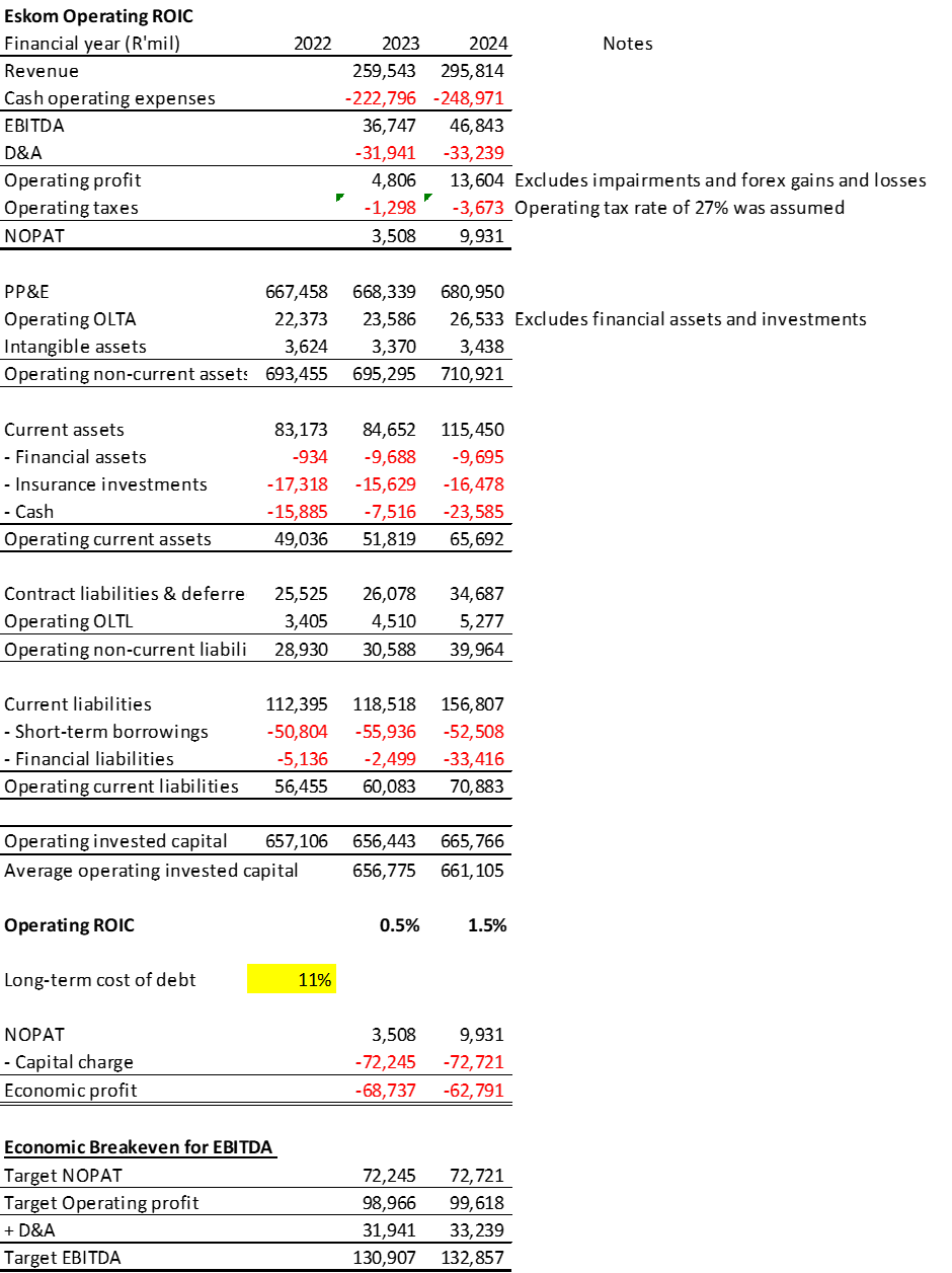
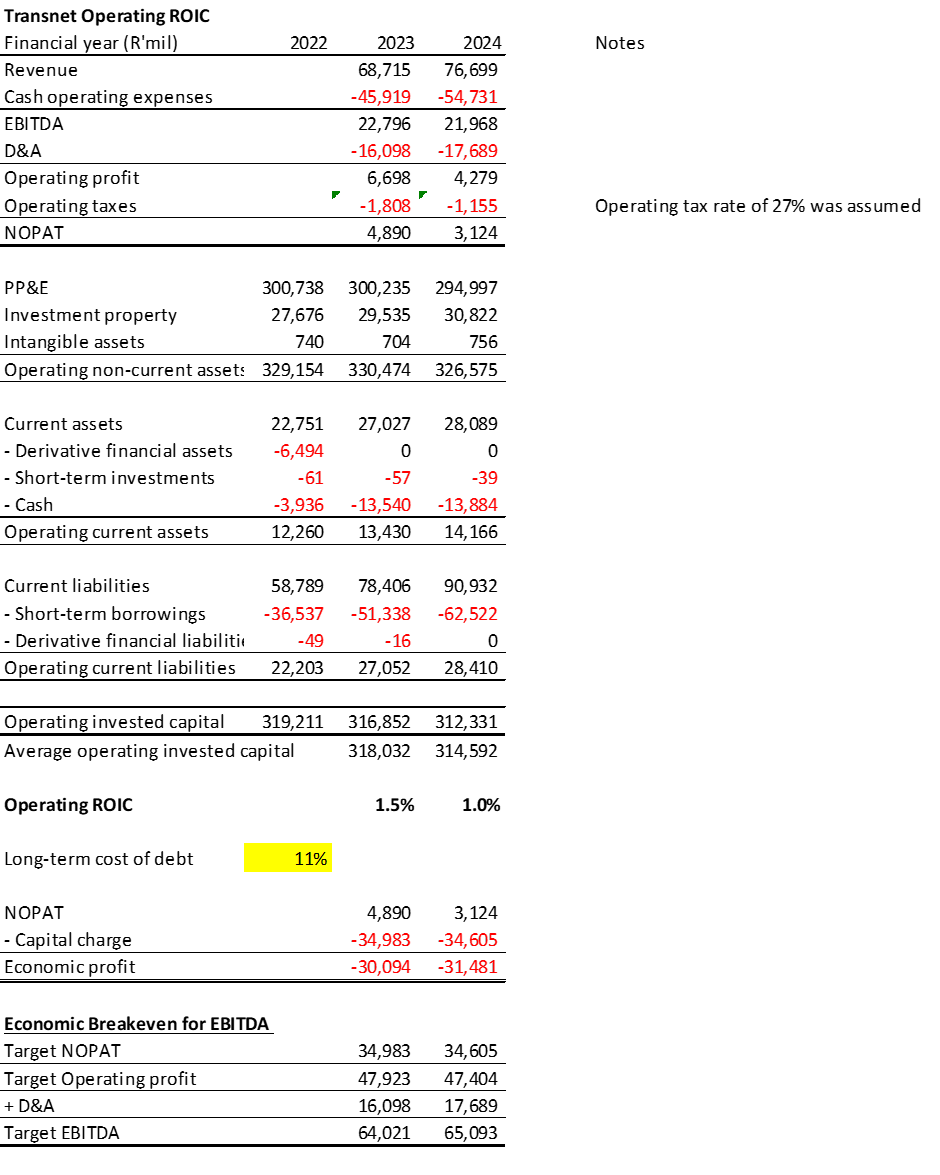
South African business is similarly under pressure from shareholders to generate economic profits for their shareholders. Though the SA economy has offered lesser opportunities for growing businesses than the US economy. An important reason for this failure to grow can be found in the operating performance of the State-Owned Corporations and the terrible waste of the capital that taxpayers have been forced to supply them with. Eskom, the State-owned electricity utility, employs as much as R700 billion of capital in its operations. The return on this capital is at best about 1% p.a. If Eskom were to cover its cost of debt capital (about 11% p.a) it would need to generate and additional R70 billion plus each year from its operations. Or put another way Eskom has been wasting about R70 billion of taxpayers potential income every year. Transnet, the state-owned transport company, employing about 312 billion rand’s worth of capital, at a 11% p.a. charge is similarly wasteful. It would need about R31 billion of extra profit annually to cover its costs of capital. The sacrifice taxpayers have made of potential income had capital had been used efficiently has clearly been enormous.
South Africa urgently needs a revolution in its use of capital. It needs a focus on the return on capital, on the interests of its shareholders in the SOE’s, that is taxpayers that made America great. Among the most abused shareholders anywhere are surely South African taxpayers. The solution is obvious. The taxpayers should not be throwing good potentially valuable capital after bad. But demand that the hopelessly inefficient operations of the SOE’s be transferred to private operators who must cover their costs of capital to survive. The state can exchange assets or additional capital for a stake in more efficient businesses as Temasek has so successfully managed for Singapore. And the RSA can then look forward to taxing their profits rather than cover their further losses.
A financial appendix.
The tables and workings below summarize the dismal record of Eskom and Transnet. [2]
[1] Donald H. Chew Jnr, The Making of Modern Corporate Finance, Columbia University Press, 2025.
[2] ROIC= Return on Invested Capital. NOPAT= Net Operating Profit after Taxes. EBITDA=Earnings before Interest, Depreciation and Amortisation. The fuller work sheet is copied below.
In years to come the 2023-24 years will be recognized as very special ones for share owners. Something to toast over what may prove to be an equally special Grand Cru. One that, thanks to the exceptional draw up in market values, has become more affordable to the patient investor. A case of what the wine cognoscenti might describe as linearity- from much extra wealth created to the wine cellar. Though why a straight uncomplicated line from lips to throat, should be regarded as an attribute of a fine wine escapes me. I thought one pays up for complexity in wines, never simply described.
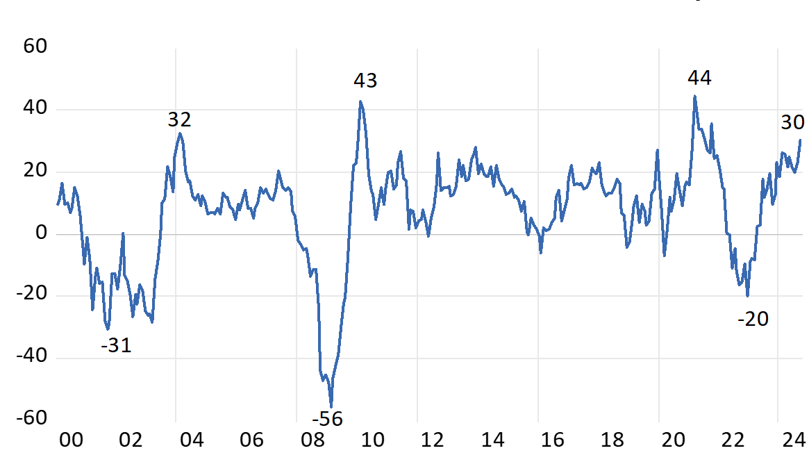
This past year the S&P 500 delivered the best annual returns this century. Comparable to the recovery from the panic drawdowns of 2008 (GFC) or 2020 (Covid) The Index, up 30 % in the twelve months to September 2024 was very generously valued a year ago -at 21 times earnings. It is now even more expensive and valued at 25 times reported earnings. The average S&P P/E since 2000 has been 19.7 times. Unusually It has not taken a draw down to lead a strong recovery. This time has been different. Strength on Strength.
The S&P 500 Index Annual Returns – calculated monthly 2000-2024
Source; Bloomberg and Investec Wealth and Investment.
The upward direction of the S&P Index recently has been dominated by a few stocks- the so described magnificent seven- making the Index unusually concentrated, less diverse and therefore more risky than usual. The top three by market value Microsoft Corp., Apple, Inc., and Nvidia Corp., constituted 20% of the S&P 500 this year, while the top seven stocks accounted for 32%.
Yet while the S&P 500 is up 22% this year to September, the equal-weighted S&P 500, the average listed company, is up by less – a mere 14.9%. During the first half of the year, the S&P 500 rose by 15.2%, and by 5.9% in Q3, while the equal-weighted S&P 500 increased by only 5% over the same period. This greater than 10% performance gap between the weighted and unweighted indices was the widest in nearly 30 years. Only about a quarter of S&P 500 stocks kept pace with the market’s overall return during the first half of this year, with over a quarter experiencing negative returns. If you did not own the very largest stocks and own them in size, you likely underperformed the indices. Risk (less diversification) and return were as usual well correlated.
The “magnificent seven” and so the market are valued for the prospective growth in the demand for artificial intelligence that they supply the backbone for. But their investment case so strongly appreciated will only be fully revealed over time. This makes their valuations less dependent on near term earnings and so on the essentially short-term business cycle. They are valued much more idiosyncratically than your average value company on their own recognizances. They have also grown earnings and cash flows at well above the average rate to date. These super growers with impressive track records are allocating truly massive volumes of internally generated cash flows to supplying the essential facilities that the average firm will be drawing upon and hopefully paying up for. They also have the financial strength to pay dividends and buy back shares. In contrast, the average S&P 500 company is valued more heavily on the short-term outlook for the U.S. economy. About which there has been and perhaps will always be considerable uncertainty.
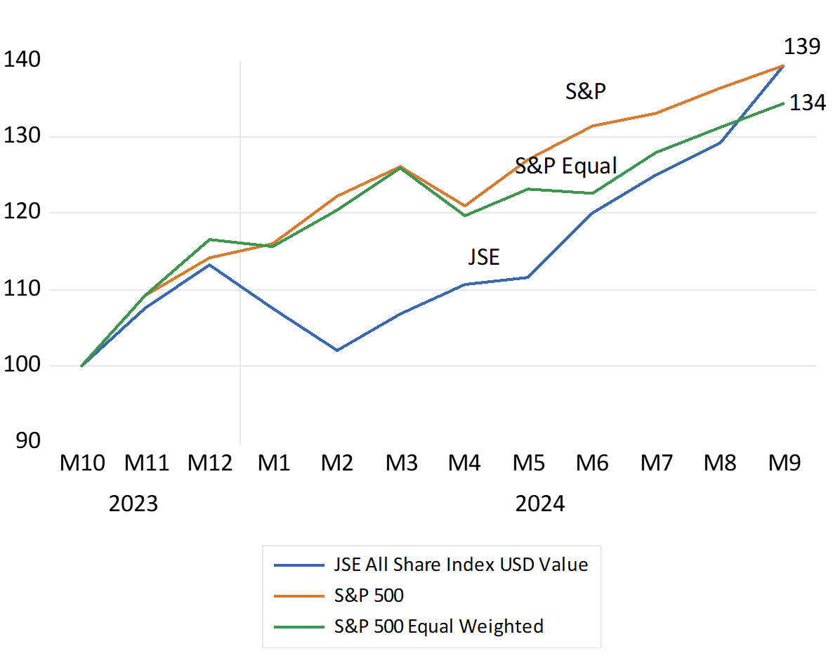
The S&P 500 Index, the equally weighted S&P Index and the JSE All Share Index. Total returns to October (2023=100) USD Values
Source; Bloomberg and Investec Wealth and Investment.
The JSE has also enjoyed a very good year. Up by as much as the S&P since October 2023. 40% in USD and still impressively 28% higher in the mighty ZAR. The JSE All Share Index measured has added as much to SA portfolios as would have holding the S&P Index. A wealth adding outcome for old-fashioned reasons. The prospect of faster growth has fired up the share market and the value of RSA bonds and the exchange rate. Less inflation, lower interest rates and faster growth in GDP and government revenues has been very heady stuff. Enough perhaps to add to the prices bid at the Wine Guild Auction and deserving of an early toast to the GNU.
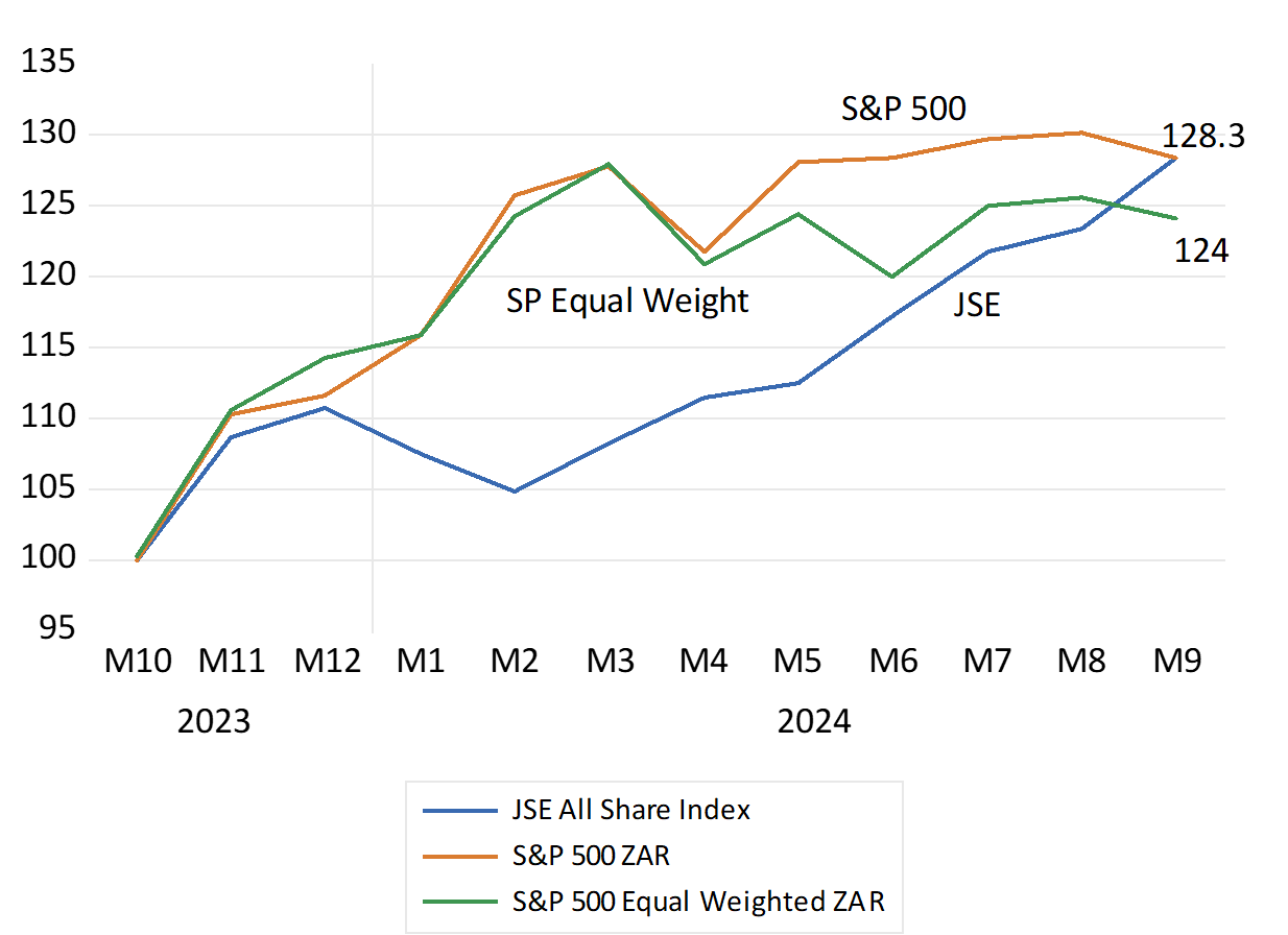
The S&P 500 Index, the equally weighted S&P Index and the JSE All Share Index. Total returns to October (2023=100) Rand Values
Source; Bloomberg and Investec Wealth and Investment.
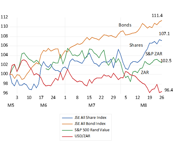
The financial markets have welcomed the Government of National Unity (GNU) The reactions in the bond market have been particularly favourable. The JSE All Bond Index on August 26th was up by 11.4% since the election of May 2029. The share market was up by 7.1% while the ZAR has gained 4% vs the US dollar and vs other EM currencies. Given the importance of equities and bonds held by SA households in unit trusts and pension plans (some 15.2 trillion rands worth at year end 2023) representing 85% of all the assets held by SA households) such market moves have already had a very significant impact on the wealth of South Africans.
The promise of faster growth has added close to 10% or over 5 trillion rands mutual funds to the SA household balance sheet. Extra real money indeed and helpful for stimulating additional household spending, of which SA has had too little of for many years now. [i]It is not only the supply side constraints that have held back the economy. Demands from households and the firms that serve them have been insufficient to drive growth above an immiserating 1% a year.
The importance of the judgments of the global capital market of SA economic policy for the average South African, their hopes for employment and a comfortable retirement, for which they sacrifice heavily, cannot be underestimated.
Post election movement in the Financial Markets. Daily Data – May 29th – August 26th 2024. May 29th=100
Source; Bloomberg, Investec Wealth & Investment.
The strength of the ZAR is particularly welcome. It brings with it lower inflation and lower short-term interest rates essential for a recovery in the economy. The positive link between the outlook for growth and the behaviour of the ZAR has again been emphasised, (more growth stronger rand and vice versa) as has the link between a stronger rand and inflation.
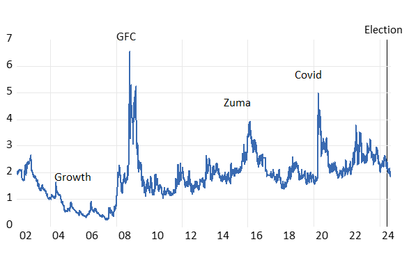
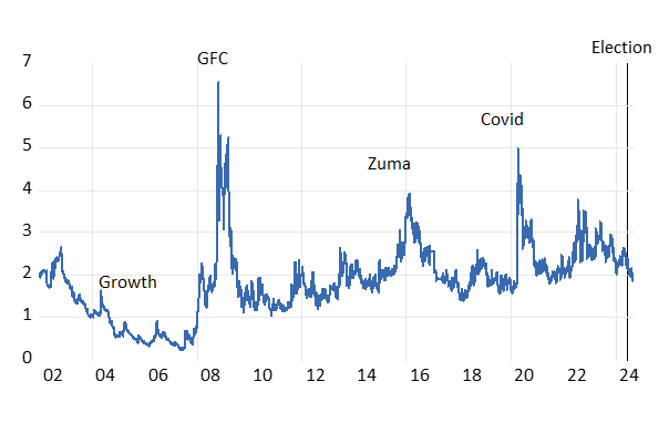
There is no room for complacency. The status of RSA debt has improved, but interest rates and the cost of capital remain elevated. Our credit rating remains significantly weaker than it was between 2002 and 2008 when our economy did grow at close to 5% p.a. (see below)
The RSA Credit Rating. The CDS spread between the yield on RSA 5 year USD Denominated Bonds and a 5 year US Treasury Bond
Source; Bloomberg, Investec Wealth & Investment.
There is much room to further impress investors. By taking economic policy decisions now, that by promising faster growth over the longer term, could immediately further strengthen the bond and currency market.
The National Health Initiative, now being actively promoted, does the opposite. It promises more of the same fundamental weaknesses that have infected all the State directed enterprises to date. The direction of health care reforms should also be one of seeking partnerships with the private sector- with private hospitals and practitioners. It calls for experimenting with the private control and management of hospital services. Hospitals currently funded by the State that perform so poorly on all metrics, including the costs of supplying inferior service.
A helpful positive note was offered by the Transnet CEO. Michelle Phillips who said yesterday that “…the entity’s move to maintain run and invest at Ngqura and the 670km container corridor would be reworked after potential bidders complained that the conditions attached to the tender were too stringent and costly for the private sector to fully participate..” (BD August 28 Thando Maeko)
The public sector in SA, in all its guises, needs to come to realistic terms with the potential providers of private capital and skills that are essential to our economic purpose. Their managers need to fully understand how to deal with potential private sector partners who operate globally. Such knowledge applies to plans for ports and railways and refineries, for the supply of water and the transmission of electricity. And for bringing minerals, oil and gas to the surface. And to recognise the terms and conditions, no more or less than internationally competitive terms, that would bring potentially abundant and truly economic game changing offshore gas, onshore. Offering credible deals of this kind would be enough to move the markets. And so immediately, with lower interest rates and a stronger rand and less inflation, would help realise the growth in incomes and employment necessary to re-elect a GNU in 2029.
[i] I am drawing on a recent comprehensive analysis of the SA balance sheets by J.Makoena and K Setshedi published in the SA Reserve Bank Quarterly Bulletin, June 2024. The study shows how very well developed are pension and retirement savings in SA (120% of GDP) are compared to other emerging economies. And so the importance of investor sentiment for SA wealth owners.
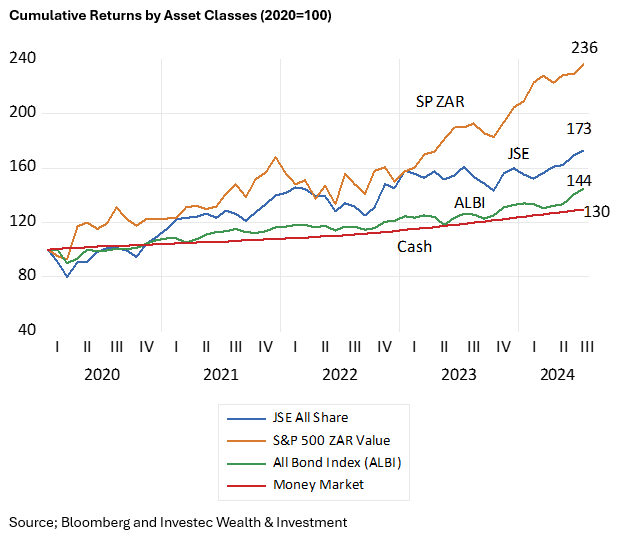
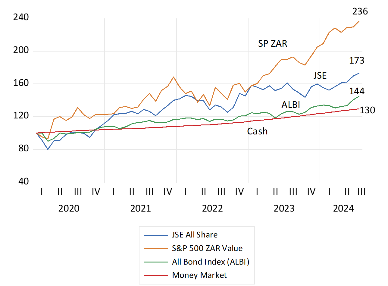
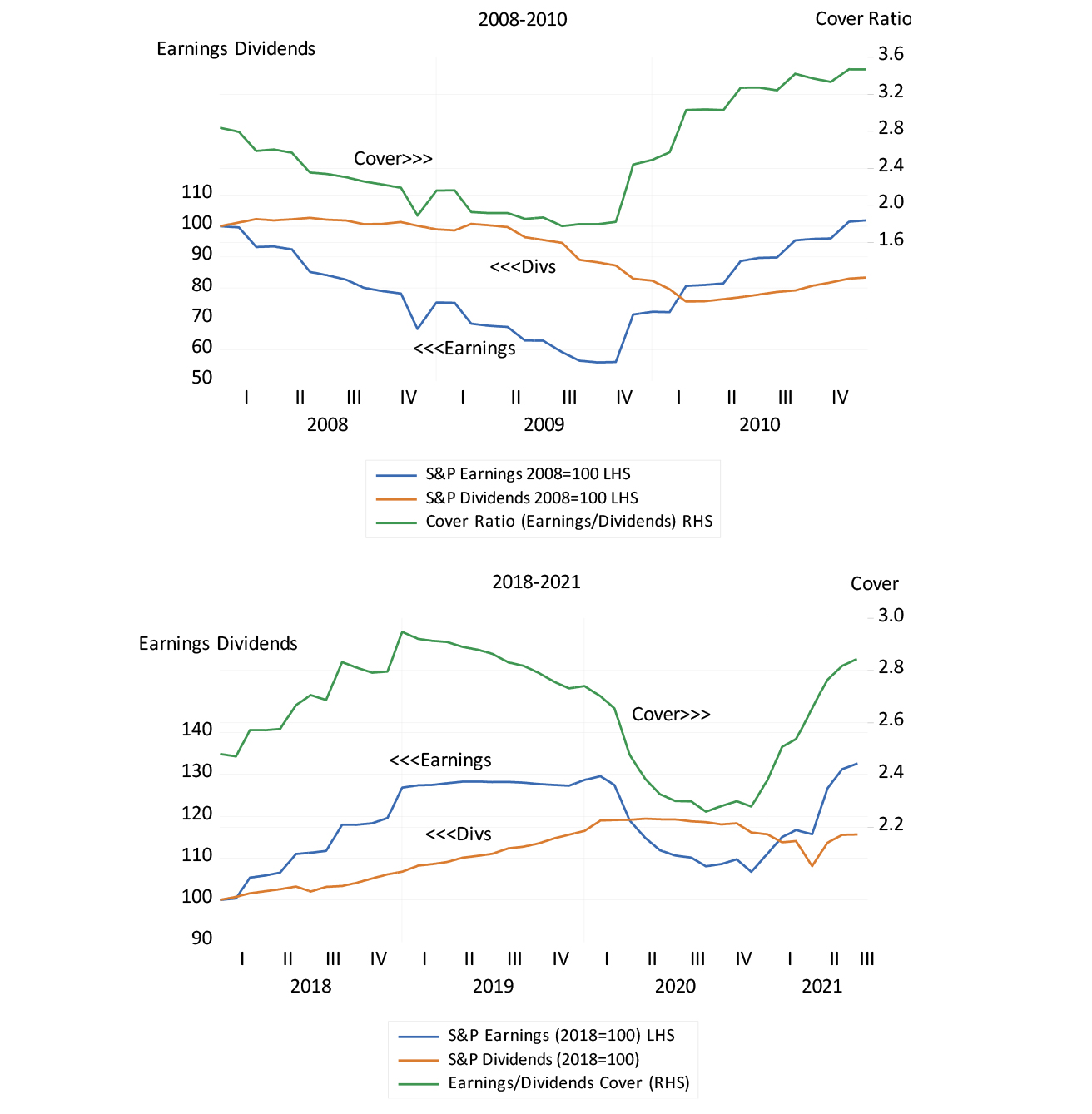
Dealing with Covid in 2020 was a frightening episode. The JSE All Share Index lost 20% of its value by March that year and the S&P 500, suffered a very similar drawdown, of 20% in USD. Yet something predictable then followed. Between January 2020 and July 2024 share markets have given very good returns and they have outperformed bonds and cash by large margins. R100 invested in the JSE immediately pre Covid with dividends reinvested, would now be worth R173. Had the R100 been invested in the S&P 500 it would now be worth significantly more R236. The same R100 if invested in the Bond Index or in a money market fund with interest reinvested would have grown to only R144 and R130 respectively.
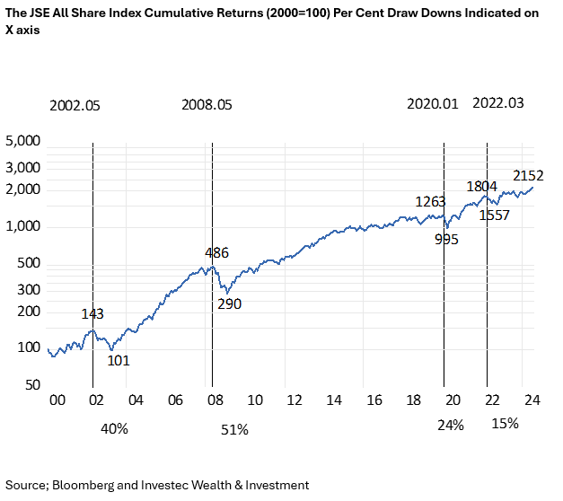
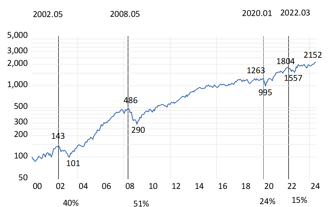
A predictable outcome–given the large outperformance by a representative share portfolio on the JSE since 2000, or for that matter also since 1980 or 1960. The R100 invested in the JSE Index in 2000 would have grown to R2152 that is by 21 times at an annual average rate of return of 13.12% p.a. The R100 in money market would have grown by 6.3 times and the Bond Index by 10.6 times over the same period. Incidentally the JSE has kept up with the S&P also measured in rands over these 24 years. The JSE outperformed significantly until 2010 and has underperformed since.
The JSE has therefore recovered very well from significant periodic drawdowns since 2000, 40% down in 2002, 51% in 2008, 24% after Covid and 15% with Fed tightening in 2022.
Equities are expected to give superior returns because they are more risky to hold than cash or bonds. The higher returns expected of equities compensate for the different risk of losses investors believe they are exposed to holding shares. Higher expected returns mean lower entry prices for investors, all else remaining the same. And these expected extra returns have been delivered to date by most Stock Exchanges.
Share prices move each day about an average of close to zero. They demonstrate a random walk with hopefully upward drift to give the expected positive returns over the long run. The more difficulty investors have in interpreting the news about a company or an economy, the wider are the daily swings in prices in both directions. This volatility gives rise to an objective measure of risk. It will be reflected in the cost of an option to insure against volatility. Investors can buy or sell a volatility index, the VIX, based on the underlying volatility of the S&P 500. When S&P volatility (risk) rises share prices fall. And vice versa They do so to improve or reduce prospective returns, in a statistically significant way. As has again been the case this year.
Yet were share market returns measured over longer periods, the risk of an in period loss falls significantly. The average returns when investing on the JSE or S&P market are very similar when returns are measured over one, five or ten year holding periods. Since 2020 returns for holding the S&P Index have averaged about 14% over one year and 11.1% p.a. and 11.2% p.a. when calculated over consecutive five year and ten-year periods respectiverly. However, the Standard Deviation (SD) of returns about the average has been much higher for one-year returns (13.87) than for five or ten year returns with SD’s of 2.93 and 1.96. The same relationship holds when the analysis is taken back to 2000. Risks (the SD or volatility of returns) have fallen sharply when the investment period is extended beyond one year. Absolute losses when returns are measured over five- or ten-year periods occur rarely. It took a Financial Crisis to do so.
The extra expected returns for extra equity risk applies to the averagely risk-averse investor with limited wealth. When you are investing for you children and grandchildren and their children, and are wealthy enough not to have to worry about being forced to cash in your shares, you can invest without much risk -and you can expect to pick up the money left on the table by the more risk averse. Further support for time in the market – not timing the market.
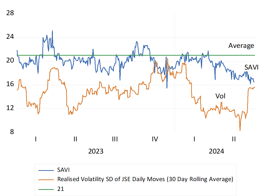
You might have expected more volatile markets, in this election year. The evidence however suggests otherwise. Investors on the JSE and the New York Stock Exchanges have coped comfortably well with the potential dangers. Daily volatility on both share markets, the scale of daily ups and downs in average share prices, has been unusually subdued, and well below long term averages in the US. Electing a scoundrel or a cognitively challenged US President has not made much of a difference to stability in the US markets The coalition outcome in SA proved welcome but not much of a surprise, again as judged by volatility trends. The Volatility Index for the S&P 500 – the VIX- also known as the Fear Index- has averaged 13 this year well below a daily long-term average 2000-2024 of 19. The equivalent construct for the JSE, the SA Volatility Index (SAVI) – with a similar long-term average of 21, has also trended lower this year.
As may be easily observed the chances of an Index or any well traded share moving higher or lower on any day are about the same. The pattern is thus of a random walk, of ups being matched by downs of roughly the same average magnitude. Yet happily for shareholders these movements have come with a slight upward bias, above a daily average of zero, to provide shareholders with positive returns over the longer run. If they stayed invested in the share market the end result has been strongly positive annual returns over five or ten year periods rolled back each month.
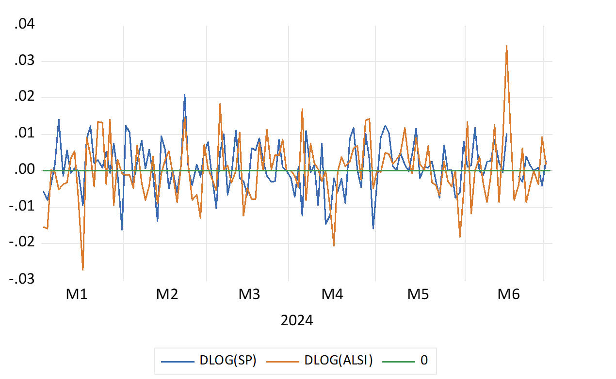
(See below the daily moves of the S&P 500 and the JSE All Share Index in 2024. We also show the Daily SAVI in 2023-24 as well as actual volatility of the JSE – calculated as the rolling 30 day Standard Deviation about the Daily Average Share Pirce Move)
Daily % Share Index Movements on the JSE and the S&P 500 in 2024
Source; Bloomberg and Investec Wealth & Investment
Daily Moves in the SA Volatility Index (SAVI) and Volatility Measured as the Standard Deviation of the JSE (Annualised as a rolling 30-day average)
Source; Bloomberg and Investec Wealth & Investment
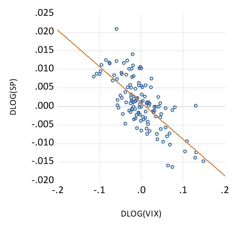
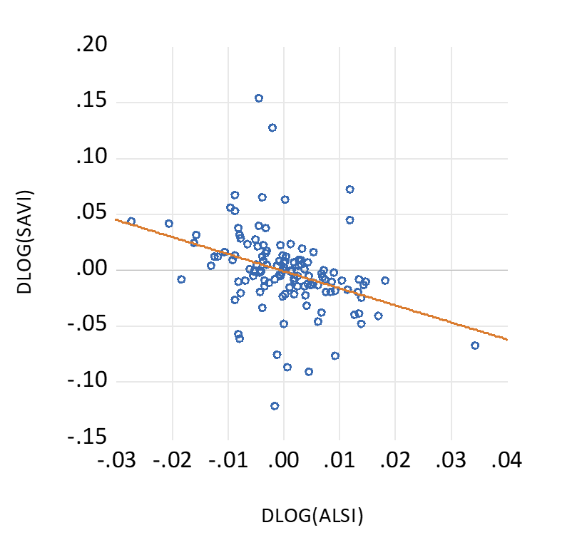
When daily volatility is more elevated, share prices will change consistently in the opposite direction. When the VIX or SAVI goes up share prices go down most days. They do so to improve the chances of higher risk adjusted returns- off a lower entry price- to compensate for more risk incurred. And vice versa. In 2024 it has been vice versa in the US and in SA- risks have fallen and values have improved. Extra risk comes with more returns and vice versa as nature intends. (see below)
The average move for the JSE in 2024 in the six months to June 2024 was an encouraging 0.27% per day. The S&P did only half as well- providing an average gain of 0.11% per day.
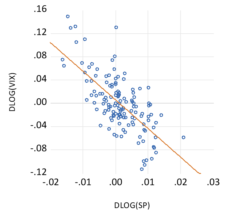
Daily % Changes in the VIX and the S&P 500 in 2024. Scatter Plot
Source; Bloomberg and Investec Wealth & Investment
Daily % Changes in the SAVI and the JSE in 2024. Scatter Plot
Source; Bloomberg and Investec Wealth & Investment
It is the quality of economic policy, more than the presumed certainty of such policies, good bad or somewhere in between, that will matter much more for financial markets in the long run. Any willingness of investors to accord a SA facing business an extended economic life will also add to present values. Provided the Return on Equity (ROE) exceeds the opportunity cost of capital, faster expected growth for a longer term, can explode the current present value of a share and market multiples. Price over Current Earnings or Cash flows and Market to Book ratios.
An accompaniment of lower ROE’s and a lower discount rate attached to future surpluses would also add much additional market value to SA companies. And to their willingness and ability to undertake and fund growth enhancing capex and employment. Faster growth if realised will add to an extra flow of cash to the government, bringing less risk to the fiscal outlook. And be reflected in lower interest and discount rates across the board and in higher share prices.
Extra wealth created in the bond and equity markets, is a game played by all with formal employment and retirement plans, and not only the richer few. The capital markets will provide an objective measure of the performance of the government of national unity (GNU) The score will be continuously kept and updated. While investors have not been frightened by the GNU, they have still to give approval. Over to the GNU.
Dealing with Covid in 2020 was a frightening episode. The JSE All Share Index lost 20% of its value by March that year and the S&P 500, suffered a very similar drawdown, of 20% in USD. Yet something predictable then followed. Between January 2020 and July 2024 share markets have given very good returns and they have outperformed bonds and cash by large margins. R100 invested in the JSE immediately pre Covid with dividends reinvested, would now be worth R173. Had the R100 been invested in the S&P 500 it would now be worth significantly more R236. The same R100 if invested in the Bond Index or in a money market fund with interest reinvested would have grown to only R144 and R130 respectively.
Cumulative Returns by Asset Classes (2020=100)
Source; Bloomberg and Investec Wealth & Investment
A predictable outcome–given the large outperformance by a representative share portfolio on the JSE since 2000, or for that matter also since 1980 or 1960. The R100 invested in the JSE Index in 2000 would have grown to R2152 that is by 21 times at an annual average rate of return of 13.12% p.a. The R100 in money market would have grown by 6.3 times and the Bond Index by 10.6 times over the same period. Incidentally the JSE has kept up with the S&P also measured in rands over these 24 years. The JSE outperformed significantly until 2010 and has underperformed since.
The JSE has therefore recovered very well from significant periodic drawdowns since 2000, 40% down in 2002, 51% in 2008, 24% after Covid and 15% with Fed tightening in 2022.
The JSE All Share Index Cumulative Returns (2000=100) Per Cent Draw Downs Indicated on X axis
Source; Bloomberg and Investec Wealth & Investment
Equities are expected to give superior returns because they are more risky to hold than cash or bonds. The higher returns expected of equities compensate for the different risk of losses investors believe they are exposed to holding shares. Higher expected returns mean lower entry prices for investors, all else remaining the same. And these expected extra returns have been delivered to date by most Stock Exchanges.
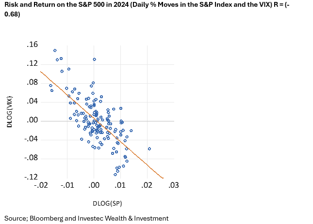
Share prices move each day about an average of close to zero. They demonstrate a random walk with hopefully upward drift to give the expected positive returns over the long run. The more difficulty investors have in interpreting the news about a company or an economy, the wider are the daily swings in prices in both directions. This volatility gives rise to an objective measure of risk. It will be reflected in the cost of an option to insure against volatility. Investors can buy or sell a volatility index, the VIX, based on the underlying volatility of the S&P 500. When S&P volatility (risk) rises share prices fall. And vice versa They do so to improve or reduce prospective returns, in a statistically significant way. As has again been the case this year.
Risk and Return on the S&P 500 in 2024 (Daily % Moves in the S&P Index and the VIX) R = (-0.68)
Source; Bloomberg and Investec Wealth & Investment
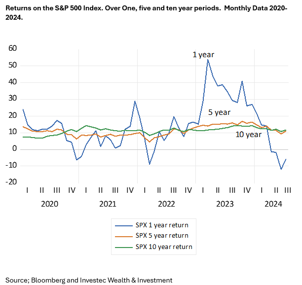
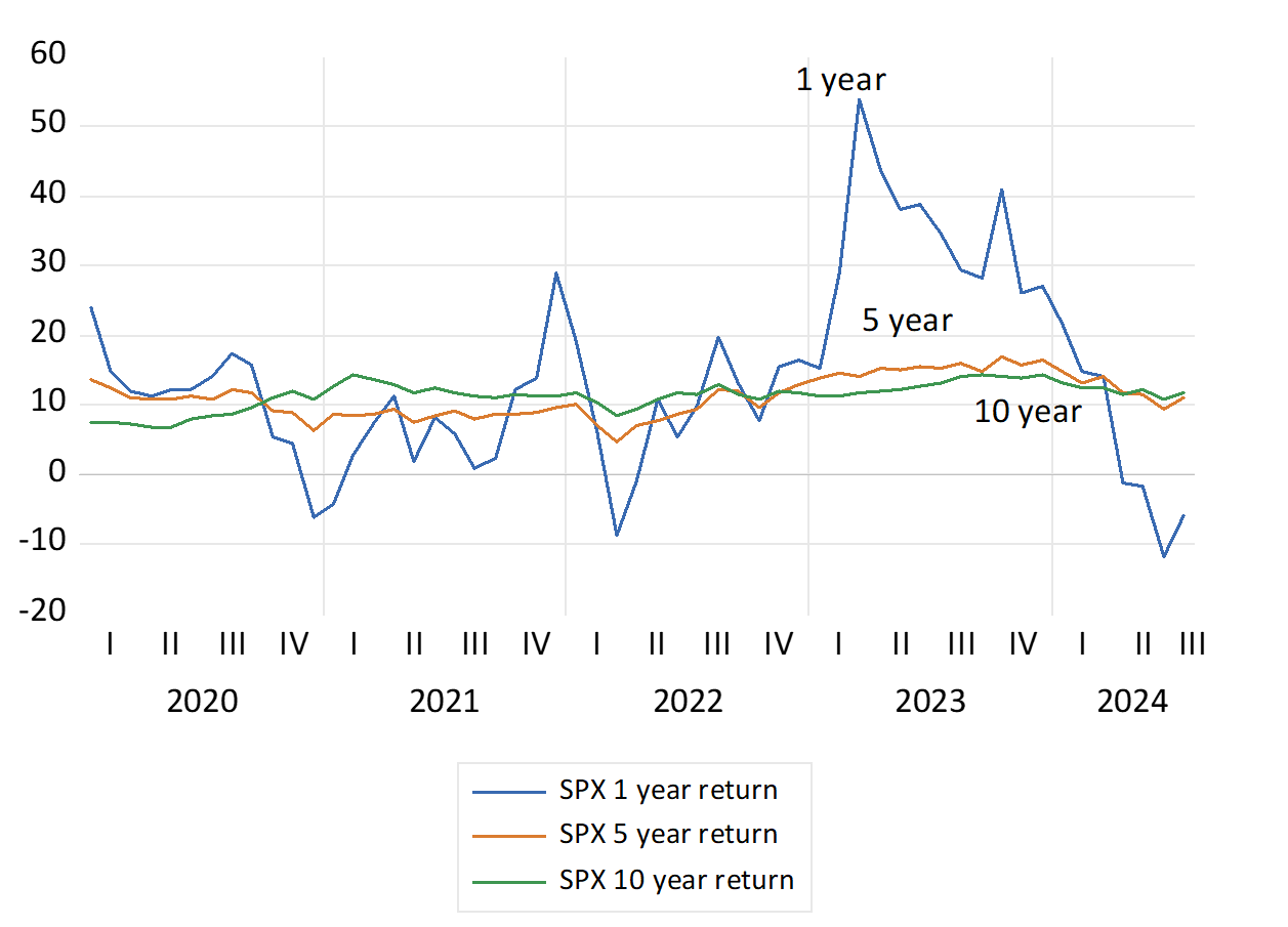
Yet were share market returns measured over longer periods, the risk of an in period loss falls significantly. The average returns when investing on the JSE or S&P market are very similar when returns are measured over one, five or ten year holding periods. Since 2020 returns for holding the S&P Index have averaged about 14% over one year and 11.1% p.a. and 11.2% p.a. when calculated over consecutive five year and ten-year periods respectiverly. However, the Standard Deviation (SD) of returns about the average has been much higher for one-year returns (13.87) than for five or ten year returns with SD’s of 2.93 and 1.96. The same relationship holds when the analysis is taken back to 2000. Risks (the SD or volatility of returns) have fallen sharply when the investment period is extended beyond one year. Absolute losses when returns are measured over five- or ten-year periods occur rarely. It took a Financial Crisis to do so.
The extra expected returns for extra equity risk applies to the averagely risk-averse investor with limited wealth. When you are investing for you children and grandchildren and their children, and are wealthy enough not to have to worry about being forced to cash in your shares, you can invest without much risk -and you can expect to pick up the money left on the table by the more risk averse. Further support for time in the market – not timing the market.
Returns on the S&P 500 Index. Over One, five and ten year periods. Monthly Data 2020- 2024.
Source; Bloomberg and Investec Wealth & Investment
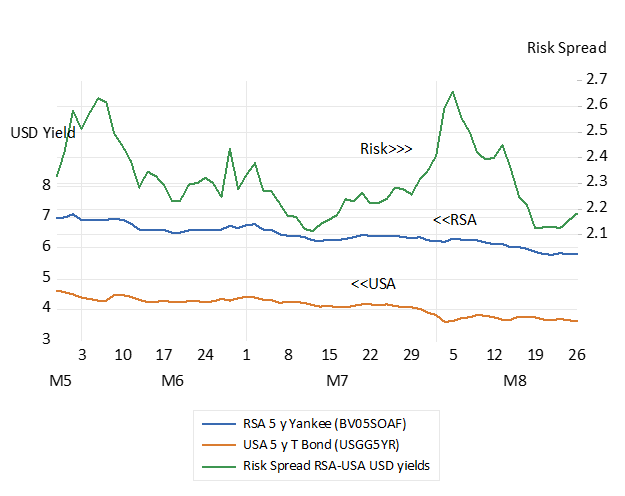
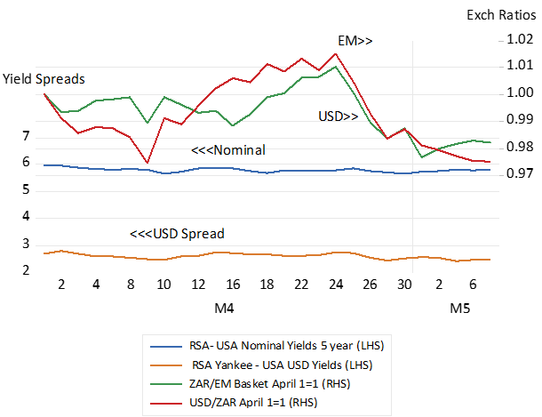
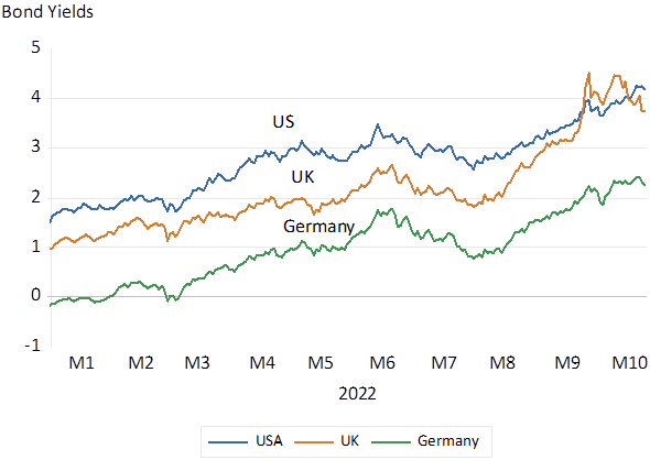
There is a confident calm in the SA financial markets despite the upcoming election the outcomes of which are surely uncertain. Since about two weeks ago the premium for accepting the risk of a SA debt default, measured as the spread between the yields on RSA dollar denominated debt and USA Treasury yields, narrowed marginally to 2.5% p.a by May 7th. It was 2.71% on April 25th. The spread between RSA and USA 5 year bond yields, has remained stable though it is still a discouragingly wide 5.8% p.a. as US and RSA interest rates moved lower off recent highs. Very recently the US dollar has become a little less expensive and value of the ZAR has improved when exchanged for other EM currencies, both by about 2% between since April 25th – which appears as the recent turning point in sentiment – and May 7th
Interest rate spreads and exchange rate ratios. April – May 2024- Daily Data
Source Bloomberg and Investec Wealth & Investment
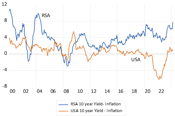
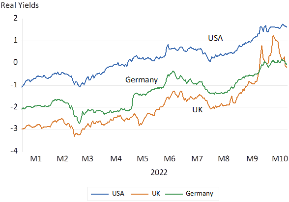
Interest rates, by themselves, tell us little about the rewards for saving or the cost of borrowing. It is after inflation interest rates, that reflect the real rewards for saving and the real cost of issuing debt. Real rates have declined with inflation in the developed world since the mid-eighties. Post covid the long decline in real and nominal bond yields appears to have reversed accompanied by higher inflation. Inflation and nominal and real interest rates in SA have remained comparatively elevated, even as inflation has receded. Since 2000 the real after realised inflation rate for an RSA 10 year Bond has averaged 3.7% p.a. while a US Treasury has offered on average a real less than 1% p.a. The current RSA-USA real yield gap is a large 6% p.a. for ten-year money. Making for undesirably expensive capital for the SA public and private sectors.
Real (after inflation) Long term Interest Rates in SA and the USA
Source; Bloomberg, Federal Reserve Bank of St.Louis, SA Reserve Bank, Investec Wealth & Investment
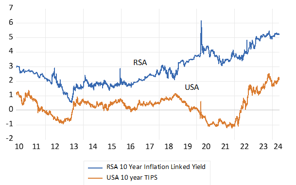
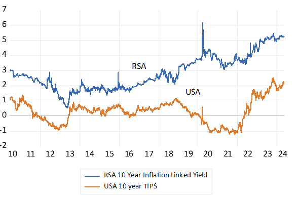
Yet with the advent of inflation protected government bonds rather than be exposed to potentially harmful, inflation events, that reduce the purchasing power of their interest income lenders can own fully inflation protected bonds. Bonds that are guaranteed to maintain their purchasing power regardless of the inflation outcomes. Since 2010 the RSA ten-year inflation linker has offered an average real 2.84% p.a. compared to an average 0.32% p.a. for the US equivalent. This real yield gap has widened significantly in recent years as RSA real yields have risen. The RSA inflation linked ten-year bond currently offer an impressive 5.3% compared to 2.1% for the US TIPS- a real spread of over 3% p.a.
Real Inflation Protected Yields in South Africa and the US. 10-year Government Bond Yields
Source; Bloomberg, Investec Wealth & Investment
Why has this high real 5.3% p.a. inflation protected yield not attracted more investor interest and a higher value? It is a rand denominated bond with no default risk- and no inflation risk. To which the equivalent vanilla bond is subject to – and to default through inflation – should control of the money supply be abandoned, as is always possible, should governments become irresponsible spenders. The current yield on an inflation exposed RSA vanilla bond with ten years to maturity is now about 12% p.a. And after inflation, if maintained around the current 5%, would become a very realised high real yield- and very comparable with the yield on the inflation linker.
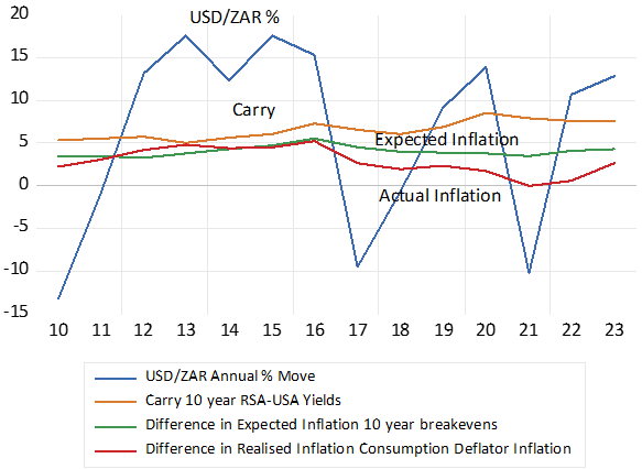
These RSA nominal and real yields are closely connected and elevated, by expectations of rand weakness. A market-based weaker expected exchange rate is revealed by the positive difference between RSA and USA borrowing costs and interest rates over all durations, from 3 months to ten years. This carry, or equivalently, the actual or potential cost of hedging rand exposure by buying dollars for forward delivery, reduces the actual or expected dollar returns on SA debt held by foreign investors. That is when they convert rand income, be it inflation protected or exposed, and capital gains in rands into dollars when exiting a trade in a rand denominated security, they will be well aware of the dangers of rand weakness. If they expose themselves to rand risks and do not hedge their exposure with forward cover, they will make a dollar profit when the rand weakens by less than the carry, that is by less than the difference in SA and US interest rates over the investment period. If the rand weakens by more than the carry they will have been better of holding the lesser interest paying, dollar denominated security.
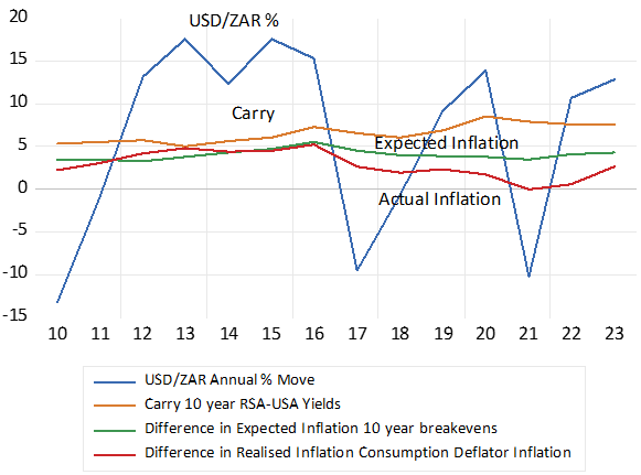
The SA carry, the expected move in the USD/ZAR exchange rate, is however consistently much wider than the difference in actual and expected SA and US inflation. One might surmise that movements in exchange rates equilibrate differences in inflation and differences in expected inflation between trading partners. To level the foreign trading field. But this has not at all been the case. Since 2010 the highly volatile USD/ZAR has weakened on an annual average rate of a 6.3% p.a. The comparatively stable ten-year carry, the average extra cost of buying dollars for forward delivery, has averaged 6.53% p.a. while the difference between expected inflation in SA and the US, has averaged a fairly consistent 4% p.a. While the difference in realised inflation has averaged a mere 2.9% p.a. These long-term trends have made the USD/ZAR a consistently undervalued, therefore highly competitive exchange rate.
Reducing inflation will reduce interest rate levels and unhelpful interest rate volatility and real rates, as the Reserve Bank has asserted it is likely to do. But it will not necessarily make the rand more competitive as the Bank also asserts. With lower inflation the exchange rate might weaken by less than the difference in realised inflation rates between SA and in our trading partners. In which case lower interest rates and a stronger rand could well be accompanied by a less competitive exchange rate.
Interest and Exchange Rate Trends. Annual Data
Source; Bloomberg, Federal Reserve Bank of St.Louis, SA Reserve Bank, Investec Wealth & Investment
Persistently lower SA inflation and lower interest rates will therefore require not only less inflation, but less expected exchange rate weakness. That is a reduced difference between SA and US interest rates as SA interest rates fall.
How could this be achieved? A stronger rand and a stronger rand expected, and with it less inflation realised and expected, can only come with faster real growth, that would bring more favourable flows of taxes, proportionately smaller fiscal deficits and issues of RSA debt- given also restrained government spending linked closely to the same real growth trajectory. The Reserve Bank has limited influence on essential supply side reforms that would be essential to raise the actual and expected growth rates. The Reserve Bank lacks any predictable influence on the most important leading inflation indicator, the exchange rate, influenced as it is so strongly by global risk appetites as well as economic policy successes or failures. Interest rate increases at the short end of the money markets should never be used to fight rand or domestic currency weakness generally. Exchange rates should be left to market forces, and the wider spreads that accompany exchange rate weakness and the higher prices that temporarily accompany currency weakness are very hard to overcome without additional damage to the spending side of the economy. The Bank of Japan has been learning as much.
A wider or ideally a narrower carry, that is the interest rate spread between economies and currencies is part of a new equilibrium in financial markets. It reflects the adjustment to more or less perceived exchange rate risk and less or more capital supplied to a domestic financial market. It calls for the right supply side reforms that lead to faster growth and improved expected risk adjusted returns from additional private capital supplied willingly to domestic borrowers. Including to the government, the borrower that sets the level of interest rates.
The Reserve Bank as should other central banks effectively manage the demand side of the economy, so that demand, under the influence of real short term interest rates, does not exceed potential local supplies, nor fall short of them. So to avoid upward or lower pressure on prices and incomes, wage and interest incomes included. This is far from the actual state of the SA economy today. It suffers from too little rather than too much spending. The Bank could now help growth and the foreign exchange value of the ZAR by reducing what are very high nominal and real short term interest rates that have throttled domestic spending.
Lenders demand compensation for expected inflation with higher interest rates and borrowers are willing to pay more when higher prices are expected to erode their real borrowing costs. Interest rates, after inflation, therefore reveal the real rewards for saving and the real cost of issuing debt. Real interest rates in SA have remained elevated, even as inflation has receded. Since 2000 the real income owning a RSA 10 year Bond has averaged 3.7% p.a. while a US Treasury has offered on average less than 1% p.a. The current RSA-USA 10 year real yield gap is a large 6% p.a.
Real (after inflation) Long term Interest Rates in SA and the USA
Source; Bloomberg, Federal Reserve Bank of St.Louis, SA Reserve Bank, Investec Wealth & Investment
With the advent of inflation protected government bonds, lenders can now avoid exposure to uncertain inflation. They can buy a bond with a guaranteed real return. That is receive an initial yield to be augmented by actual inflation. Since 2010 the RSA ten-year inflation linker has offered an average real 2.84% p.a. compared to an average 0.32% p.a. for the US equivalent. This real yield gap has widened significantly as RSA real yields have risen. The RSA inflation linked ten-year bond currently offers an imposing 5.3% compared to 2.1% for the US TIPS- a real spread of over 3% p.a. Capital is really very expensive in SA and discourages capex.
Real Inflation Protected Yields in South Africa and the US. 10-year Government Bond Yields
Source; Bloomberg, Investec Wealth & Investment
Why has this high 5.3% p.a. real yield not attracted more investor interest and a higher value? It is a rand denominated bond with no default risk- and no inflation risk. To which the equivalent vanilla bond is subject to – and at worst should inflation accelerate – to the effective expropriation of wealth tied up in a bond. The current yield on an equivalent vanilla bond is now about 12% p.a. Time will tell whether it delivers a real return in excess of the certain 5.2% on offer from the inflation linker.
All the RSA bond yields are connected and elevated by expectations of rand weakness. That reduces the expected dollar returns for any foreign investor. The weaker expected course of the rand is revealed by the positive difference between RSA and USA interest rates over all durations. This carry, or equivalently, the actual or potential cost of hedging or compensating for exposure to the rand, reduces the actual or expected dollar returns on SA debt held by foreign investors who are an important source of capital for the RSA. It is expected returns in dollars not rands, even inflation adjusted rand income, that guides their investment decisions.
This carry, is moreover consistently wider than the difference in actual and expected SA and US inflation. One might surmise that movements in exchange rates equilibrate differences in inflation between trading partners, to help level the foreign trading field. But this has not at all been the case. Since 2010 the highly volatile USD/ZAR has weakened on an annual average rate of a 6.3% p.a. The comparatively stable ten-year carry has averaged 6.53% p.a. while the difference between expected inflation in SA and the US, has averaged a consistently lower 4% p.a. While the difference in realised inflation in SA and the US has averaged a mere 2.9% p.a. Persistently lower SA inflation will therefore require not only less inflation but also less expected exchange rate weakness, that is a narrower carry.
Interest and Exchange Rate Trends. Annual Data
Source; Bloomberg, Federal Reserve Bank of St.Louis, SA Reserve Bank, Investec Wealth & Investment
A stronger rand and a stronger rand expected, can only come with faster real growth. The Reserve Bank has limited influence on growth enhancing supply side reforms including any predictable influence on the exchange rate with its interest rate settings. It should manage the demand side of the economy, so that demand, under the influence of real short term interest rates, does not exceed potential local supplies, nor fall short of them, to put avoidable domestic pressure on prices and incomes. The Bank could now help growth and the foreign exchange value of the ZAR by reducing what are very high nominal and real short term interest rates that have throttled domestic spending.
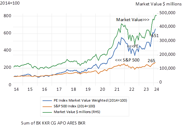
Over the past 20 years institutional fund allocators have fallen in love with high-fee paying, internally valued, and illiquid private investment strategies known as Private Equity (PE). The PE industry has evolved from a small cottage industry to a very important asset class. The PE partnerships that manage the process have gone the other way. Converting from small private partnerships to highly valued public companies. With their revenue and earnings and market value propelled by the ever-increasing inflow of assets they have captured from institutions. Supporting strategies that promise to ignore the “hated” and unavoidable volatility associated with owning listed stocks. Their founders are the new Titans of Wall Street.
These PE managers typically invest alongside their pension fund and endowment partners in the series of multiple separate funds (partnerships) they initiate and raise capital for. The largest the Blackstone Group Inc. has over $1 tr of assets under its management (AUM) and a stock-market value of $155b. Other prominent names in the category include KKR, the Carlyle Group, Apollo, Ares, Blackrock and Brookfield.
For privately owned operating companies sourcing capital from these private equity funds has clearly become an increasingly viable alternative to an initial public offering of their shares. The number of publicly listed companies traded on US exchanges has fallen dramatically from a peak in 1996 of 8,000 plus. Now only 3700 companies are listed in the US. Astonishingly there are now about five times as many private equity-backed firms in the US as there are publicly held companies according to the Wells-Fargo Bank.
Staying or going private works because the private co-owners and managers of their business operations are very likely to focus narrowly on realising a cost of capital beating return on the capital at risk, including their own capital. The controllers of the private equity funds are aware of the advantages of appropriately incentivised owner-managers. They design their contracts with the private companies they oversee accordingly. And the private companies that the funds invest in will also be encouraged to raise debt to improve returns on less equity capital.
Regular fund valuations and annual returns on the funds however are conveniently based on internal calculations of net asset value. Reporting smoother annual returns, so calculated, than provided by listed equity plays well in the annual performance reports provided to trustees of pension funds and endowments. Moreover, if returns on equity generally exceed the costs of finance over the long run, as expected, the case for leveraging returns on equity capital with more debt is a powerful one. And lenders also like smoother, predictable returns, especially when secured by the pre-commitments to subscribe funds when called. The longer the call for capital by the funds can be delayed, the higher will be the returns on the lesser equity capital invested.
A further advantage is that their private companies supplied with capital will be given time –five to up to ten years – to prove their business case – before the funds have to be liquidated. Perhaps via an initial public offering of shares (IPO) public market conditions permitting. Or a sale of assets to another PE fund. Perhaps even rolled over to a new fund raised by the same fund manager. The performance fees paid to the private equity firms themselves (perhaps 20% of the capital gain) will be realised on the final liquidation of a fund. Management fees of typically 1-1.5% p.a. on AUM will also be collected. These performance fees account for a large proportion of the fund manager’s revenue.
Yet paradoxically it would have been an even better idea to have become a General rather than a Limited partner in these burgeoning private equity funds. That is owning the shares of the listed private equity managers as an alternative to subscribing to one of their funds. The shares of six of the largest listed PE managers – yes volatile and market-related – have SIGNIFICANTLY outpaced the excellent performance of the S&P 500 Index itself. And PARADOXICALLY outperformed most of the funds they have managed. Taking more risk in PE investments has had its reward. (see below)
Listed Private Equity Companies; Market Cap weighted value of six large listed PE managers. (2014=100) Month End Data.
Source; Bloomberg, Investec Wealth and Investment International
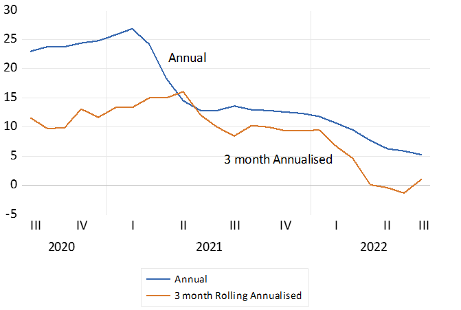
The odds on a US recession in the next twelve months have receded in the light of the continued willingness of US households to spend more- despite much higher interest rates and reductions in the supply of money and bank credit. Spending on goods and food services rose by 0.7% in September on top of a robust increase of 0.8% in August. The annual increase in retail sales is 3.7% and the increase over the past three months is running at an annual equivalent of 8% p.a. Prices at retail level are falling. They stimulate demand but they also devalue the inventories held to satisfy demand. Prices have their supply and demand causes. They also have their effects on demand- and supply. Lower prices stimulate demand and incomes are now growing faster than prices.
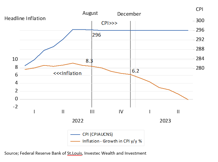
All that is holding up the US CPI – now 3.7% up on a year ago – are house prices – and what are imputed as owners’ equivalent rent. That is at what the owners could earn if they rented their homes They are up 7% on a year before. They have a huge weight in the CPI – over 25% – and if excluded from the CPI – would have headline inflation running in the US below the 2% target. Cash rentals account for a further 7% of the US CPI. By contrast food eaten at home carries a weight of only 8.6% in the CPI and food eaten out is 4.8% of the US CPI Index. SA also includes owners’ equivalent rent in its CPI with a weight of 12.99% and actual rentals account for only 3.5% of the index. Both rental series in SA are up by a below average 2.6% on a year before. The headline inflation rate in SA was 5.4% in September.
Owners equivalent rent is a very different animal to other prices. Higher implicit rentals based on the improved value of an owner’s home are not the usual drag on spending. The extra wealth in homes, as would all increases in household wealth, more valuable pension plans, more valuable share portfolios, etc. will encourage more, not less spending. The boom in US house prices post Covid has had much to do with the ability and willingness of US households to spend more and help push up prices generally. Average house prices in the US are now falling under pressure form much higher mortgage rates and house price inflation to date will be falling away rapidly as will owner’s equivalent rentals. Thus helping to reduce headline inflation.
The question investors are asking about both inflation (falling) and the state of the economy ( holding up) is what will it all mean for interest rates. The stronger the economy the lesser the pressure on the Fed to lower short rates. And the greater will be the pressure on long term rates in the US. The key ten-year Treasury Bond is now offering 4.9% p.a. reaching a 16 year high. In the share market what is expected to be gained on the swings of earnings may be lost on the roundabouts of higher interest rates, used to discount future earnings. But if inflation is subdued, any visible weakness in the economy, can be followed immediately by lower interest rates. This thought will be consoling to investors.
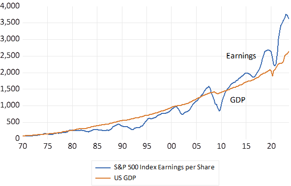
The attention paid to GDP by investors is fully justified. Where GDP goes so will the earnings reported by companies. Their correlation since 1970 is (R=0.97) Though helpfully to shareholders in recent years earnings have been running well ahead of earnings indicating widening profit margins from the IT giants. GDP , on a quarter-to-quarter basis, is a highly volatile series. Though growth in earnings is much more volatile.
US GDP and S&P 500 Earnings. Current values. (1970=100)
Source; Bloomberg, Federal Reserve Bank of St. Louis and Investec Wealth and Investment.
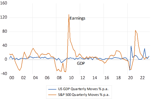
The underlying trend in GDP and earnings will never be obvious. To make sense of their momentum, to recognize some persistent cycle, the data has to be smoothed and compared to a year before. Thus we will know only in a year or more whether the US economy has escaped a recession. It is not recessions that move markets, only expected recessions do so. And the jury will always remain out.
GDP and S&P 500 Earnings Growth Quarter to Quarter % Annualised.
Source; Bloomberg, Federal Reserve Bank of St. Louis and Investec Wealth and Investment.
Politicians propose spending and revenue plans – but the bond market disposes and not always kindly. In the UK plans to combine tax reforms that only work gradually with an immediate massive increase in subsidizing the consumption of energy with borrowed money was apparently a step too far for lenders to HMG and the governing party.
Yet long term interest rates in the US and Europe were also rising rapidly. In Germany Ten-year money yielding negative rates in January had increased to 2% p.a. by October. US US Treasury Bonds that offered 1% p.a. in early January 2022 now yield over 4% p.a. and indeed offer more interest in US dollars than the much battered 10 year gilts.
Long Term (10 Year) Interest Rates in the US, UK and Germany. Daily Data to October 25th
Source; Bloomberg and Investec Wealth and Investment
Blaming all this wealth destruction on a potentially profligate UK government is further complicated by the fact that not only were nominal interest rates on the rise – more so were real rates. Real ten-year yields in the US now deliver a yield of close to 2% p.a. – they offered a negative 1% in January 2022. They now exceed the returns on a UK ten year inflation linker that has increased from a negative -3% in early 2022 to the current much higher 0% p.a. Equivalent Inflation protected German Bunds also now offer about 0% p.a. – compared to -2% early in 2022.
Real Inflation Protected 10 year Bond Yields
Source; Bloomberg and Investec Wealth and Investment
It is the real cost of funding developed government debt that have been driven much higher this year -not more inflation expected. Expectations of more inflation to come would have found expression in higher interest rates for inflation exposed lenders and not necessarily in higher real yields. Expected inflation measured as the difference in nominal and real yields for equivalent bonds has not increased this year in the US,UK or Europe. Inflation expected in the in the UK over the next ten years has remained about 4% p.a. this year, higher than inflation expected in Germany and the US that have varied about the 2.5% p.a. rate.
Source; Bloomberg and Investec Wealth and Investment
It is not easy to explain why real interest rates in the developed world have risen so significantly this year. Additional competing demands for capital to fund capital expenditure that might ordinarily help explain higher costs of capital and rewards for savers have been notably absent. An alternative explanation is that greater risks to lenders has forced yields higher and bond prices lower to compensate lenders for assuming extra risks – that more risk demands higher returns and forces bond values lower. The risks posed by central banks struggling to cope with inflation have made bond markets far more volatile. The negative correlation between the increases in US bond market volatility Index and the Global Bond Index is strikingly large this year. The link between increased volatility and lower bond and equity valuations seems highly relevant. If it is the risk of central bank policy errors that have driven up required returns it may be hoped that a more predictable Fed will be accompanied by lower government bond yields.
US Bond market volatility and the Global Bond Market Index
Source; Bloomberg and Investec Wealth and Investment
Thanks to the inflation panicking Fed, government bonds have proved anything but a safe haven for pension and retirement funds in the developed world. But in high bond yield, high risk South Africa, RSA bonds have performed much better than equities for pension and retirement funds. The increase in long bond yields have been offset by much higher initial yields, leaving the bond market total return indexes in rands unchanged year to date while the JSE Swix Index has cost investors about 4% this year. RSA 10 year nominal yields started 2022 at 9.73% and have risen to 11.5% while the real yield on the inflation protected bonds are up from 3.63% to an elevated 4.6% p.a.
JSE Bond and Equity, Total Return Indexes January 2022=100. Daily Data
Source; Bloomberg and Investec Wealth and Investment
These high yields mean very expensive debt for SA taxpayers and offer high risk premiums to compensate for what has been a seriously deteriorating fiscal stance since 2010. The MTBS just presented represents a serious attempt to regain fiscal sustainability. If the plans are realized the debt to GDP ratios will decline to levels well below that of the US or UK. A primary budget surplus – revenues exceeding all but interest expenses – has come surprisingly in sight. Achieved this would surely represent fiscal sustainability and help bring down RSA yields closer to those of the developed market borrowers.
The financial market reactions to the US CPI news on 13th September provides an extreme example of how surprising news plays out in the day-to-day movements of share prices, interest and exchange rates. The key global equity benchmark, the S&P 500 lost nearly 5% of its opening value after the announcement that inflation in August had been slightly higher than expected. Implying that the Fed that sets short term interest rates in the US would be more aggressive in its anti-inflationary resolve, making a recession inevitable and more severe.
By the recent trends in GDP the US economy was already in recession despite a fully employed labour force. Recession without rising un-employment would have been unimaginable before the Covid lockdowns. The Fed failed to imagine the inflation that would follow the stimulus it, and the US Treasury, had provided to the post covid economy and this has become the problem for investors and speculators required to anticipate what the Fed will be doing to protect the value of the assets entrusted to them.
Yet it should be recognized that the US CPI Index in fact is no longer rising – average prices fell marginally in August as it had done the month before. But perhaps not as much as had been expected. The headline inflation rate- the rate most noticed by the households and the politicians had reached a peak of 9.1% in June and has since fallen to 8.3% as the CPI moved sideways. The increase in prices over the past three months was lower – 5.3% p.a.
Inflation in the US. Headline % p.a. Monthly % and three monthly % p.a.
Source; Federal Reserve Bank of St.Louis, Investec Wealth and Investment
Yet even if the average prices faced by consumers stabilized at current levels until June 2023 the headline rate of inflation would remain elevated- at 6% p.a. by year end and could return to zero only by June 2023. One wonders just how realistic are the Fed’s plans to reduce inflation rates in shorter order. Patience is called for
The outlook for Inflation if the US CPI stabilized at current levels.
Source; Federal Reserve Bank of St.Louis, Investec Wealth and Investment
The true surprise in the inflation print was the trend in prices that exclude volatile food and energy prices. It was these supply side shocks to prices that had helped to drive the index higher and they are reversing sharply. However, the inflation of prices, excluding food and energy remains elevated. They are now 6% ahead of price a year ago. The Fed is known to focus on core rather than headline inflation.
Headline and “Core” inflation in the US
Source; Federal Reserve Bank of St.Louis, Investec Wealth and Investment
The largest weight in the US CPI Index is given to the costs of Shelter. They account for over 32% of the Index of which 28% is attributed to the implied rentals owner occupiers pay to themselves. The equivalent weight in the SA CPI is much lower – 13%. Where house prices go – so do rents – and the implicit costs – rather the rewards – of home ownership – and inflation. But surely the reactions of those who own more valuable homes are very different to those who rent? Higher explicit rentals drain household budgets – and lead to less spent on other goods and services- and are resented accordingly as are all price increases. Higher implicit owner-occupied rentals do the opposite. They are welcomed and lead to more spending and borrowing. House price inflation in the US has been very rapid until recently- and rents may be catching up- meaning higher than otherwise inflation rates.
Prices always reflect a mix of demand and supply side forces. But ever higher prices- inflation – cannot perpetuate itself unless accompanied by continuous increases in demand. It is the impact of higher prices on the willingness and ability of households to spend more that is already weighing on the US economy. Incomes are barely keeping up with inflation. And the supply of money (bank deposits) and bank lending in the US has stopped growing further constrains spending. If inflation is caused by too much money chasing too few goods the US is already well on the way to permanently lower inflation. The danger is that the Fed does not recognize this in good time – and as the market place fears.
US Money Growth (M2 seasonally adjusted)
Source; Federal Reserve Bank of St.Louis, Investec Wealth and Investment
There are regularities of economic crises and their aftermaths that can help us to plot the way ahead.
Life has returned to normal in the US and UK – judged by the crowds attending Wimbledon, Wembley and Whistling Straits. With only the occasional mask to remind us of a crisis passed. The normal is once again guiding our expectations and economic actions, and is determining the value of the assets we own.
Normal for now, that is, and until the next crisis again moves the markets. Its timing, causes and consequences will remain one of the great known-unknowns, or perhaps it will even be an unknown- unknown (in the words of the recently passed Donald Rumsfeld). However, the successes of recent crisis management may help put us in a better position to cope.
We can define an economic crisis as a serious disruption of economic activity, leading to the severe loss of income and the benefits gained from producing and consuming goods and services. A crisis is therefore destructive of the value of the assets we own, which depend on such incomes.
A crisis is worse than your average recession, when GDP declines by a percent or two below trend for a year or so. The failures of the banks and insurance companies in 2008-2009 resulted in the Global Financial Crisis (GFC), which threatened to implode the real economy with them. In 2020, economies were shut down summarily to escape the pandemic, resulting in the loss of as much as a quarter of potential GDP, a large sacrifice of potential incomes and output.
Overcoming these two crises relied essentially on governments and their central banks. In the case of the GFC, it required central banks to shore up the global financial system buying assets from banks and financial institutions on a vast scale, in exchange for central bank money.
The responses to the crisis of 2020, at least in the developed world, were more immediate, less equivocal and on a larger scale than after 2008. They added much direct income relief to the monetary injections. They have surely succeeded not only in reducing the pain of lockdowns, but also in ensuring that demand for goods and services would recover with the supply of goods, that a return normality makes possible.
Judged by the signals provided by the markets in shares, bonds and commodities, the economic crisis is now well behind the developed world. US, emerging market (EM) and therefore South African companies are now worth significantly more than they were when the lockdowns became a reality in March 2020, when the US Index lost 13%, the EM Index 17% and the JSE gave up 27% of its US dollar value. The JSE had lost 14% of its value the month before.
The JSE from these lows has been a distinct outperformer, in dollars and in rands. The JSE has gained 50% compared to a 30% gain for the S&P and EM indices, when converted to rands. In dollars, the gains since the trough are even more impressive. The JSE is up 86% compared to the 66% and 61% gains for the S&P and EM since the crisis lows.
Regularities of a crisis
This indicates one of the crisis regularities for SA. South African assets and incomes are highly exposed to changes in global risk, losing more during a crisis and then gaining more than the average EM equity or bond when the crisis is over. It is also worth noting that the JSE has not moved much since March this year – another sign of normality. If only we had the gumption not to waste a good crisis.
This illustrates another regularity when an economic crisis is not of South African making. The rand is what we call a high beta EM currency – it does worse than its EM peers when risks are elevated and better when global risks decline, as has been the case with the JSE. During the height of the present crisis the rand/US dollar exchange rate and the JSE were 30% weaker compared with EM peers. They are now back to the normal long-term relationship of an average of one to one.
Global market risks are easily identified by the volatility of the S&P 500 index, as represented by the well-known volatility index, the VIX. When these daily moves become more pronounced and share prices bounce around abnormally, the cost of insuring against market moves becomes ever more elevated – shares lose value when the future appears much less certain. Higher expected returns, and hence lower share prices, compensate for increased risks. In short, the VIX goes up and share prices go down in a crisis.
The daily average for the VIX in the two years before the pandemic was 19 – it was over 80 at the height of both crises. It has recently moved back to 19.
The S&P 500 index is now in record territory in nominal and real terms. In inflation-adjusted terms, the S&P 500 is up about 7.4% a year since the low point of the financial crisis. Real earnings over the same period have grown at an annual average rate of 5.9% since 2009, an above average performance.
Looking for cover
Another regular feature of a crisis is the behaviour of the cover ratio – the normally very close relationship between earnings and dividends. The more cash retained (the less paid out) the more value that is added for shareholders.
We make the presumption that the extra cash retained is invested well and earns above its opportunity cost. S&P earnings are again rising much more rapidly than dividends (which held up better during the crises). Indeed, analysts, absent the usual guidance from the managers of the companies they report on, are still struggling to catch up with the buoyant earnings recovery now under way. Earnings surprises are the order of the day.
The cover ratio for the JSE follows a similar pattern in times of crisis and has a similarly negative impact on share valuations. The more companies pay out dividends relative to earnings, the less these companies are generally worth. The recent recovery in cover ratios to something like their longer-term averages is another sign of normality, as well as a support for share prices. Ideally, the JSE cover ratio declines in line with the increase in opportunities to invest in ways that would add value.
SA shows its metal
A further regular feature of the economic crises of recent times and the recovery from them has been the behaviour of commodity and metal prices that make up the bulk of SA’s exports. They fall during a crisis and they recover strongly as the crisis passes by as they are doing now. Metal and mineral prices lead the South African business cycle in a very regular way. Commodity prices lead, the rand follows, inflation is then contained and interest rates, at worst, do not rise. And the money and credit cycles accommodate the rising incomes that emanate initially from the mining sector.
We are far from the super cycle we benefitted from in the lead up to the GFC of 2008. But we can hope that above normal demand for metals will continue to impress itself on below normal supply responses, translating into higher prices.
While long-term interest rates in SA have recovered from their crisis-driven extremes, they remain discouragingly elevated. Discouraging because they imply high hurdles for capital expenditure budgets to leap over and hence low cover ratios and less cash retained for capex. The gap between short and long-term interest rates, the slope of the yield curve, has moreover remained at crisis levels.
The yield curve implies that short-term interest rates will double within three years. This is a prospect that seems completely out of line with the outlook for the SA economy. We can only hope that the market has got this badly wrong.
The crisis-driven SA economy should not be forced to adjust to higher interest rates. It would be inconsistent with the economic and financial stability that the Reserve Bank is constitutionally charged to secure. It takes much more than low inflation to overcome an economic crisis, as South Africa may still come to recognise.
Does the reduced value of the S&P 500 reflect the earnings permanently lost after the coronavirus? We give a provisional answer.
The tribe of company analysts is hard at work revising the target prices (almost all lower) of the companies they follow. They will be adjusting the numerators of their present value calculations for the permanent losses of operating profits or free cash flow caused by the lockdowns. They will attempt to estimate the more long-lasting impact on the future performance of the companies they cover, after they get back to something like pre-coronavirus opportunities.
What discount rate will they apply to the expected post-coronavirus flow of benefits to shareholders? Will it be higher for the pandemic risk or lower because long bond yields are expected to remain low for the foreseeable future? When they have revised their target prices for the companies they cover, we could theoretically add up how much less all the companies covered by the analysts are now estimated to be worth. We would count the total damage to shareholders in trillions of US dollars since 1 January.
The analysts are taking much longer than usual to revise their estimates of forward earnings and target prices. But investors in shares are an impatient lot. They are making up their own collective minds, also with difficulty, as the turbulent markets and the high cost of insuring against market moves shows.
The companies listed in the S&P 500 Index were worth a collective US$28.1 trillion on 1 January 2020. By 23 February, when the market peaked, they had a still higher combined market value of US$29.4 trillion. By 23 March, the market had deducted nearly US$10 trillion off the value of these listed companies. Yet by 17 April, the market had recovered strongly from its recent lows, and was worth US$24.6 trillion, or US$3.5 trillion less than the companies were worth on 1 January. Is this too low or too high an estimate of permanent losses?
Figure 1: The market value of companies listed in the S&P 500, to 23 April 23 2020
Source: Bloomberg and Investec Wealth & Investment
We will try to answer these questions. First, we attempt to estimate the damage to S&P reported earnings. These lost earnings can be compared with the losses registered in the market place, the US$3.5 trillion of value destruction. To do so, we first extrapolate S&P earnings beyond 2019, using a time series forecasting method. This forecast is used to establish the S&P earnings that might have been, had the economy not been so cruelly interrupted. We then estimate the earnings that are now likely to be reported, by assuming a loss ratio. That is the ratio between the earnings that we predict will be reported as a ratio to the earnings that might have been, had the US not been disrupted by the coronavirus.
As we show in the figure below, the reduction in reported earnings is assumed to be very severe in Q2 2020, when earnings to be reported in Q2 are assumed to be equivalent of only 25% of what might have been had the earnings path continued at pre-crisis levels. Then the loss ratio is assumed to decline to 30% in Q3, 50% in Q4 2020, and 75% in Q1 2021, where after it is estimated to improve by 5% a quarter until the earnings path is regained in Q2 2022.
The calculations are indicated in the charts below. The total accumulated loss in earnings under these assumptions would be a large US$3.4 trillion. It will be seen that the growth in estimated S&P 500 earnings turns positive, off a very low base, as early as Q2 2021. The key assumption for this calculation is the loss ratio, as well as the time assumed to take until back to the previous path. The more elongated the shape of recovery and the greater the loss ratios, the more earnings will be sacrificed.
If this assumed permanent loss of over US$3.4 trillion were subtracted from the pre-coronavirus crisis value of the S&P 500 of US$28 trillion, it would bring the S&P roughly to the value of about US$24 trillion recorded on 17 April.
Figure 2: The quarterly flow of S&P earnings in billions of US dollars
Source: Bloomberg and Investec Wealth & Investment
Figure 3: Estimated quarterly loss of earnings per quarter (billions of US dollar) and growth in estimated earnings (year-on-year) 2019-2022
Source: Bloomberg and Investec Wealth & Investment
How much S&P 500 gross earnings will be lost permanently is still to be determined with any degree of confidence. The US$3.4 trillion loss we estimate is consistent with the losses recorded to date in the market value of the S&P 500 companies. The environment after the coronavirus and the impact of the new political economy will have to be considered carefully when assessing the long-term prospects for businesses. As always, the discount rate applied to future economic profits will have a decisive role to play in determining the present values of companies.
If we are to take seriously the signals from global bond markets- as we should- savers should expect a decade or more of very low returns. The decline in bond yields due to mature in 10 years or more accelerated dramatically during and after the Global Financial Crisis (GFC) (see below)
Less inflation expected is part of the explanation for these lower yields. But it is more than lower expected inflation at work. Yields on inflation protected securities – those that add realized inflation to a semi-annual payment – have declined to rates below zero. Before the GFC the US offered savers up to a risk free 3% p.a. return for 10 years, after inflation. The equivalent real yield today is a negative one of (-0.11% p.a). (see below)
Real Yields in the US 10 year Inflation Linked Bonds ( TIPS)
Source; Bloomberg and Investec Wealth and Investment
These low risk-free rates also mean that firms investing the capital of their shareholders have very low investment hurdles to clear to justify their investment decisions. A 6% internal rate of return would be enough to satisfy the average shareholder given the competition from fixed interest. Equity returns might also be expected to gravitate to these lower levels.
Another way to describe these capital market realities is that the rate at which the value of pension and retirement plans can be expected to compound is expected to be at a much slower one than they have been in the recent past. Savers will need to save significantly more of their incomes to realise the same post-retirement benefits.
The past decade has in fact been particularly good for global pension funds. In the ten years after 2010 the global equity index returned 10.5% p.a. on average while a 60-40 blend of global equities and global bonds returned an average 6.4% p.a. with less risk. US equities would have served investors even better, realizing average returns of 13.4% p.a, well ahead of US inflation of 1.8% p.a. over the period.
Total portfolio returns 2010-2019 (January 2010 =100)
Source; Bloomberg and Investec Wealth and Investment
Why then has global capital become so abundant and cheap over recent years? Many would think that Quantitative Easing (QE) the creation of money on a vast scale by the global central bankers, has driven up asset prices and depressed expected returns. An additional three and more trillion US dollars-worth has been added to the stock of cash since the GFC.
Global Money Creation
Source; Bloomberg and Investec Wealth and Investment
But almost all of this cash has been added to the cash reserves of banks- and not exchanged for financial securities or used to supply credit to businesses that could have stimulated extra spending. Bank credit growth has remained muted in the US and even more muted in Europe and Japan.
The supply of global savings has in fact held up rather better than the demand for them, helped by an extraordinary increase in the gross savings to GDP ratio in Germany. These savings have increased from about 22% of GDP in 2000 to 30% of GDP in 2018- while the investment ratio has remained at around 22% of GDP. Government budget surpluses have contributed to this surplus of savings in Germany. For advanced economies the share of government expenditure in GDP has fallen from 42% in 2010 to 38% in 2018 while the share of revenue has remained stable at about a lower 35% of GDP. This could be described as global fiscal austerity -post the confidence sapping GFC.
Germany – Gross Savings and Investment to GDP ratios
Source; IMF World Economic Outlook Data Base and Investec Wealth and Investment
IMF – All Advanced Economies – Ratio of Government Expenditure and Revenue to GDP
Source; IMF World Economic Outlook Data Base and Investec Wealth and Investment
Perhaps depressing the demand for capital may be the changing nature of business investment. Production of goods and more so of the services that command a growing share of GDP, may well have become capital light. Investment in R&D may not be counted as capital at all. Nor is intangible capital as easily leveraged.
Lower interest rates have their causes -they also have their effects. They are very likely to encourage more spending – by governments and firms and households. Mr.Trump does not practice fiscal austerity. Boris Johnson also appears eager to spend and borrow more. It would be surprising if firms and many more governments did not respond to the incentive to borrow and spend more and compete more actively for capital. Permanently low interest rates and returns and low inflation may be expected – but they are not inevitable. The cure for low interest rates (high asset prices) might well be low interest rates.